Visual Quote
For this project I used the lyrics from the song Heavy by Linkin Park
Reflection
Phase 1:
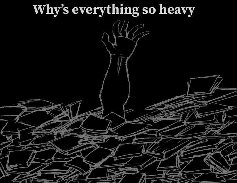
So for phase 1 it was actually really hard to think of an important quote or song lyrics just because there are so many songs that have important lyrics or just in general important quotes. I started thinking about music just because I really like listening to music, and I listen to it like every single day. Then the next step was to find a group where in the songs the lyrics are very relatable and where people can resonate. That was another hard part just because I relate to a lot of songs and there’s a lot of songs that I like. Then later, I found a group. I was looking at my Spotify artist and this group I remember growing up with their songs through really hard times. The group is Linkin Park. It took me a while just to pick a song from them because a lot of their songs have to do with mental health issues and I wanted to do like a perfect song because I feel like I wanted a song that I can and the rest of the world can relate to, so I chose the song Heavy. The lyrics are very relatable to not just me, but everyone in this world where they can resonate with these lyrics. Now part of the sketch phrases were really hard because my mind went completely blank. Out of seven of my sketches, I didn’t really like six of the sketches because I feel like it wasn’t really showing the point of the song. My first sketch was the only sketch that I liked just because it felt like it related to the lyrics where the lyrics was “why is everything so heavy” so I wrote the word, Heavy in bold and block letters to show how something can be very heavy, which can relate to mental health. I feel like I want to refine that sketch, Maybe showing a person’s figure crouched with their hands covering their faces and the lyrics just around the head showing thoughts. Which is implying going through some emotions showing that both emotions are heavy that it’s affecting that person.
Phase 2:
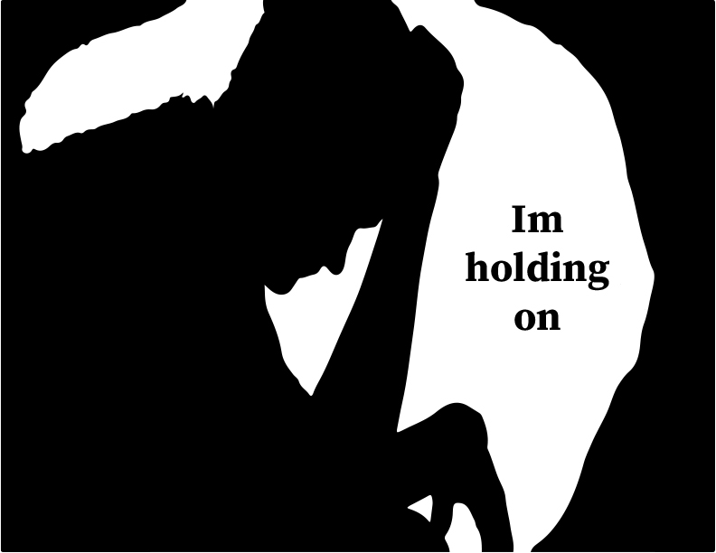
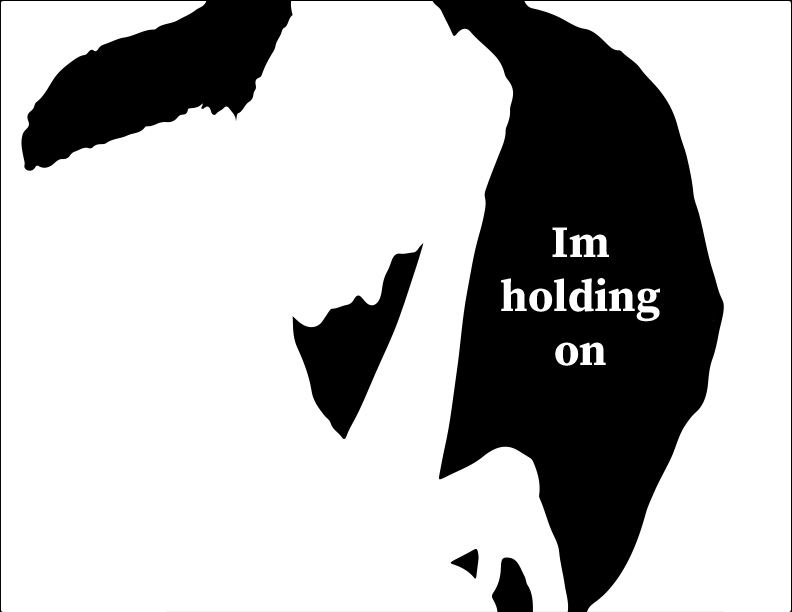
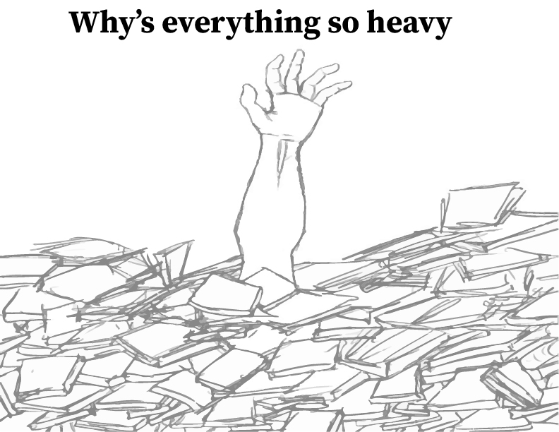
So for Phase 2 it was actually easier to fix up my logo using the quote. The quote I used was “Holding on, why is everything so heavy?” for my first image what I did was, I got an arm standing out where it’s covered in rubble or just books and paper. Generally showing how the person underneath that rubble cannot get out because everything is just on that person like the pressure and everything which relates to the song because the song has to do with mental issues that can happen due to stress and anxiety. Sometimes work or just doing something with the time limit can cause a person to feel a heavy pressure on them. I had two images based on that because the first image is in black and white the second image is also black and white but inverted to see which one is better. Then for the second image I used a silhouette of a person covering its face or just forehead in general showing that it’s stressing or is anxious from the pressure. Then I put the lyrics “Holding On”. I also inverted the image to see two different views of the same image. This phase honestly was easier to do than the first stage because I had a better idea of what to design.
Phase 3:
For phase 3 it was more like revising my posters. The thing I had to mostly work on was the typeface I was using. The last typeface that I used was harder to understand what it was saying and was also too distracting away from the posters. So I spread it across the posters and I also made a simpler typeface to make it clear to understand what’s going on in the poster. The last time the reason why I used a different font was to make it look like a rock kind of look but I realized that it made it look like the logo for Metallica but Linkin Park is an alternative rock group so their logo is also different. I also just want to focus on the poster itself, if I make the typeface distracting from the poster then the audience wouldn’t really understand what’s going on in the poster because the poster is about mental health issues and that’s the message I’m trying to get across. I also made the type a bit larger to get the message across.
Additional Images