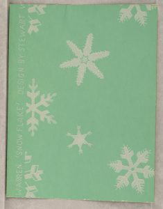
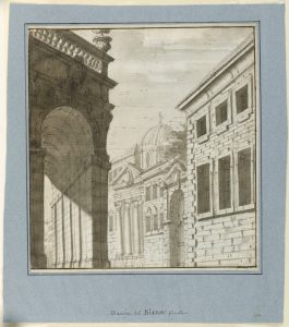
So for the first example is a piece that is made by Katzenbach and Warren, Inc. in their sample piece form 1929-1932. The reason why I found this piece interesting is because of the way the snowflakes simply contrast with the sea green background which is sight not seen very often by many designer, usually we would associate winter with light blues and whites but not sea green. For the second piece was made by an unknown artist however this persons use of contrast between the red background and orange and blue fans blend well with out over saturating each other. I also like the inclusion of the black ascents to help fill in the negative space. Now for the last piece which was made was around 1725-1750 by Fabrizio Galliari. This piece is a perfect example of really good use of technical contrast because the way that Galliari uses heavy shading upon the large arch contrast well with the buildings around it really brings a sense of evenly distributed and well thought out visual hierarchy to the eye. So those are 3 classic pieces from cooper hewitt I felt had really good use of contrast.
the links I used
https://collection.cooperhewitt.org/objects/102334633/
https://collection.cooperhewitt.org/objects/18631607/
https://collection.cooperhewitt.org/objects/18543189/


