3 Examples of Rhythm That I Found Interesting

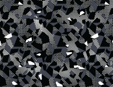
I am gonna start this off with a quick disclaimer the pictures im about to show you are copyrighted so their not gonna be the best of quality. If you want to see them in full clarity then click the link below the page, anyway lets talk about rhythm :D. So I went to Coroflot.com and discovered a design artist by the name James Peay and his work uses a mixture of movement and uneven rhythm in his patterns. For instance in his first piece we see here the rhythm is incredibly sporadic with lines going all over the place giving me the impression that each line is continuing in their own way. However in the second piece we see its more clam almost using the same color palette as the first piece we saw in piece. The impression of the rhythm in this piece is slow with line work increase and decrease horizontally almost gives a static approach like what you would see VHS tapes. As for the third piece it tends to take a more different approach by having the rhythm scattered throughout the checker boarded gradient and covering it with tones of grey and black triangular shapes. Overall I like Peay’s use of rhythm because of the his use of triangle line work and use of color. It almost reminds me of retro design work from the late 80s and early 90s.

0

here the link of reference:

http://www.coroflot.com/Jamespeay5/Textiles

3 Examples of Contrast That I Find Interesting

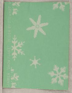
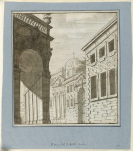
So for the first example is a piece that is made by Katzenbach and Warren, Inc. in their sample piece form 1929-1932. The reason why I found this piece interesting is because of the way the snowflakes simply contrast with the sea green background which is sight not seen very often by many designer, usually we would associate winter with light blues and whites but not sea green. For the second piece was made by an unknown artist however this persons use of contrast between the red background and orange and blue fans blend well with out over saturating each other. I also like the inclusion of the black ascents to help fill in the negative space.  Now for the last piece which was made was around 1725-1750 by Fabrizio Galliari. This piece is a perfect example of really good use of technical contrast because the way that Galliari uses heavy shading upon the large arch contrast well with the buildings around it really brings a sense of evenly distributed and well thought out visual hierarchy to the eye. So those are 3 classic pieces from cooper hewitt I felt had really good use of contrast.

1.

2. 

3.

the links I used

https://collection.cooperhewitt.org/objects/102334633/

https://collection.cooperhewitt.org/objects/18631607/

https://collection.cooperhewitt.org/objects/18543189/

Textures :D

So when it comes to these textures that I picked, I feel it could be best used for a project that in a project that involves messing with color and which hue would best fit this background. It would be a nice project to test our sense in color theory.

A Wonderful Piece of Wimsey

So for my collage design student artist of liking I chose a student from Parsons her name is Anastasia Ionkin The reason I had chose her work was because out all the artist on Parsons show case of students her work spoke to me the most. It really sparked my interest in illustration with her whimsical designs reminding me of shows like Adventure Time giving off that 2010s animation Renaissance vibe. It also has elements of artist like Jim Henson with the character facial design. When looking at it from a design perspective I love her use of contrasting with each palette I also admire the use of geometry in the design of the characters it makes them more at visually attached to the whimsical environment.

Here one of my favorites

\

Heres the link to her showcase. Its called

Creating Critter Worlds

https://www.newschool.edu/parsons/student-work/?id=17179872453

to check out the rest of her work check it out here 🙂

http://www.stasiaarts.com/

New York Times Article: Calmer New York Living Through Minimalist Art

The NY Times article (that relates to design)  I found interesting talked about a women named Nathalie de Gunzburg who lives in apartment with an interior design of  modern art museum. Its inspired by minimalist art and I find very unique while at the same time very usual for an apartment.

https://www.nytimes.com/2017/02/16/arts/design/calmer-new-york-living-through-minimalist-art.html?rref=collection%2Fsectioncollection%2Fdesign&action=click&contentCollection=design&region=rank&module=package&version=highlights&contentPlacement=6&pgtype=sectionfront

Amazon Prime 50% OFF OwO

Good News Everyone

We as City Tech students can get 50% off  on amazon prime. Now I understand not everyone can afford prime but I just wanted to let you all know that you have this available to you. ^_^

https://www.amazon.com/gp/student/signup/info/ref=sm_mkt_paper?tag=googhydr-20&hvadid=178602952689&hvpos=1t1&hvnetw=g&hvrand=6698075037908124594&hvpone=&hvptwo=&hvqmt=e&hvdev=c&hvdvcmdl=&hvlocint=&hvlocphy=9004171&hvtargid=aud-272124949846:kwd-34550245884&ref=pd_sl_1468faggi2_e