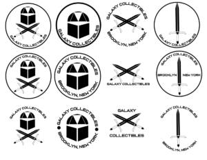
In regards to the logo, My supervisor for this internship liked the direction in which i was going and noted and smiled at the inspirations within my mood board and wanted to see what I had to offer in regards to digital work. Mr. Garcia pointed out not to color them yet but to make the logos black and white due to the fact that the black and white version of a logo is the purest form and if you don’t convey your message in black in white the message is NOT going to be sent in color. We Ultimately decided that the logo variations with the robots were creative and stood out in a way due to the fact that it was both simple and to the point and also created a mascot/icon of some sort and to have that character attached to the site and may one day have shirts and hats with that it would be cool. I call the little robot Kenji (idk why. It just sounds like a cool name )

A City Tech OpenLab ePortfolio


