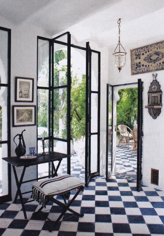
This felt like a residential interior space than a modern interior space. Although the two doors adjacent to each was pretty interesting. It made me question they’re purpose to why they designed the doors to be a various size, and why did they have to be right next to each other. By doing so, although they were in the same area they’re meant to be used as a framing unit. Looking through these door, I was able to have two different experiences. Since they’re facing two different directions they’re also giving the occupants a choice to choose a path. If the tiles didn’t stay constant beyond the boundaries within the wall, then it’ll change the entire aspects of this interior space. Although the sense of circulation was pretty clear, and the placement of the furniture helped signify the space.
ARCH 2310 Design III
Professor Montgomery 2016 sp


