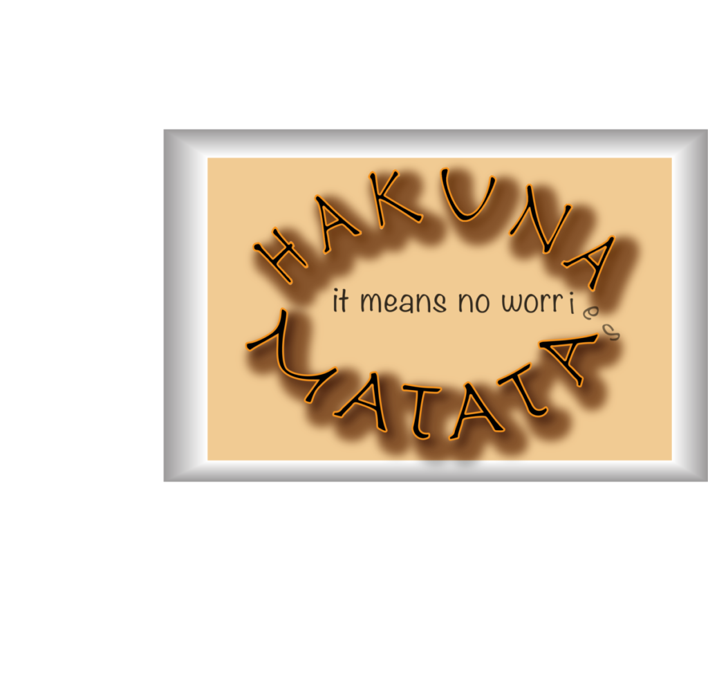
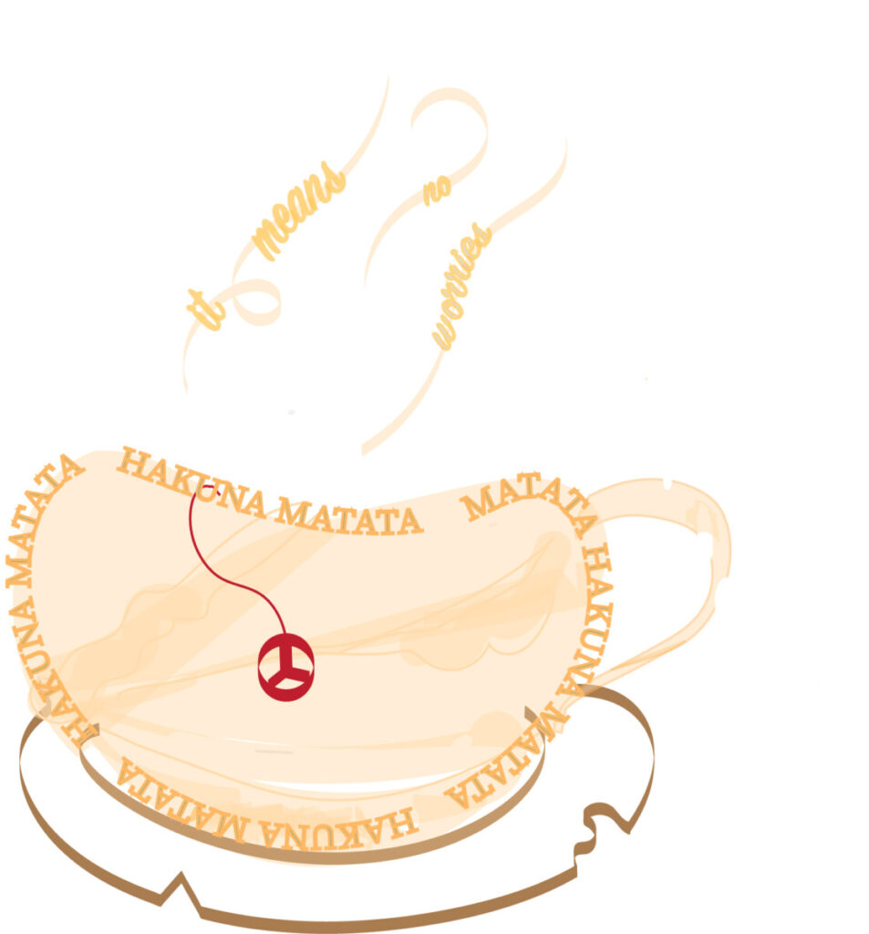
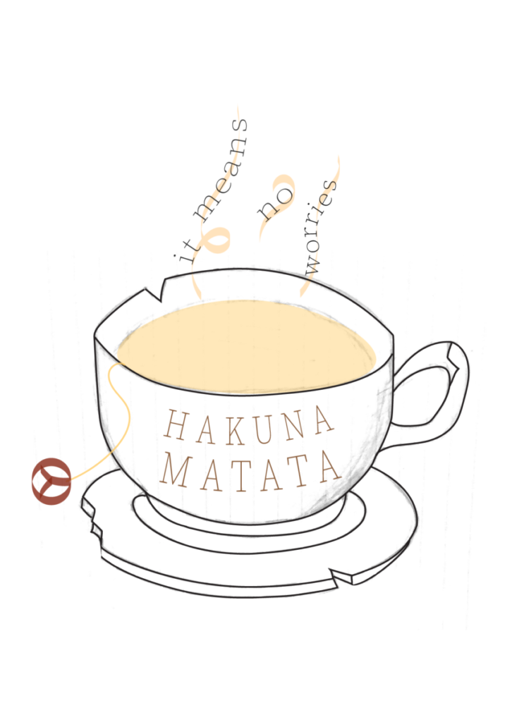
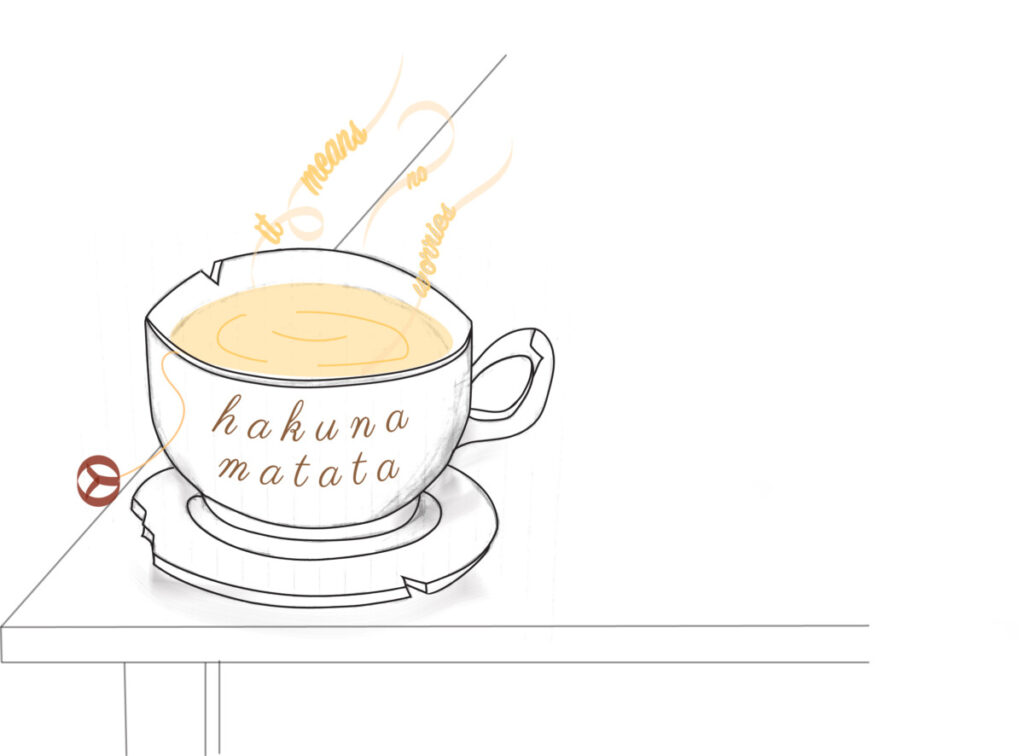
This was the first version of my visual quote. My quote was, “Hakuna matata it means no worries” this quote was inspired from the Disney movie, “The Lion King”. I overall wanted a similar color scheme from the movie which has brown, orange, and red tones. My first thought was to exemplify the lettering in bold yet in a calming way. I thought of this because I wanted to be playful however it turned out to be the opposite. This second version of my visual quote was leading more of an actual visual. I thought of two things. The first one is to create a fresh steaming cup of tea. That is what I believe to be universal of relaxing. The second thought was to use a peace sign to resemble the end of the tea bag. This too would represent to be calming. I was also thinking of having the tea and plate a little broken. I made this decision to act as if the tea is struggling to maintain itself together, however the saying Hakuna Matata is making it all better because it’s basically acting as if everything is fine. As for the color scheme I tried to keep the browns colors except I made the tone lighter so it wouldn’t look too harsh.This is the final version of my visual quote. As you can see it has some elements from the previous two ideas. I used the teacup, steam and the brown tones; also some chipped up parts of the objects. I left most of the visual white and outlined just to make it look simple and effective. In doing so the eye is brought to the important aspects of image. Such as the quote itself and making the colors known. These elements make the visual calming and not so distracting. This is the updated version of my visual quote. Ive added a more organic feel to it by adding shadow and pencil marks on the teacup. Ive also added a table for the background since I felt that there was something missing. Changing the steam and making the liquid movable made this piece feel more organic. Lastly I changed the typeface of the actual quote to make it more soft and comfortable.