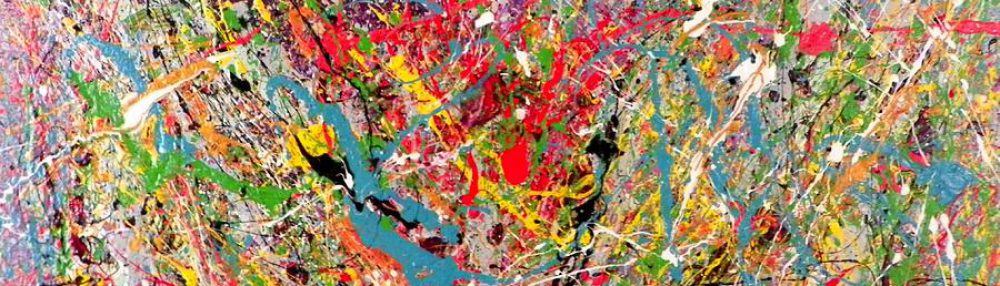


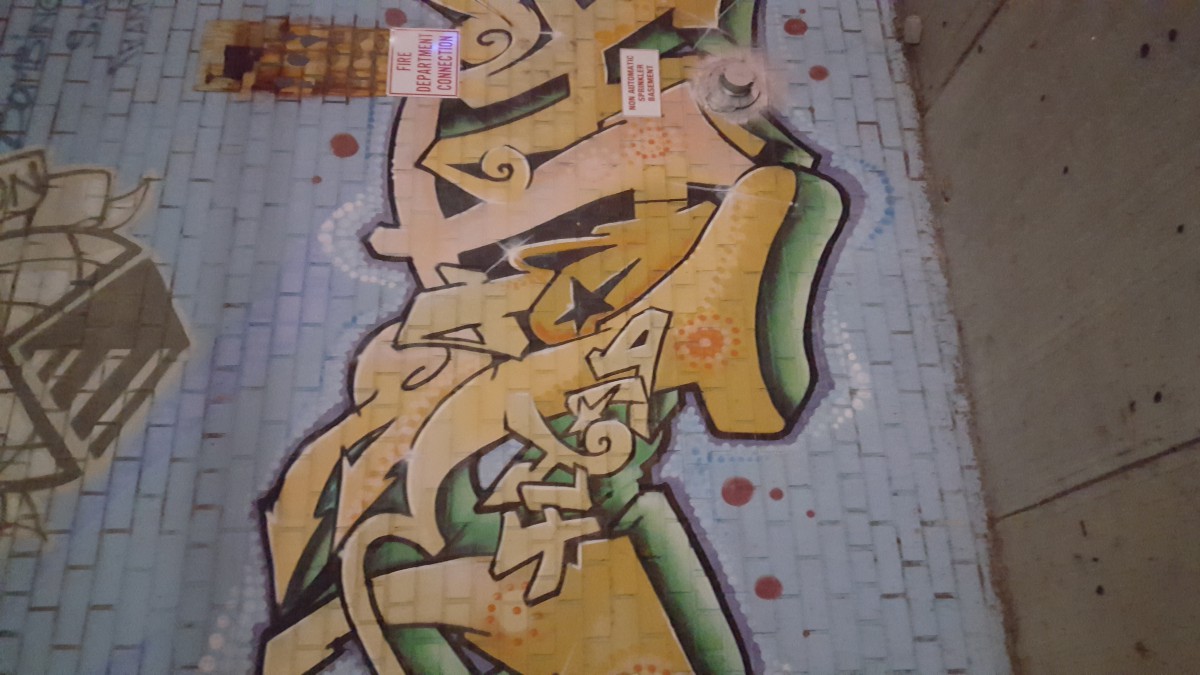
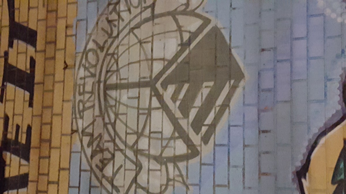

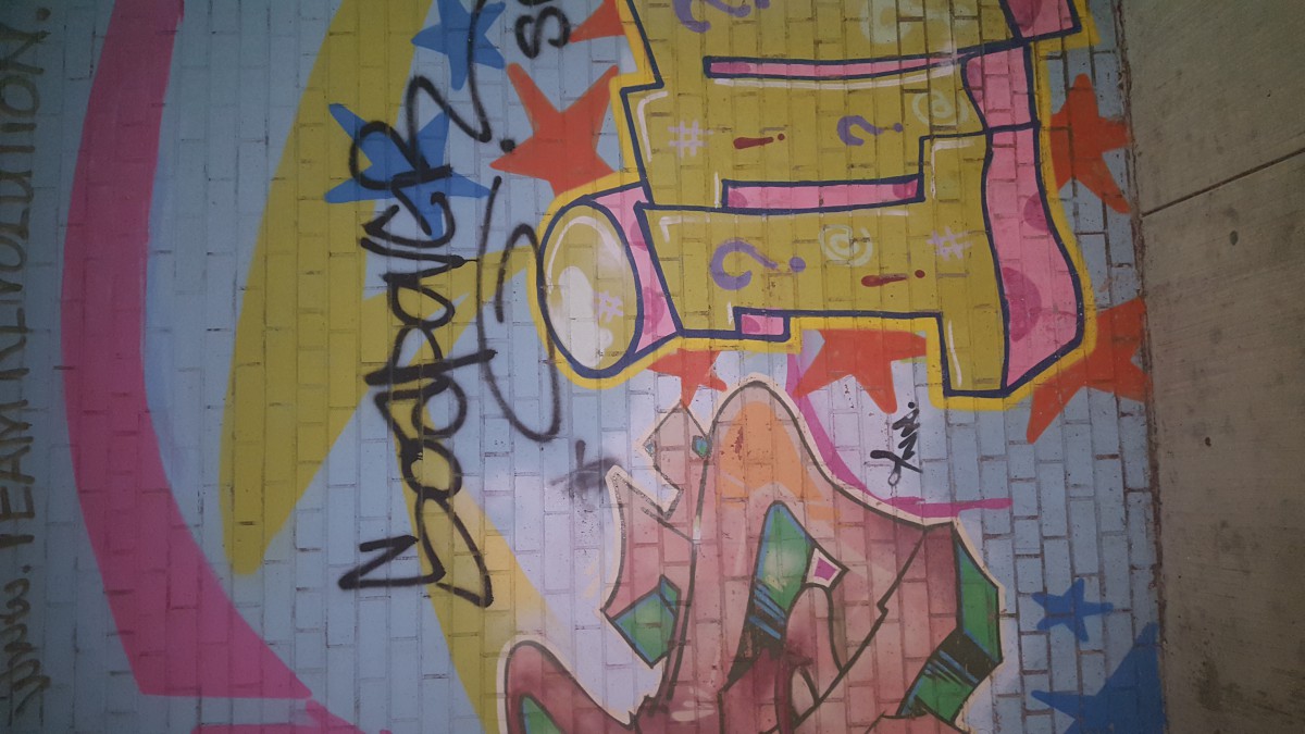
The following pictures that I have attached are pictures from my neighborhood. These pictures are from the walls, the gates, the trains and windows of my neighborhood. I live in Brooklyn. One of the most diverse neighborhoods in New York I think. For the graffiti and spray paint type that I have included, it shows that there is a lot of creativity in my neighborhood. When I say Spray Paint art, I mean that the spray paint was not meant to be expressive. It was just meant to be a marker for possible professionals who are working with the spray painted item. The Graffiti form of type is not meant to be dictatorial, it is meant to be “CAREFREE” and “EXPRESSIVE”.
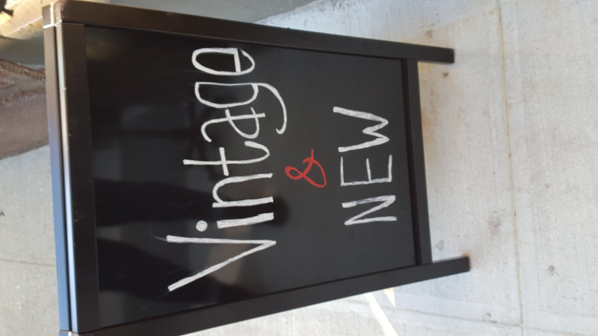
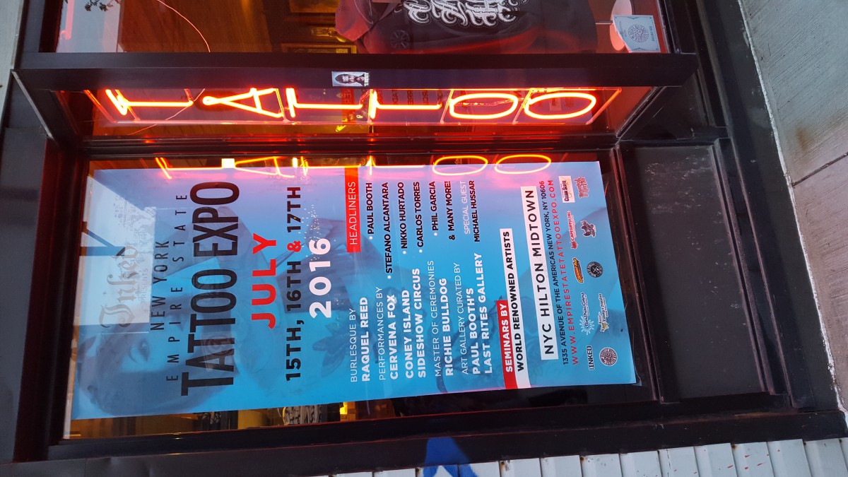
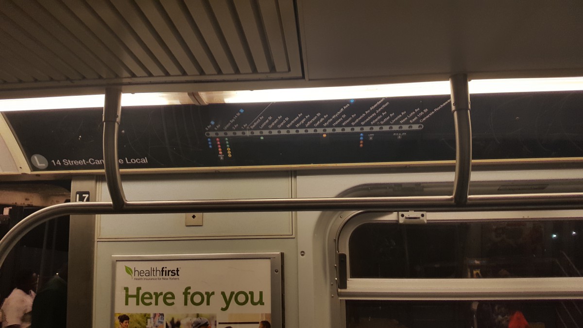
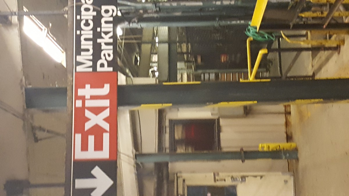
The other pictures are forms of type that are meant to catch your attention. The train signs and neon light letters are things that just naturally get your attention. Train signs because they will direct you to where you have to go. Neon Lights to make you feel excited and curious about a venue. I feel like the overall feeling of my neighborhood is GOOD VIBES. There is nothing that I have seen in my neighborhood that brings fear or too much authority. These are just things that we are used to and make us BROOKLYN.


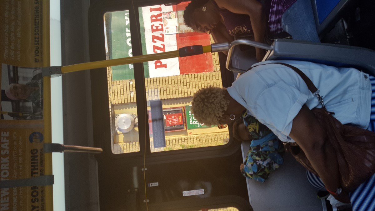
The neighborhood also feels transient because of the graffiti, spray paint art and the other makeshift signs like the restaurant and the “move on green” sign which is a bit of an awkward sign. Type sprayed on top of other type is also an interesting juxtaposition between moving parts and people.
Would love to see more variety in these pictures, one of graffiti and then one sample of additional samples of typography.
I enjoyed seeing the selection, but wish you had madew sure they were right side up before mounting them. I suggest figuring that out and doing it. Photoshop menu has rotation 90º ccw (counter clockwise) or 80º cw (clockwise) under the tab image, and image rotation. Please use this before mounting the work.
Prof. Rosenblatt
I enjoyed seeing the selection, but wish you had mad sure they were right side up before mounting them. I suggest figuring that out and doing it. Photoshop menu has rotation 90º ccw (counter clockwise) or 80º cw (clockwise) under the tab image, and image rotation. Please use this before mounting the work.
Prof. Rosenblatt