History of Target’s Logo

Matthew DeSouza

COMD 1112 OL14

2/7/2020

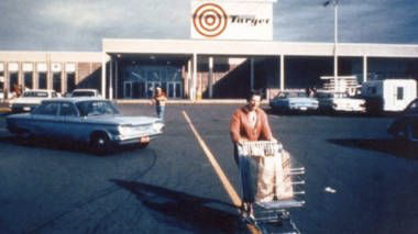
There are hundreds of different stores and markets, but one stands out from the rest as being one of the most iconic marketplaces in human history. With a logo that is extremely simple, yet very recognizable and to me, impactful. In 1962, the Dayton Company opened a discount store in Roseville, Minnesota and that store would later become known as Target.

Multiple names and logos have been passed around before the name “Target” was settled upon.  Once decided, the first version of the logo was created. The background depicted a target with three red circles with three different white spaces between them. Finally the name of the store was placed right in the middle of the red circles. The word mark was featured as being black with a bold italic font. The logo itself was created by the director at the time, Stewart K. Widdess and his workers came up with the name.

Target’s First Logo (1962-1968)

The name and logo go hand in hand as they are very self explanatory. Extremely simple yet memorable. According to blogger Roman Rogoza, “In 1962, the company’s PR team had to sift through more than 200 business names before it opted for “Target”. The name dictated the logo choice. This is how a red bull’s eye became the symbol of the US retailer.” (logaster.com) (March 2020). This initial Target logo remained unchanged from 1962 until 1967. In 1968, an executive decision was made to update the logo as Target stored were opened in other states such as St. Louis and Houston. Always provide the business reason for a logo change as well as the discussing the visual adjustments.The newly changed Target logo featured only two red circles and a single white ring.

Target”s Second Logo (1968)

With the change, the emblem became much more easier to look at. The simplicity of it was at its highest and it worked as it did garner the attention that company wanted. “The legibility issue was resolved, the emblem grew easier to grasp. To begin with, the type grew more transparent and the elements of the Target logo were separated from each other…Also, three rings disappeared making the design simpler.” (1000logos.net)  (December 2020). A year later, a wordmark was again added to the logo. The typeface used for the workmark was outlined in black in an italic, sans serif typeface.

 Target’s Third Logo (1968-1974)

For six years the third logo was maintained but after that the color of the font was changed from white to a solid pitch black. I believe this was a good change because it made the font more readable, the uppercase name remained on the right side of the logo and the bull’s eye became smaller. 

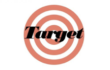
However during 1989 the font was changed from black to red but this was believed to not have been a good decision. According to blogger Lily Wordsmith, she states,“By 1975, Target had switched over to a two-ringed bullseye placed to the left…Later, this was replaced by a much quirkier version of “Target” in red and white in 1989. This version proved to be a total failure, as shown by how it was retired from use after a short period of just 12 months.” (moneyinc.com) (August 2020). Another piece to support this is by Deepak K, they state,” The new logo didn’t get a positive response from the customers and the team decided to replace it soon and the word mark logo lasted for a very short period of time.” (compile.blog) (January 2020)

Target’s Fourth logo (1975) (Black Version)
Target’s Fourth logo (1989) (Red Version)

The Target logo underwent another change in 2004 and 2006 but it was only a slight update in the typeface. This update involved the name of the brand going underneath the iconic bulls’eye logo.

Target’s Fifth logo (2004)

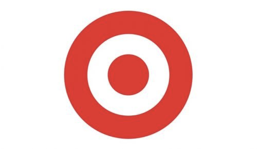
Target itself has created such a popular brand that they have settled on just taking away the name “Target” and just have the bulls-eye logo there. This shows how iconic and popular the brand has become. According to the Logo Ream Team they state, “The 2006 logo is instantly recognizable as the symbol of the Target retail store and is versatile enough to place on an advertisement with no textual reference to the retail store and still evokes customer recognition.” (logorealm.com) However in present day Target seems to involve both the 2004 logo and the 2006 logo. But the 2004 logo has been officially changed once again except the capital “T” has been updated to a lowercase “t”.

Target’s (2006-Present)Target’s newly updated 2004 logo

The logo for a brand and company is a reflection of what it is and Target is a brand that is very successful when it comes to grabbing people’s attention with just their logo alone. Target has less design elements and therefore looks more precise, relevant, and a distinctive appearance. There is no crowding, there isn’t much happening in the logo color and basic design wise. The removing of the brand name just enhances the overall by a lot, not only certifying it as a household emblem that needs no introduction but just shows how far the brand and company has come since its first creation. The typography is also very simple as well being an Helvetica Neue Bold Font. “Expect More. Pay Less” is the motto Target follows and it prides itself as being a discount focus retail store in the United States of America. Now how big is Target exactly? Well according to a blog by Logo Design they state, “Target is the second-largest discount retailing store in the United States with close to 1,900 locations. Its wide range of products includes but is not limited to food and beverages, baby products includes but is not limited to food and beverages…” (blog.logomyway.com). Target is one of the most memorable brands in all of human history, standing at the top along with other brands like Walmart, Best Buy, Kohls, etc… but none of them have yet to do what Target has done logo wise.

Sources

https://blog.logomyway.com/target-logo/

http://logorealm.com/target-logo-design-history/

https://compile.blog/2020/01/03/target-logo-history/

https://moneyinc.com/target-logo/

https://www.logaster.com/blog/target-logo/

https://www.prnewswire.com/news-releases/target-outlines-2020-strategic-initiatives-301015576.html

Video Project

Video Link: https://vimeo.com/553790642

This video project was about a hobby that I enjoyed doing ever since I was little which is drawing. I love to draw and sketch things as I find it extremely soothing and calming, using it as a temporary escape from the world. I’m not an open person and I don’t like to show much of myself to world but this project really gave me a chance to share some of my favorite work that I kept to myself for a long while. Some challenges I faced during this project was finding proper lighting to film my sketches. Sometimes things were to bright which would negatively affect the sketches as these are drawn in pencil making bright lights reflect off of them. I had to try and find some nice natural lighting while also searching for a background that wasn’t distracting from my sketches. I learned how to use the basics of Adobe Premiere Pro and iMovie; utilizing transitions, some cropping and the inclusion of music. Overall this is the first video I’ve ever produced myself and I’m satisfied with the final product, however there is always room for improvement.

Saucony Ad Discussion

1: What to you think of the sounds of children in this one compared to the French Supermarket Ad?

The sounds of the children in both ads are very high pitched/ frequency and seemed to sync with each other when transitioning to the next scene.

2: What is different about the video in this ad from a typical ad and why do you think this was done?

This ad doesn’t flat out state what it is about and is leaving the visuals and audio as hints. Other typical ads would say what the product is and begin promoting it while this one but never once says so but shows it by the camera angles. The faces are cut off only showing the sneakers.

3: Do you think the commercial is effective–why or why not?

Think the commercial is effective because it is unique as it doesn’t show any faces and is only focusing on what is important in the ad by just the camera angles. The ad is saying that the shoes are helpful for mothers, to make them feel comfortable and always keep moving. It was visually appealing.

Designer Research Paper: David Carson

Background

David Carson is an American graphic designer and art director whose unconventional style of work was revolutionary in the 1990’s. Born September 8th, 1955, in Corpus Christi, Texas. Before arriving to the graphic arts scene, Carson was a competitive professional surfer and a high school teacher in California. Upon self evaluation and discovering a new calling, in 1981, he briefly enrolled at a commercial art school before working at a small surfer magazine called Self and Musician. He also began working for Transworld Skateboarding magazine as an art director which helped pave the way for his experimental designing work.

After experimenting this new interest for four years as a part designer he began to develop his style of art which involves chaotic spreads with overlapped photos and altered/mixed type fonts. Developing his signature style, Carson published six issues before the magazine folded but it was enough time as his designs were recognized for their unique style and typography. Because of this he had obtained many design awards, only further establishing his dominance in that career choice and the impact each of his notorious designs held in the hearts of people.

Early Designs/ Artworks

Davids 2019 street poster for Spain REC festival

This piece of work is promotional art for one of the world’s largest pop up festival in Spain. The poster has a collage style to it, utilizing various sizes of fonts and multiple different colors. The building is cropped in the back not aligning properly only adding the collage aesthetic. The most important thing about this work has to be the typeface fonts and how/where they are placed on the poster. The words that are smaller are considered to be less of importance than the ones that are much larger. It gives a sense of organization, telling your eyes where to look to first. The typeface that your eyes will most likely drop to is the name of the festival being “REC”. After that the rest of the information becomes smaller as they become less important. The black coloring of the words also work well with the background, making them pop out.

davids 2019 street poster for Spain REC festival (davidcarsondesign.com)

Mind over Matter

Carson working alongside Thijs Biersteker presents “Mind over Matter” a step up for Carson’s collage art style being put into motion using randomized algorithms. This piece of work explores how we as people can overcome any obstacle and challenges by focusing on one thing at a time. When asked about it David Carson gave a good description about what this piece of work means to him stating, “The combination of some of my new work, done hand, takes on a refreshingly new dimension and meaning when combines with this state of the art technology skills. Where both makers enjoy to work with our hands. I think our passion for what we do comes thru in this collaboration. While it’s fascinating to watch other brain waves on the screen in front of you, nothing I know of is quite like the experience of actually putting on the head set and seeing the results of your own brain waves.” (David Carson) The artwork has a black background that takes most of the screen except for the middle which consists of light green and blue also having two black figures standing in the middle. The cherry on top is the main words “mind over matteR”. Whats so interesting about the typeface is how mind is quite literally placed over matter, providing a literal sense to the phrase. The “R” in “matteR” is also capitalized while the other letters are lowercase. Finally they utilize a white color on the phrase to make it stand out from the black background and dark color scheme.

Mind over Matter By David Carson x Thijs Biersteker (davidcarsondesign.com)

Nu surfboard collaboration

Carson presented an array of interesting color choices and fonts in this piece. A thing to notice is the use of outlined words constantly overlapping one another with each one having different sets of colors, making them very distinctive and separate despite them overlapping. The white background only enhances the coloring making things less confusing. However the most important inclusion in this work is the Muti-colored surfboard in the middle of the white background and seems to be behind the many outlined words. The surfboard itself is a call back to David Carson’s roots as a competitive surfer, using the two things that he loves doing, surfing and designing, creating something new out of both. The many filled colors along with symmetry helps the surfboard stand out from everything else showcasing its importance in the photo and to ignore the confusing outlined words that is trying to distract you.

nu work, 2017. nusurfboard collaboration with album surfbds, (davidcarsondesign.com)

References

http://www.davidcarsondesign.com

https://eyeondesign.aiga.org/anti-grid-icon-david-carson-on-why-computers-make-you-lazy-and-indie-mag-design-needs-to-liven-up/

https://thijsbiersteker.com/mind-over-matter

http://historiadesigneteoria.blogspot.com/2013/04/david-carson.html

https://www.britannica.com/biography/David-Carson

https://www.famousgraphicdesigners.org/david-carson

https://www.behance.net/gallery/69106945/Analysing-Designer-Aspects-and-Techniques-Level-3

http://www.trippinguptrump.co.uk/docs/2a69ab-david-carson-work-analysis

Reflections of Blue Exhibit

The first image that caught my eye was an acrylic painting known as “Huxley Guide to Switzerland” made by Christopher Winters in the year 2011. The painting showcases a surrealism tone and that both art and magic can co-exist with each other. The color scheme used in the painting is very eye appealing as Winters uses various shades of acrylic blues to create an overlapping effect with the water, the mountains and the light blue sky above. All of these colors have a strong connection with one another and while under the same family of color, the way that Winters uses them you are able to fully understand what is what and separate that they are depicting appropriately. This added with the use of reflection creates a understanding of what the painting is upon first glance. When you look closely you can see the mountains reflecting off the clear water and also the feet of both the male and female characters floating over. Balance is the first word that comes to my mind upon looking at this piece work. The water with the use of reflection is creating an illusion, a parallel world to what is real on top, adding a bit of balance to the work. There is also the positioning of both of the characters as the mirror the movements of one another. Taking all of this into account, the composition feels thorough, fulfilled, and has a overall peaceful and calming tone to it.

This painting is known as “The Old Guitarist” made by Picasso, during the blue period. This painting represents a great deal of sorrow and grief while also depicting the miseries of the poor, the ill, and those cast out of society. This is clearly represented the with color. It has been painted with a monochromatic blue palette, with the guitar being a warm brown instead. The color choice of the guitar is intentional as it brings a sense of hopefulness as it is the point of warmth throughout the painting. The figure is slouched over with his eyes closed giving the feeling of being worn out and tired. The use of shadows plays on the figures face and body making him appear starved and cadaverous. The overall tone of this piece of work is filled with isolation and anguish.

Visual Quote Project

SKETCHES

The sketches I picked in my opinion really defines the quote “Still I Rise”. Some utilizing physical representation of the quote like a phoenix and a eyeball. The steps I took to make these Visual Sketch Quotes was a little bit difficult but overall a fun experience. First I had to think of a quote that I like and can resonate with, that being “Still I Rise” by Maya Angelou. This quote resonates with me as it mainly focuses on self respect and confidence. That nothing in the world can bring me down as long as I believe in myself and the abilities I have. The second step was to figure out a way how I can turn this quote into multiple designs that means what the quote says. I began sketching a few ideas, trying out a few different typeface styles involving the quote. Afterwards I began to draw things that can bring out the meaning of the message in a more upfront way. Once I made about six designs I then began to craft them in Adobe Illustrator using a 8.5 and 5.50 page.

CONCEPT 1

The first design is of a phoenix rising into the sky, spreading its wings beginning to soar. The placing of the words are crucial to this design as I placed each letter on a single wing, but distinguishing the letter “I” to the main body of the phoenix itself. This creates nice bit of symbolism.

CONCEPT 2

This concept is more of a simpler one as it includes a rebus. A rebus is when you use a picture to replace a word but the meaning is still the same. The picture of the eye gives a clear replacement for the letter “I” in “Still I Rise”. The placement of the words “Still” and “Rise” are also used in a way to make them seem like eyelashes.

CONCEPT 3

This design is a little more abstract as I created a connection from still I rise to another piece of work Maya Angelou created which was a poem called “Alone”. In a section of this poem Maya Angelou mentions people are rich and live lavishly, and explains how money and other materialistic things cannot be an escape goat and fill the feeling of being alone. By pushing and bettering yourself only then you can find happiness. The pearl in my design is a common trope used to associate with the rich like diamonds and other gemstones. I included to saying of “Still I Rise” to showcase that even if you’re successful and rich there is always room for improvement as no one in this world is perfect. I also made a small decision to have the I’s cross themselves giving a little bit of symbolism that you don’t need pearls and diamonds to feel happiness.