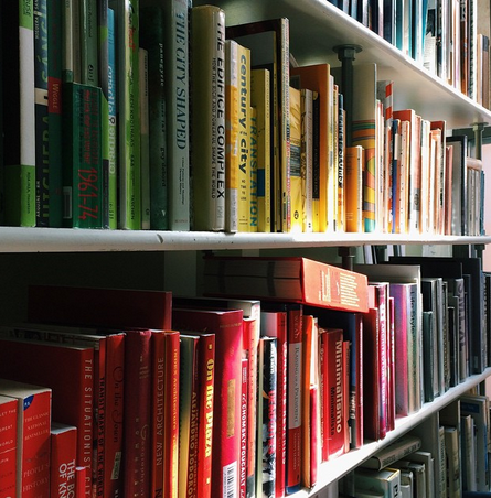
It is a bit humorous, looking back at everything when it felt just like yesterday coming to the et al. collaborative office for the first time. I realize that the internship is at its final stages and in a few weeks, it’ll be over and I’ll look at this as a nice memory. I’ve learned a lot from my supervisor Manu, Meigan, Jose, John and the other intern Daniella. A lot of things had changed from the first days of March from the work I was told to do to my own workflow, at et al. as well as outside of it.
After the student work had been archived and saved onto my supervisor’s hard drive, the easy stuff was done. Now it was down to the nitty and gritty, the fun part of the internship. I discussed with Manu on what he needed of me prior to starting and he reiterated what he told me in our interview. He wanted me to design an academic portfolio, showcasing through hand-picked student work his approach to design to future employers. Manu shown me examples from his library to show what he would like and wouldn’t like.
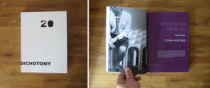
The one example that he told me to be careful to look at Diochotomy, an architecture journal published at the University of Detroit Mercy.
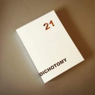
The journal was a great help to me and gave some perspective on what my supervisor was looking for in terms of an academic portfolio. He wanted something minimalistic and simple that conveyed what he wanted the portfolio to say about him. Nothing too graphic-heavy unless he said otherwise. He liked the design choices in the architecture journal when it came to the title pages with a picture on one side, title and a small blurb about the book section on the next page. The title page would’ve been of a different color than the pages before and after it to show its signifance. He was in love with a san serif typeface and was dead set on it from the beginning. We narrowed our choices for fonts to: Gill Sans, Arial, Helvetica Neue, and Avenir Next.
We ended our collaborative discussion with me getting an idea of what we wanted. He gave me the opportunity to do some covers Of course, it was now up to me to present options to him. As I would in any project assigned to me in school, I had to come with thumbnails of what I wanted to do before I would start working on the computer. These were the intial concepts that I came up with.
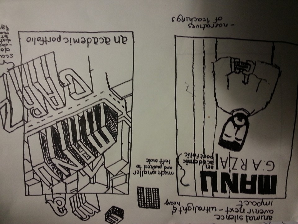
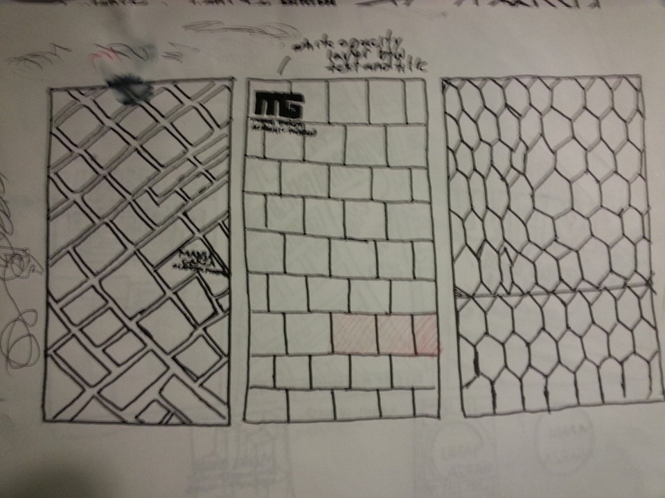
I came up with these initial ideas to get more of a gauge of what Manu liked in them. I based them off concepts that Manu relayed to me were kosher with him or he was interested in seeing what could be done with them or stuff around me. For example, on the middle concept on the third image, I based it off the 3D modeled map put on display in the back of the et al. collaborative office.

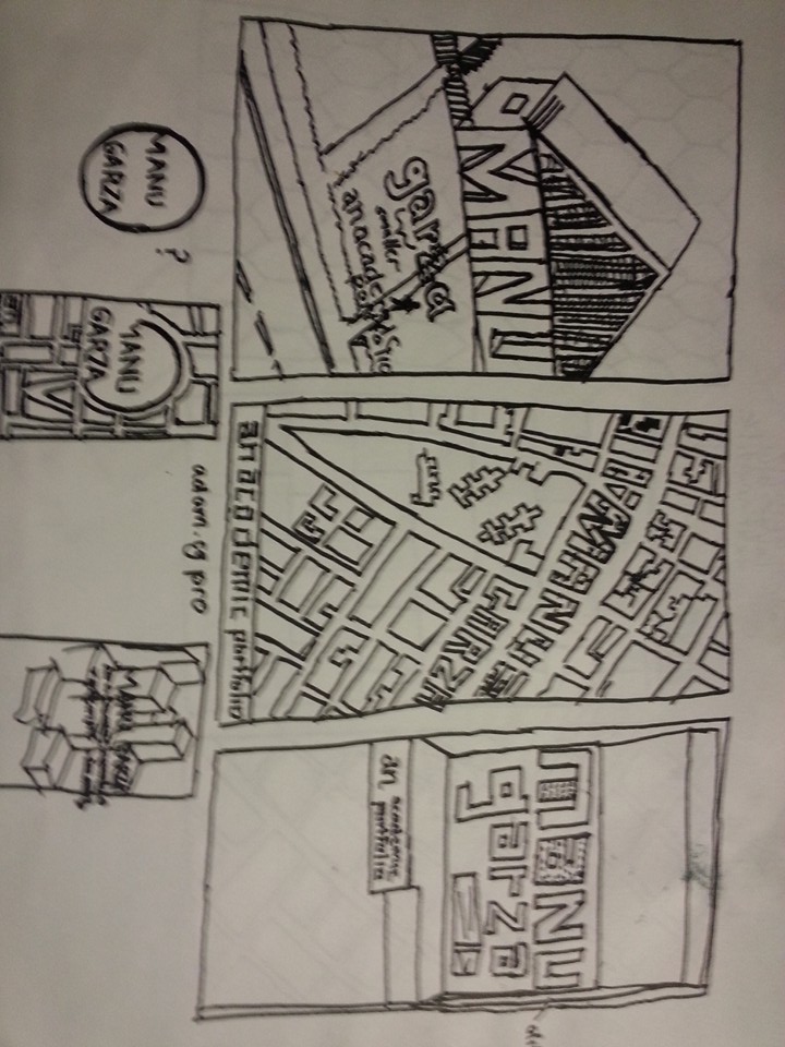
In others, I did some concept inspired from kitchen or bathroom tile patterns. While with some other variations, I just went with something more illustrative in mind such as having my supervisor’s name appear on a house, similiar to a photo of a house in the archives and his name appearing in 3D, protruding above the New York City streets. On the very first one, I thought of the academic portfolio possibly appearing as an architecture magazine and considered the idea of using an illustration or photo on the cover.
The first big lesson that I took out of this internship was that you cannot fall in love with any of your ideas. No matter how good you think your ideas may seem, it is ultimately the decision of your boss or the client’s decision in whether you succeeded or not in meeting the person’s objectives. You have to adapt and look at things from their side. It was a little tough getting used to having ideas shot down but it helped me grow as an individual on the fast track of becoming a graphic designer.
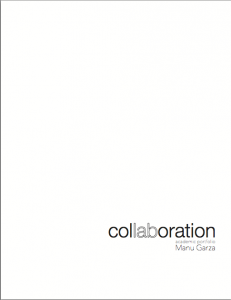
We end into discussion again and Manu said that the academic portfolio, much like the Dichotomy architecture journal, needed a name, a theme to go behind. After much deliberation, Manu decided on the name “collaboration” with an emphasis on lab, which to my supervisor meant research, planning, etc. For the next few weeks, as I was working on the layout, table of contents, and other things, I was still making variations of a minimalistic front cover to present as options. These are some of the ones that I’ve done.
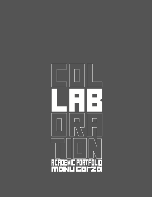
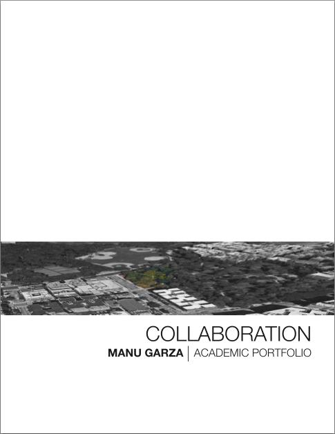
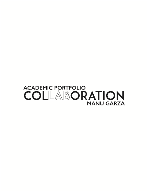
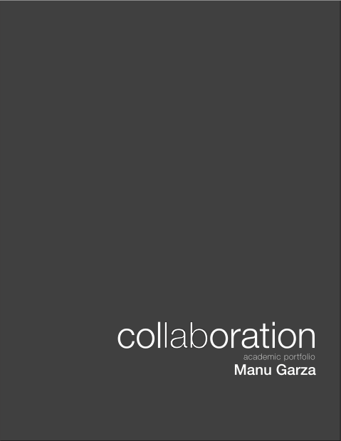

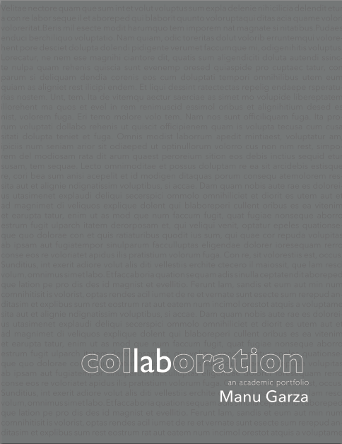
I learned that not everything could be achieved with a fancy beautiful cover that overwhelms the seer. At least that design approach was not appropriate for an academic portfolio of an architecture professor; I had to think like a minimalist. I had to think what would I normally do for a book or magazine cover and break them down to their most basic elements and meld them into something appropriate for the audience Manu wants to look at this finalized piece. The reception I received from Manu and the others was a bit more positive. Manu liked blacks, whites and dark greys. He was fond of my choice of using only san serif typefaces that had a sharp contrast in their weights.
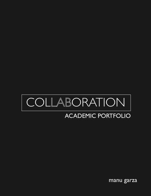
For one reason and the another, he liked the cover ideas but he wasn’t in love with any of them. He ended up liking one idea that I do. It was simple, perhaps a little for my taste if I was in his shoes, but that was the one that was just right for him and that’s honestly the only thing that mattered to me. He was pleased. I was pleased.
It was the end of one part and the beginning of another. As the front cover had been finalized, I would proceed to work on the rest of the portfolio’s design, shaping it slowly but surely into the thing that Manu would proudly show to his employers.

