After coming up with the initial sketches for the portfolio’s front cover, I followed by coming up with concepts for the table of contents. The portfolio needed a systems of organizing the content into a nice, easy to read layout for people interested in reading further. In this, I consulted and found references from academic portfolios in behance.net and issu.com to give me some rough concepts for two-page table of contents spreads to try out. It was a great help to me as I banged out some ideas to show him.
l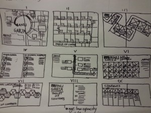
There were a couple of ideas that showed some promise to him but like with the initial ideas of the front cover, I didn’t quite reach what he looked for. I was a little disappointed but nonetheless I tried doing more ideas. Manu fluctuated a lot from wanting a two page spread devoted to the table of contents to a single page spread. There wasn’t anything finalized on what he wanted in terms of pages or layout or anything so there were changes on the project every day I was there. I wanted to do more sketches by hand but he gave me the go ahead to move to work on the computer and try to go for something minimalistic and clean. This was my first attempt.

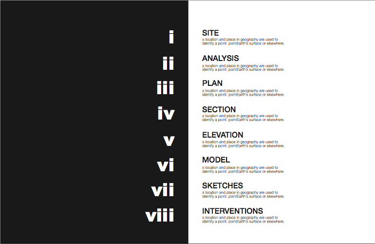
My supervisor was keen on the page being named contents as he wasn’t fond of having table of contents in huge letters. He liked the organization of the pages with each section named after a course that he taught at NYIT, as well as the spacing. He wasn’t fond with how busy it was and that’s what led us to our next big conversation. The portfolio, as Manu described it initially, would be this large book of every student work. That would be narrowed to the work of a few selected students per each course. At the time he was not too sure of what exactly he was looking for but there was a hunch that the portfolio sections wouldn’t be based off the courses.

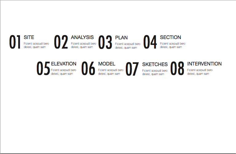
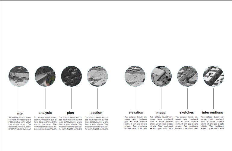
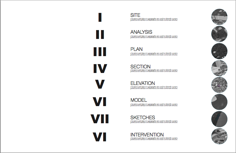
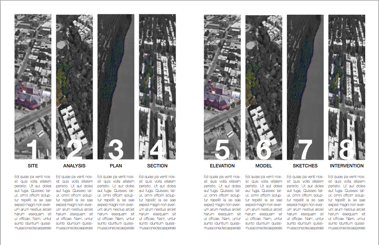
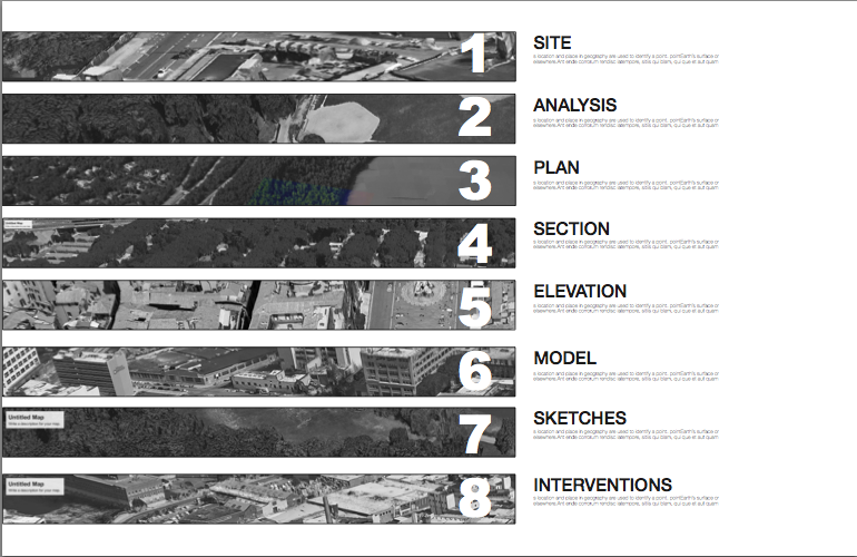
I presented him this and he was a bit more content that it didn’t feel so cluttered but wasn’t too pleased with the layout now that most of the content was gone. This is around the time that Manu decided that there would be no course sections in the academic portfolio but sections devoted to particular themes and how Manu taught them. As he wrote down in the second layout, instead of courses like Design I or Design Fundamentals, the sections would have names such as site, elevations, plan, section, photography, models, sketches, etc. Student work would be present but it would not be the centerpoint of this large project: it would just be his teaching style. 
As Collaboration was a book about Manu’s teaching pedagogy, Meigan suggested that I used a symbol signifying pedagogy. We found one done by the natives of Australia and modified, would’ve made an interesting graphic if I hadn’t pointed out from a distance, the pedagogy symbol resembled something of the occult. Something that didn’t need Manu’s attention to throw into the wayside. I offered these alternatives instead.


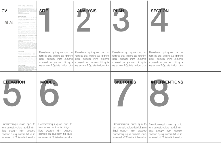
My supervisor, Meigan and Jose liked all of them, save for the last one. It was a hard decision to pick one out of all of them. I got to work on making layouts and a two page spread version of the CV in the meantime. In the end, they decided on the first and fifth one for the final portfolio. It was time to move on to the next part of my time at et al.

