Armin Hofmann ( june 19 , 1920 – December 18 , 2020 ) was a very eminent, influential
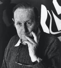
Swiss graphic designer known for his reliance on the fundamental elements of graphic
form : (point, line and shape) while also conveying simplicity, complexity, representation
and abstraction.Hofmann was a leader in the mid-century grid based Swiss design
movement. Hofmann grew up in Winterthur, Switzerland. Attended the School of Arts and
Crafts and then later worked as a lithographer in Basel & Bern. After some time he opened
a Design studio. After meeting graphic designer Emil Ruder on a train, Hofmann found out
that the Basel school of Arts and Crafts was looking for an Art teacher, so , in 1947 he
applied for the job as a teacher and continued to teach there for 40 years. Fast forward to
1968, Hofmann introduced an advanced class for Graphic Design and very soon after he
was named head of the Graphic Design department. His first job as a teacher was at the
Philadelphia College of Art here in the U.S, he also taught at Yale University until his
resignation.
In 1965, he published his textbook titled “Graphic Design Manual”, in which he explained
the principles of his rational approach to teaching design. During the 1950’s and 1960’s, he
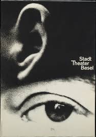
designed posters for some cultural clients which have typographic and photographic
clarity. For example, his theatrical posters capture the dramatic experience of watching and
listening as displayed in the enlarged grainy photos of an ear and an eye.
The aesthetic Hofmann taught emphasized harmony among point, line and plane in two
dimensional compositions, highlighting contrast and tension between forms. While he
used grids to create his posters, he did not always stick to it, he would prioritize clarity and
communication above everything else. He mostly experimented with black and white
photography in his works, and often “pushed imagery beyond the point of factual
representation and into the realm of the abstract”.
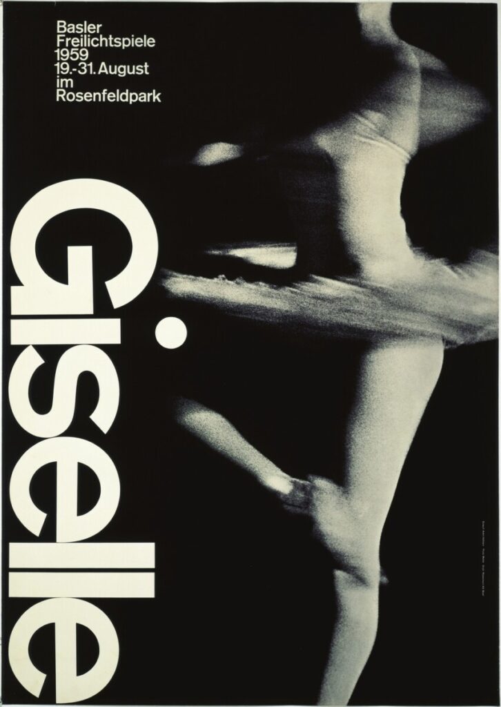
One of Hofmann’s most famous posters is “Giselle , 1959”, this design was for an outdoor
production of giselle. In it he breaks from the rigidity of the grid structure in favor of design
sensibility. While the majority of the text mathematically relates to the placement of other
elements within the poster, the dot on top of the “i” in the title extends beyond the
ascension of the letterforms. It is also round, which is rare because most dots and periods
in san serif typefaces are always square, Printed via photo-offset, the white of this poster
is the actual paper. It provides a stark contrast to the gentle halftones of the nearly-
abstracted photograph that elegantly suggests movement rather than the presence of a
human figure.
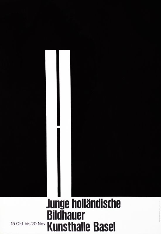
While the majority of Hofmann’s best work was created through photo-offset lithography,
Hofmann was also a master of letterpress printing, as can be seen in the design for an
exhibition of Dutch sculptors at the Kunsthalle Basel in 1960.
Armin Hofmann’s importance in Design history is still being explored and will probably still
be prominent for years to come.
Sources: