Unilever was founded in 1929 by two British Lever Brother and the Dutch margarine producer Margarine Unie to form a multinational consumer goods company. The company owns over 400 brands worldwide. This includes foods, beverages, cleaning agents and personal care products.
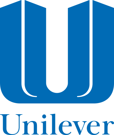
The first Unilever logo was designed in 1969 by Collis Clemens and eventually it was modified later in 1990 by Ken James. The typeface in which they used was New Baskerville. Furthermore, the company did not owned a logo until the year 1969.
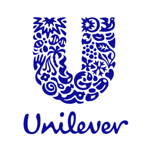
Unilever’s new logo was introduced on their 75th anniversary in 2005. It was designed by the brand consultancy Wolff Olins. Wolff Olins, has develop corporate identities for many large companies around the world. Their new logo was a new way to demonstrate the importance of the brands that they sell. It appears on every product that they sell. Its usually found in the back of the product. The logo is composed by 25 different icons that symbolizes Unilever itself and commitment. Each individual symbol has different meaning to represent the aspect of everyday life. For example, the bird on the right, it means freedom. It suggests a relief from daily chores and getting more out of life. The company felt the old logo didn’t feel friendly and it was to simple. According to Wolff Olins; “We transform Unilever from an invisible owner of brands into a single minded, idea led growth business.” They simply added “life” to their company by using the blue color in the Unilever logo that represents prosperity, unity, purity, safety and trust. Also their logo has a script typeface to make it look friendly and to connect to the consumers.
References
http://logos.wikia.com/wiki/Unilever
http://www.unileverusa.com/aboutus/introductiontounilever/
http://www.unileverusa.com/aboutus/introductiontounilever/ourlogo
http://en.wikipedia.org/wiki/Unilever
http://www.wolffolins.com/search?q=unilever
http://en.wikipedia.org/wiki/Wolff_Olins


