>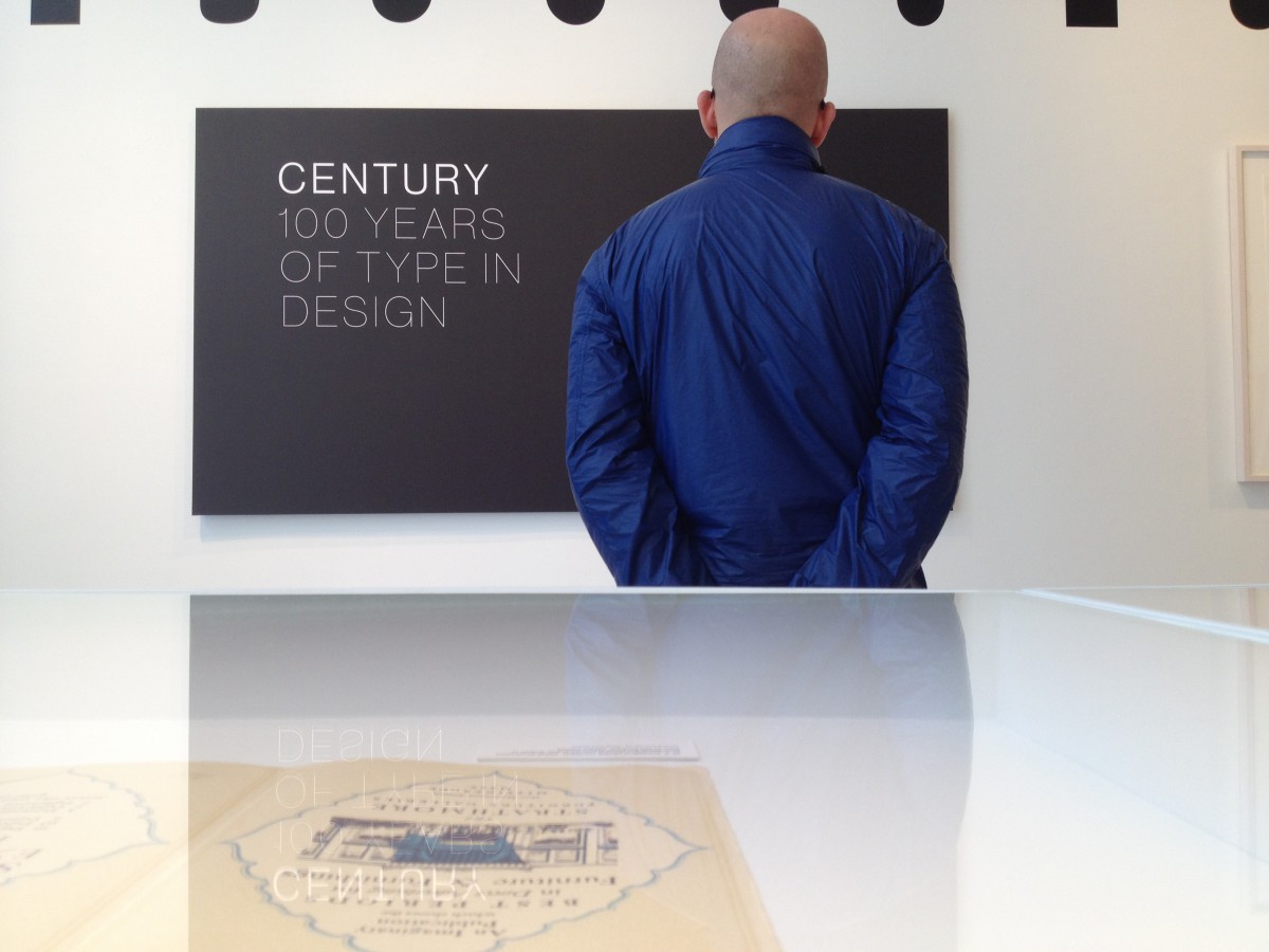
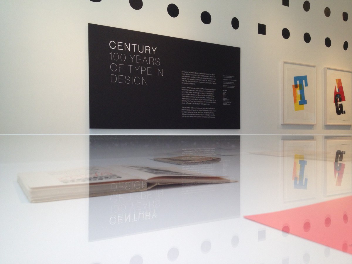
We visited the AIGA exhibition this semester at 164 Fifth Avenue in New York City.
It celebrates their 100th years of success.
At the exhibition, I noticed different pieces from successful graphic designers and typographers. It was fascinated seeing all these projects from sketch to being finish. I would visit this place again for sure.
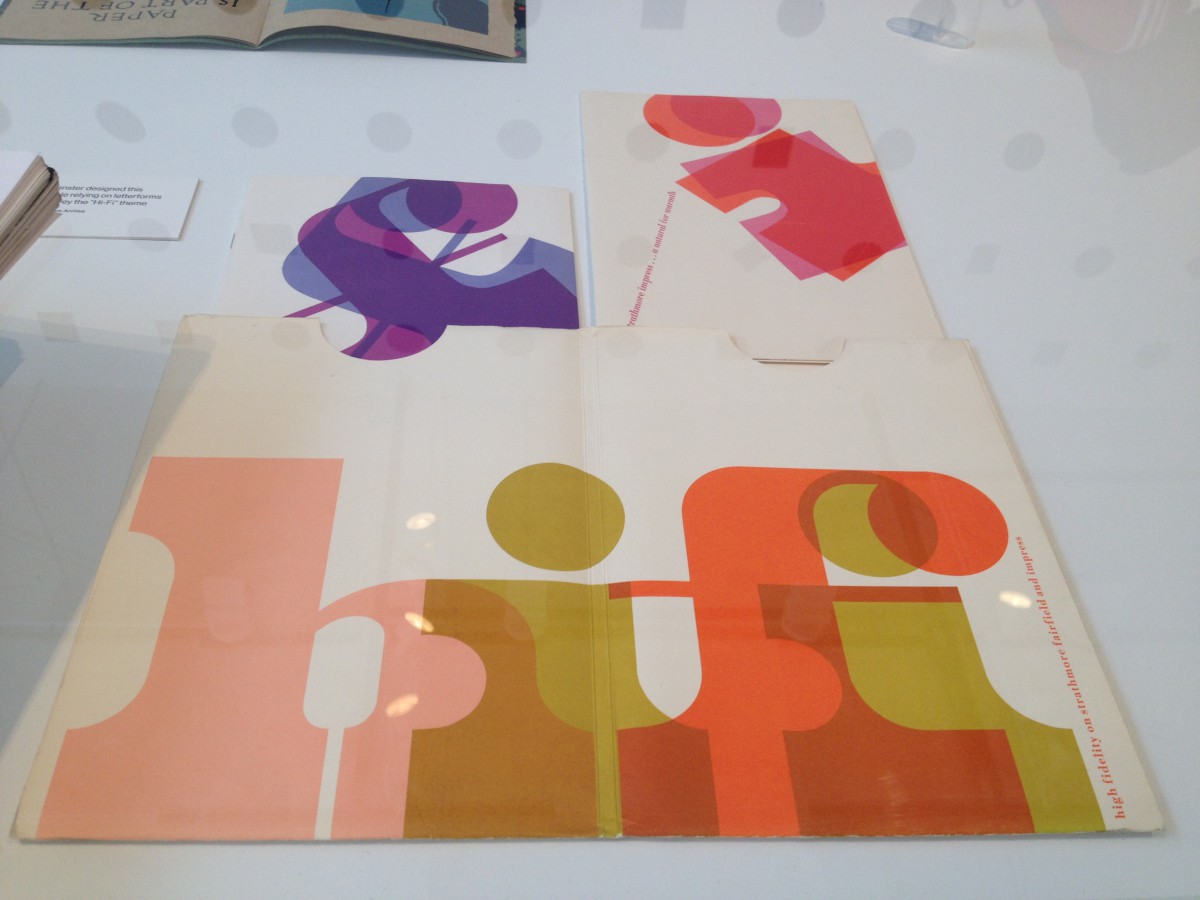
In 1969, Kenneth Kuenster design this 2-product print sample relying on letter forms and bold color to convey the “Hi-Fi” theme. In my opinion, this piece caught my eyes right away because of the large bold typeface and the warm colors gave it an easy target for me. The “HiFi” caption is tracked in order to fit in the 2-page.
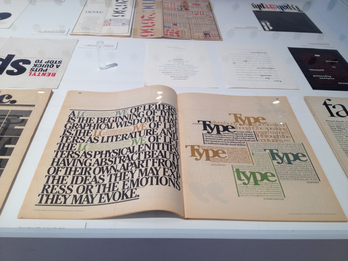
Spread from U and lc, designed by Herb Lubalin in 1979.
This is one interesting layout. It really caught my attention. The thing about this layout is that the first page, the type is all squeezed but I love how they used the parentheses to form an “o” and inside of the parentheses it has a small type caption which I think its very unique. This piece uses a transitional typeface.
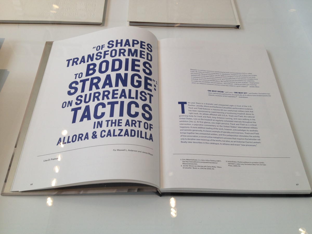
Designed Lisa D. Frieman.
This layout uses a sans serif typeface. Honestly, I love this layout. The structure is well placed and perfect. I love how they used different point sizes to emphasize the main idea. The color blue makes it look even better, strong and clean.

