Cooper Hewitt Museum
The first exhibit we visited was Pixar: The Design of Story. This exhibit focused on the design process that occurs behind Pixar Animation Studios. The exhibit displays original artwork which includes hand-drawn sketches, paintings, and sculptures. Pixar shares its main design principles of story, appeal, and believability and its design tools which are research, iteration, and collaboration that clarify its creative process. In this exhibit, there is a large digital table that shows how Pixar images relate to the Cooper Hewitt’s object collection. It also displays over 100 sketches, sculptures, and digital designs from Pixar’s films. The exhibit displayed work from Toy Story, Wall-E, Up, Ratatouille, The Incredibles, Cars, and Brave.
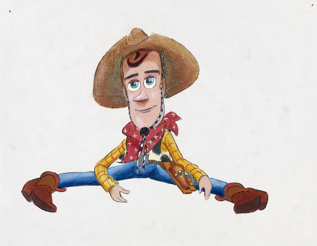
CONCEPT ART, WOODY, TOY STORY, 1995
Created by Bud Luckey, Ralph Eggleston, & Pixar Animation Studios
Medium – Mixed media on paper
H x W: 21.6 × 27.9 cm (8 1/2 in. × 11 in.)
In Concept Art, Woody from Toy Story displays all the phases of how Woody becomes Woody. It shows the initial images to the final images. First, they design on paper, then alter its shape by making sculptures and then move onto the computer. After, the colors and textures of his clothing are chosen. Each phase that took place involved many adjustments based on creative feedback, which is called iterations. After observing all the designs, it’s fun to see the stages the designers went through to get to a final character. After all, Woody is one of my favorite characters in Toy Story.
The second exhibit we visited was How Posters Work. This exhibit shows the ways dozens of designers use the principles of composition, perception, and storytelling to carry out their ideas. The exhibit features over 125 pieces that date back from the twentieth century to the present. The exhibit is organized into subsections: focus the eye, overwhelm the eye, use text as image, overlap, cut and paste, assault the surface, simplify, and others.
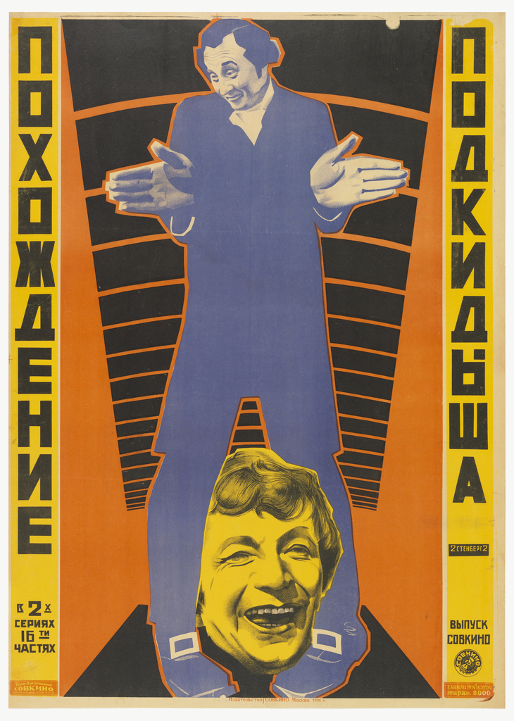
POSTER, ADVENTURES OF AN ABANDONED CHILD, 1926
Designed by Georgii Augustovich Stenberg & Vladimir Augustovich Stenberg
Medium – Lithograph on paper
H x W: 101.3 × 71.9 cm (39 7/8 × 28 5/16 in.)
In Adventures of an Abandoned Child, the poster was created out of cutting and pasting. Its medium is lithograph on paper. The Stenberg brothers created dozen of films in the Soviet Union during the 1920s. They used projectors that would enlarge frames from a movie, such as an actor’s face and then trace the image. This technique allowed designers to control the size of the images and then add abstract elements. This poster uses contrast to distinguish the images from one another. It is also symmetrical and legible.
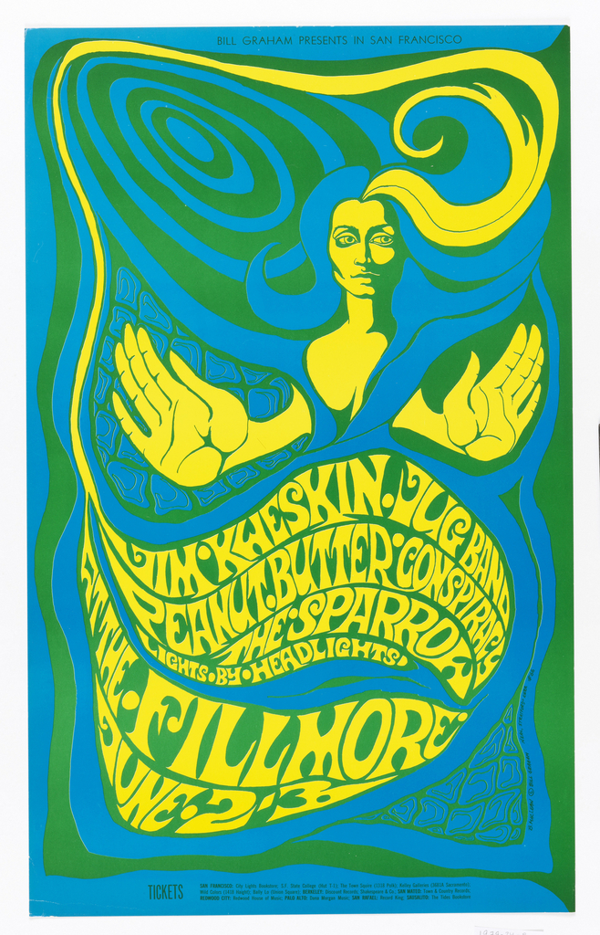
POSTER, JIM KWESKIN / JUG BAND, 1967
Designed by Bonnie MacLean
Published by Bill Graham
Medium – Lithograph on white wove paper
H x W: 58.4 × 36 cm (23 in. × 14 3/16 in.)
In Jim Kweskin/Jug Band’s poster, there is a lot going on, thus its design purpose is to overwhelm the eye. With the use of intense colors, patterns, and lines it keeps the viewer looking. As the viewer, the poster’s design did succeed in doing just that. I kept looking at the poster, following the lines, colors, and text. Although the text was hard to read, in my opinion, I like the movement of it. I find this poster hypnotizing in a way, just grabbing my entire attention. Some of the posters focus our attention on a single message, while others have multiple directions.
Throughout the exhibit, I’ve learned graphic designers use form, color, image, and language to achieve simplicity and complexity. Some designers go for maximum clarity, while others challenge the viewer to uncover a hidden message.

