Olive Garden’s Logo History
Olive Garden is an American dining restaurant chain, which specializes in Italian-American cuisine. They are famous for its unlimited supply of breadsticks and salad during the meal. Olive Garden was established in 1982 and is part of Darden Restaurants, Inc., who owns a total of 2,100 restaurants. There are more than 800 Olive Garden locations globally.
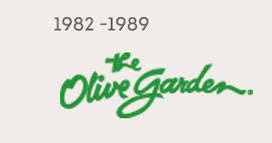
In 1982, Darden Restaurants, Inc. presented the first logo with a swirly cursive, green font, which stated “The Olive Garden”, as seen in Figure 1. The alignment of the text is centered. As for the typeface it is unidentified. The word “the” is placed above “Olive garden” in a center alignment as well. The interesting twist put in the logo is the lowercase “g” the company used, instead of a capital “g” to emphasize the beginning of a new word. In my opinion, this first logo is very simple and plain. In regards to the color, I think green was chosen because olives are green and they wanted to add a pop of color to it since it’s already simple. Although this is an Italian Restaurant the logo doesn’t represent that.
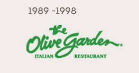
Later in 1989, “Italian Restaurant” was added to the logo in all capital letters as a serif font located underneath “The Olive Garden” as shown in Figure 2. The word “Italian” is placed under the word “Olive” and separated by the descender of the letter “g”. Along the right hand side of the descender is the word “Restaurant”. It was definitely a good idea to add “Italian Restaurant” to their logo in order to capture their target audience.
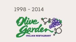
By 1998, Olive Garden eliminated the word “the” from the original “The Olive Garden” (figure 3). “Olive Garden” also made changes to the typeface with the addition of a grapevine to the upper-right corner. Furthermore, “Italian Restaurant” was centered and changed in color. The color of the grapes and of the “Italian Restaurant” makes the logo stand out more and it makes the connection with the text.
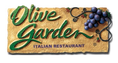
In 2014, figure 4 shows the addition to a beige background and a forest green Olive Garden logo with an increase in point size, as well as a stylized 3-D grapevine. In my opinion, the company made the logo a bit darker in order to bring out the color of the background, without over-powering it with brighter colors. Also, they might have done it to target their audience. Since the dining restaurant targets families, the logo comes off as a calm, relaxing restaurant. The logo makes me feel more welcomed and at home.
On March 2014, in an investor presentation, Darden announced a “brand renaissance” plan to regain momentum for the Olive Garden restaurants. The idea of a new logo and brand came down to a loss in profits the company was facing. According to Forbes, before the new logo, Olive Garden’s sales were down 1.3%, while sales improved at the other brand restaurants. Sales were up at Long Horn Steakhouse by 2.8% and 2.1% at its Specialty Restaurant Group which includes The Capital Grille, Eddie V’s, Yard House, Bahama Breeze and Seasons 52. After the new logo, Olive Garden has made improvements. Darden Restaurants reported an increase of total sales of 3% to $957 million. During the quarter, they have added nine restaurants and increased its profit. Although it wasn’t much, it was at least growth. The new logo development was based on work assisted by Lippincott. Lippincott is a nationally recognized design firm founded in 1943. Some of Lippincott’s other clients include Petco, Starbucks, Dell, Walmart, Delta Air Lines, Sprint, Pizza Hut, Coca-Cola, and more.
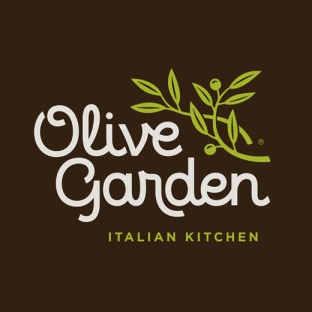
The new Olive Garden logo was put into effect as of March 2014. The new logo is completely different from the original. There is a different typeface and color change. The grapevine was replaced with a light-green leaf twig with two olives to reflect the restaurant’s name. Also, “Italian Restaurant” was changed to “Italian Kitchen” with the same light-green color. This makes a connection with the graphic design. The typeface of the new logo is customized, therefore it is unknown. There is limited information on the typeface. The typeface is still script with a tweak on some of the letters. For instance, the “r” in “Garden” is definitely extended below the baseline of the letter “d”. Although the typeface is script, not all of letters connect to one another. In Lippincott’s words it is a “fluid logotype and richer color palette”. Lippincott’s design also includes a halo lighting behind the logo in order to work well in both day and night lighting.
The change of logo resembles a more modern look, unlike the old one. I believe this new logo imposes a change for modern time. Although it is still a family restaurant, the company wants to target other audiences, such as young couples, while still maintaining their existing customers. Olive Garden wanted to achieve a clean, modern, and fresh logo to update its brand for the future. The new logo is can be seen on the front of the restaurants, the Olive Garden website, menus, uniforms, and gift cards.
