Process
The task was to initially draw a simple graphite sketch pertaining to observations in person. I chose one wall in my room because I love organic shapes and have a lot of plants. Also due to the pandemic it is also a view I know all too well. Both in admiration and weariness.

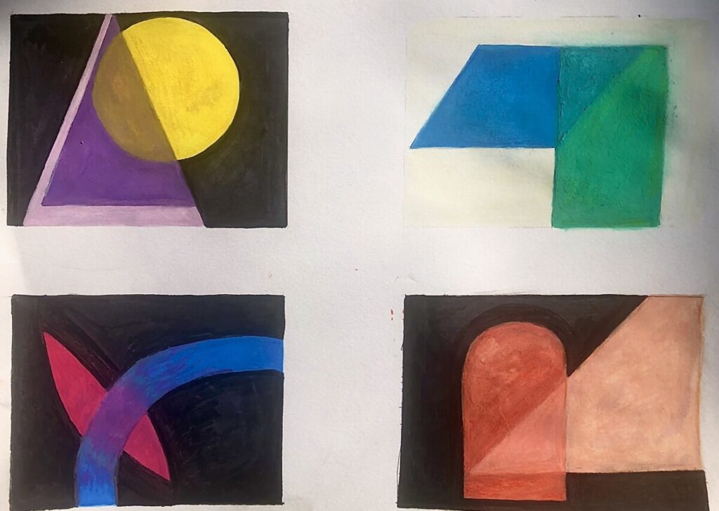
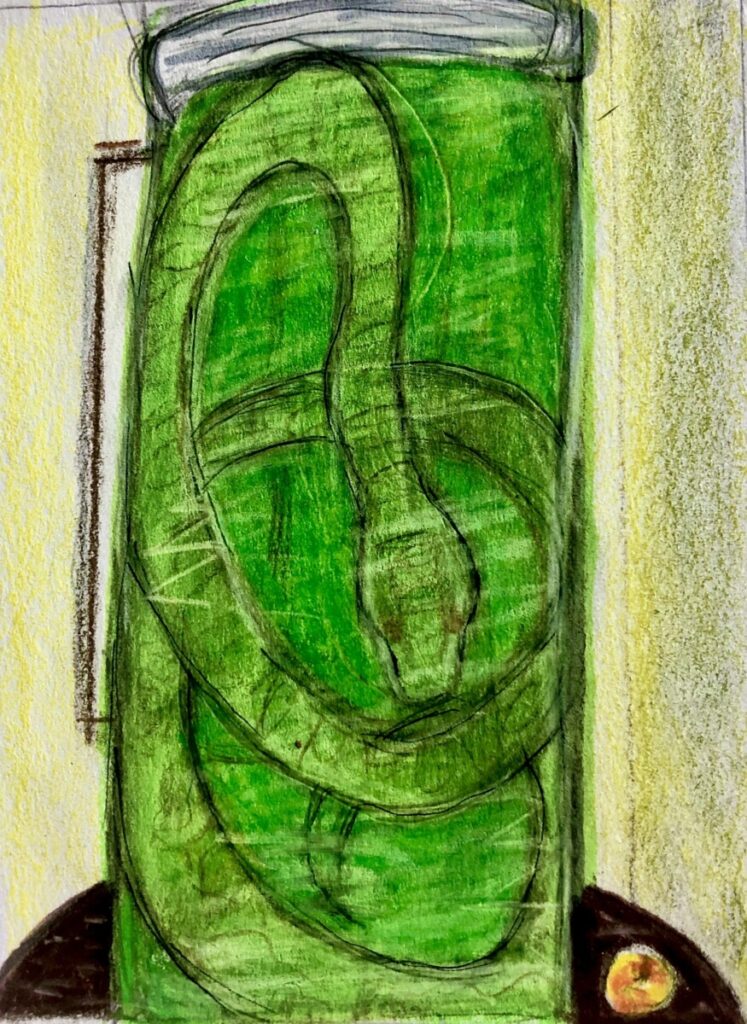
Next, we were to create thumbnails that play around with pigment and optical transparency. This entailed overlapping basic shapes of our choosing with different hues. This exercise was to engage us with other concepts such as value and color theory. It was there I started thinking about creating optical transparency designs with glassware in mind. I started creating a story of a sort of glass tube and the diffused light/color with the pink triangle thumbnail.

More thumbnails were made but the task then shifted to creating them with inspiration from a song. I chose Run To The Sun by N.E.R.D. because it touches of the concept of grief. A feeling I know all too well. N.E.R.D wrote it specifically about losing his grandmother and the guilt he felt from it. It inspired me because I too lost my grandmother unexpectedly to Covid-19. The tempo seems surprisingly uplifting but the lyrics tell a different story. I think this coveys the waves of confusion we all experience that comes with the cycles of grief. I used that emotion to fuel my designs.


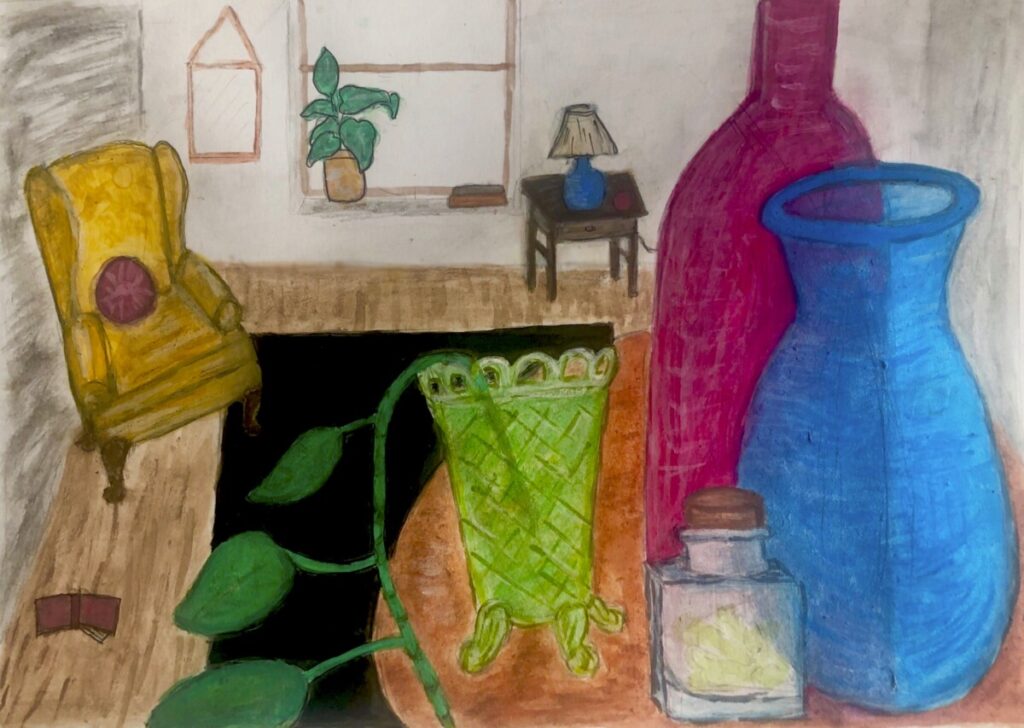
The final design was to now create a painting with both perspective and optical transparency. I decided to base this off my room and various glassware I own. Overall the painting is an exaggerated reality in an almost mundane way. Like my original inspiration from Cezanne, the perspective is there but also slightly askew. It’s eerie how unassuming it all looks but the longer you stare at it the flaws become more apparent. Also functionally the room makes little sense. There are things in the room and given the perspective of the painting it looks almost full. But when taking a step back the viewer realizes the the room is rather empty. Nothing fills. Especially from things you buy.


