Perspective and Optical Transparency

Process

The task was to initially draw a simple graphite sketch pertaining to observations in person. I chose one wall in my room because I love organic shapes and have a lot of plants. Also due to the pandemic it is also a view I know all too well. Both in admiration and weariness.

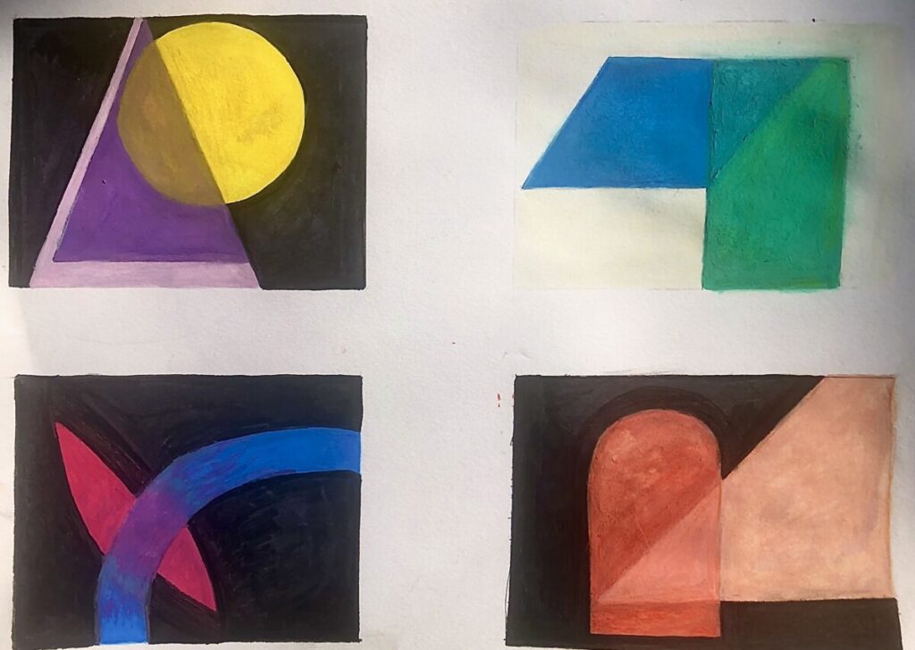
Next, we were to create thumbnails that play around with pigment and optical transparency. This entailed overlapping basic shapes of our choosing with different hues. This exercise was to engage us with other concepts such as value and color theory. It was there I started thinking about creating optical transparency designs with glassware in mind. I started creating a story of a sort of glass tube and the diffused light/color with the pink triangle thumbnail.

More thumbnails were made but the task then shifted to creating them with inspiration from a song. I chose Run To The Sun by N.E.R.D. because it touches of the concept of grief. A feeling I know all too well. N.E.R.D wrote it specifically about losing his grandmother and the guilt he felt from it. It inspired me because I too lost my grandmother unexpectedly to Covid-19. The tempo seems surprisingly uplifting but the lyrics tell a different story. I think this coveys the waves of confusion we all experience that comes with the cycles of grief. I used that emotion to fuel my designs.

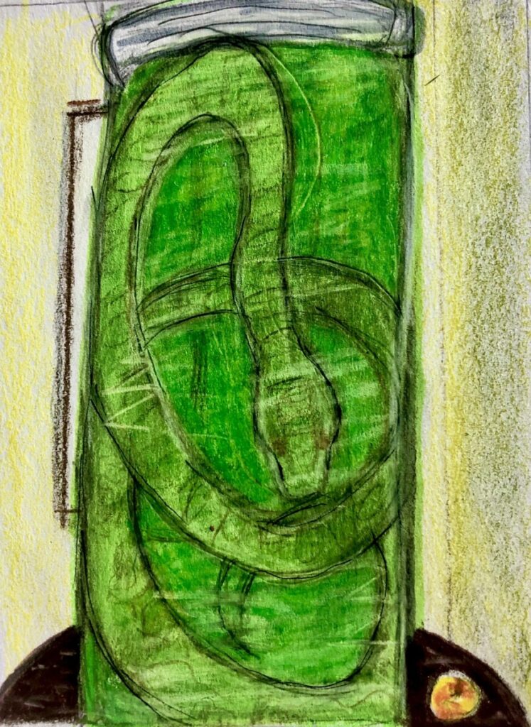
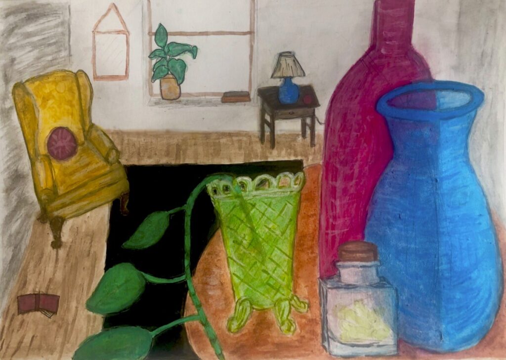
The final design was to now create a painting with both perspective and optical transparency. I decided to base this off my room and various glassware I own. Overall the painting is an exaggerated reality in an almost mundane way. Like my original inspiration from Cezanne, the perspective is there but also slightly askew. It’s eerie how unassuming it all looks but the longer you stare at it the flaws become more apparent. Also functionally the room makes little sense. There are things in the room and given the perspective of the painting it looks almost full. But when taking a step back the viewer realizes the the room is rather empty. Nothing fills. Especially from things you buy.

Texture Project

Process

This project entailed displaying texture and value in a 2D format. I first began playing around with different texture patterns in thumbnails.

After playing around with those texture thumbnails I created more but with a contextualized story attached.

After consulting with my professor, I decided to engage more with the ice cream design. But given my now discovered bias towards horizontal views I decided to make my final design vertical.

Overall I love the way this painting turned out. There’s so many different textures to observe and I think it all fits cohesively into a narrative. This ice cream cone seems to be animated and decaying. It has become humanized and is peering out a window with a blank view.

Repeated Pattern Project

β€œLet everything happen to you. Beauty and terror. Just keep going. No feeling is final.” – Rainer Maria Rilke

The task was to find a poem and create a repeated pattern inspired by it. These are the words that inspired me. For everything currently is very uncertain. And it is so easy for one to sit there and dwell on the past and look anxiously towards the future. But peace can be found. One just has to be present and detach from all expectations, both good and bad. Let go of this idea of what should be and let everything happen to you. Because in the end usually a moment , this once all consuming moment, comes and goes. Like a storm. No feeling is final.

This concept reminded me of my journey of understanding my ferns. They’re notoriously finicky plants and after a few failed trial and errors I avoided them completely. Putting the blame entirely on their “neediness”. Years later I decided to try again. And through patience I found that I neglected to see their patterns. What I saw as their death and my failure was ultimately just their dormancy and process of renewal. It not only is an unavoidable reality but a necessary one for them to flourish. Nothing is final. Life goes on.

© 2024 Kristen Narcisi

Theme by Anders NorenUp ↑