My Bio

Ā  Ā  Ā  Ā  Ā  I have always had an interest in drawing from a young age and wanted to dive into this hobby even further so I moved from the Caribbean to Brooklyn to study this. My name is Keanu King and I am currently attending City Tech. At New York City College of TechnologyĀ  I continue to strive for greater things and to broaden my senses.Ā 

Ā Ā Ā Ā Ā Ā Ā Ā  My major is Communication Design, focusing on animation. I have found this new major best suited to my creative wants and desires regarding my education and the future. Ideally I still intend to be a programmer but taking this major has opened my mind to other aspects of being in this field. (Photography, Film, Art & Design) an explosive combination that I believe I can use to create something entirely unique.Ā  Taking these new classes like, Digital Media Foundations and Graphic Design Principles I believe has unlocked a new creative side of me that I never knew possible.


Brooklyn Museum Visit

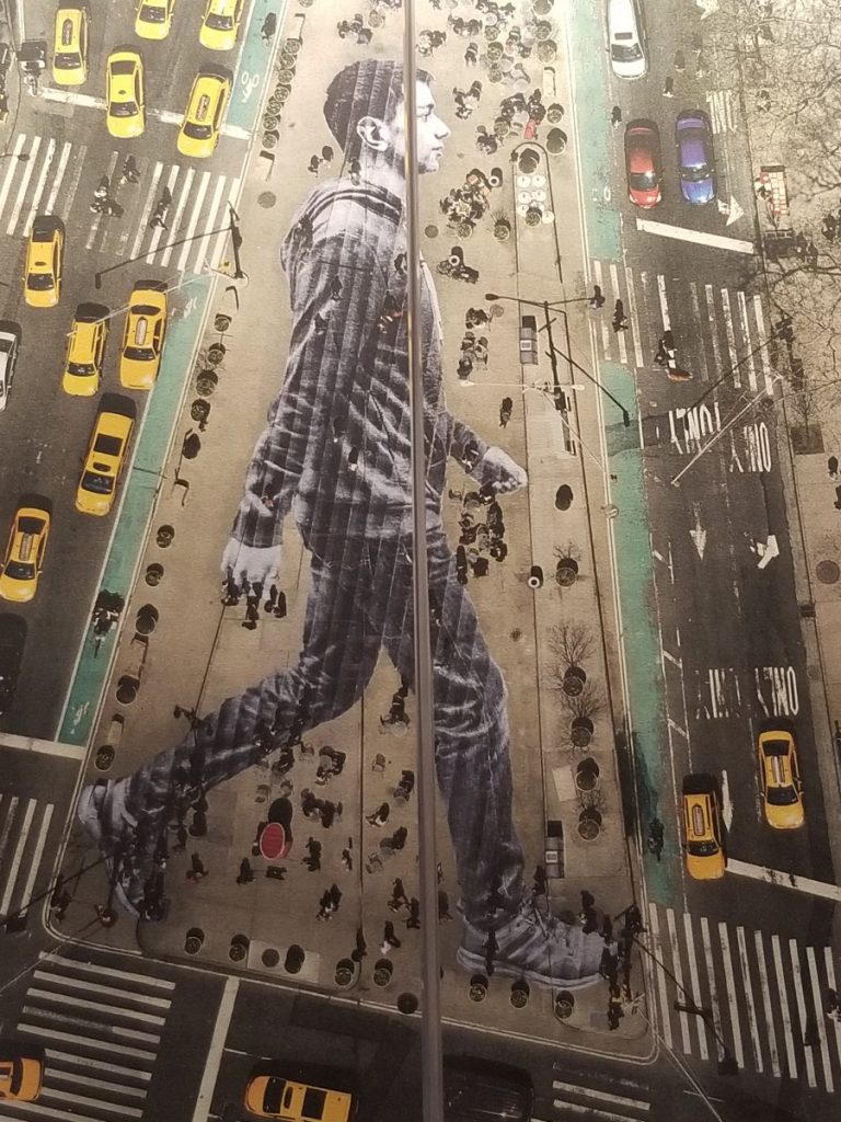
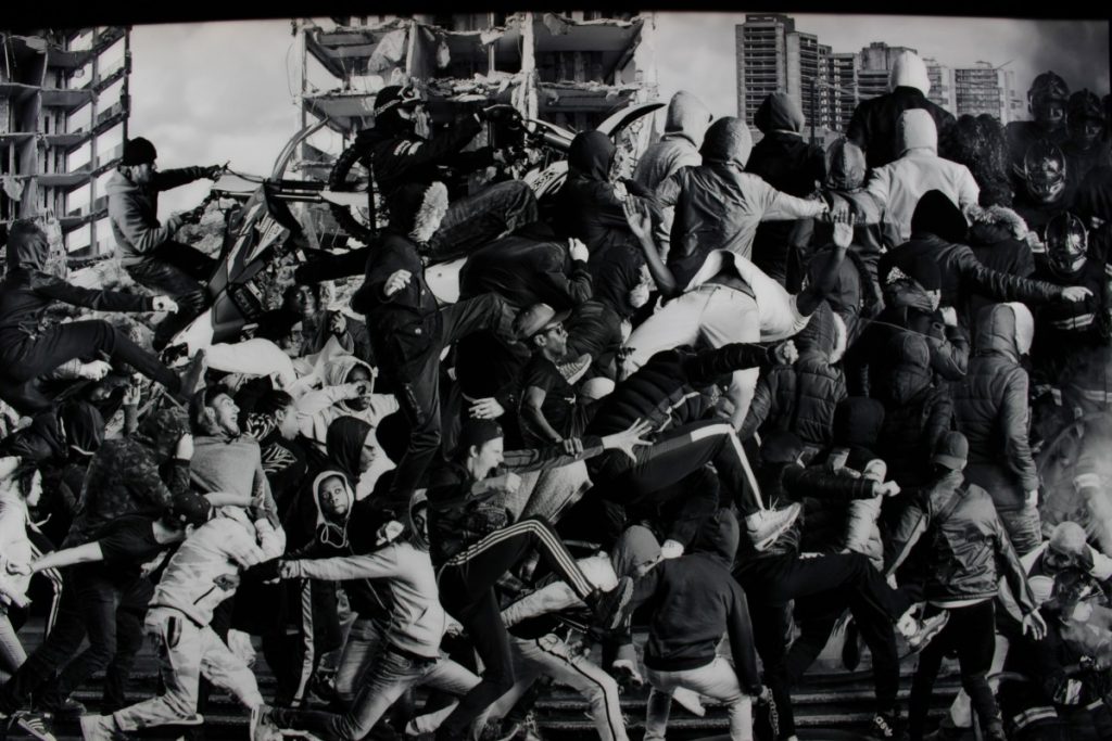
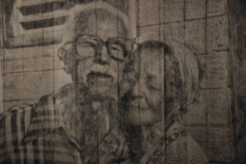
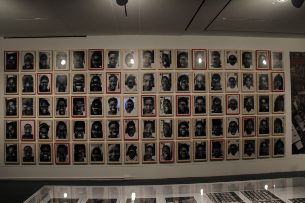
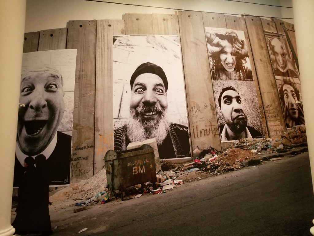
A trip to the Brooklyn Museum was quite absorbing, it displayed an immersive array of art pieces but the displays that drew much focus was the numerous pieces of work by photographer JR. Seeing his work immediately reminded me of the whole genre of street photography, and other well known photographers like Bill Cunningham and Henri Cartier Bresson but on a larger, grander scale.

Another aspect to his work that was quite enjoyable was his lack of hues and colors or black & white in some of his pieces and projects. With photography the use or lack of color can either enhance or take away from the overall purpose. Sometimes with colors a photo can become distracting, taking focus away from the photos essence JR works does the opposite. With his black and white photos it tends to compel and draw your attention to other characteristics like subtle tones, and contrast, fully flushing out the rawness of the characters within and the photo in its entirety. His photos are eyes catching yet there’s this feeling that something is missing but when given context his photography and projects can be deemed very admirable.

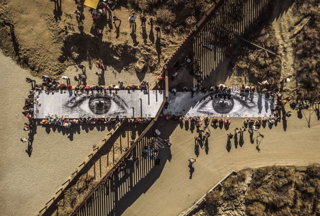
JR photography work tend to represent the voices of the people who are still struggling, whose messages are not heard. He has done this by engaging and working with communities all over the world to create his masterpieces that strives to transform old perceptions and views to create a new perspective of other points of view or situations. An example of this would be one of his photos of an eye that he turned into a surface/table that visitors could eat off starting on border of Mexico and a tarp on the side of America. This was his way in a sense to unify the people of both countries who are known to have some sense of hostility or negative views toward each other, and his done similar work in other countries.

JR is a fascinating character whose work I believe can bring about some change in this world.

Visual Quote Postcards

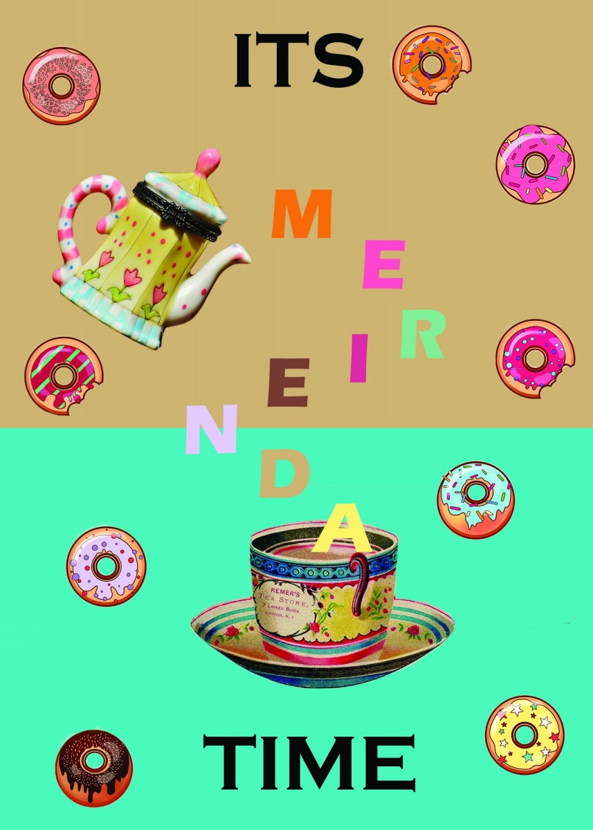
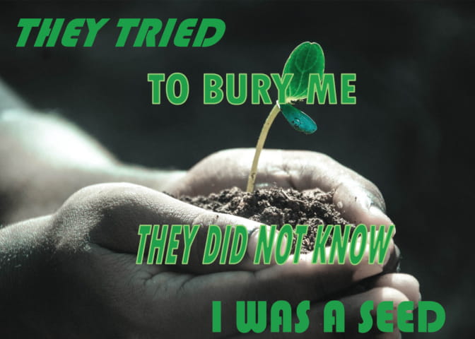
These were the postcard idea/concept that I came up with

ThisĀ  postcard design was for a snack shop so I tried to incorporate the pastries floating around the page to convey sweetness and by also giving the text a kind of colorful and playful feel to it.


This second postcard was more of a self motivational, card, a reminder of your of the importance of your own self worth and not to be stifled by negativity.

Logo History Project: Baskin Robbins

Baskin-Robbins is a large world renowned ice cream franchise which headwaters resides in Canton Massachusetts. It was founded by Burt Baskin and Irv Robbins and was known for it slogan ā€œ31 flavorsā€ for coming up with 31 different flavors with the idea that any customers could have a variety of different flavors. Baskin Robbins has since been opened more than 7,500 shop location in nearly 50 countries outside the united states and created over 1000 different flavors.

In itā€™s beginning opening Baskin-Robbins first logo could be identified by the huge highlighted number ā€œ31ā€ within a white circular background surrounded by pink and brown polka dot resembling ice cream scoops with franchiseā€™s name work mark Baskin written above and Robbins below the number 31 both in a bold and serif typeface. This number 31 was used to represent the franchiseā€™s well know slogan ā€œ31 flavorsā€ which proposed a different flavor for every day of the month. This logo was used from its initial opening of 1953 to 1991.
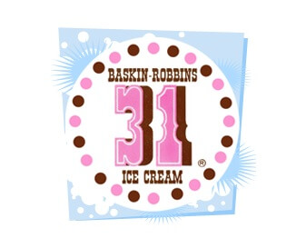
 

1960 Baskin Robbins Logo

1953-1991


The second logo was adopted from 1991 until 2006. It continued to preserve the number 31and even merged it with the word mark by placing Baskin to the right and Robbins to the left of the number. The color was also changed from its prior color scheme of brown and pink to a pink and blue
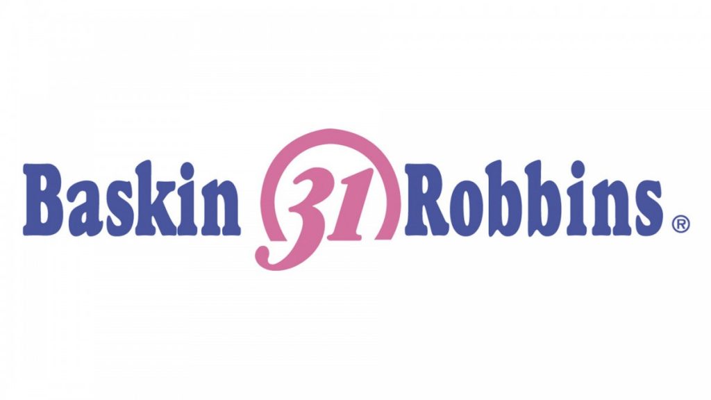
Baskin Robbins Logo Redesign

1991-2006

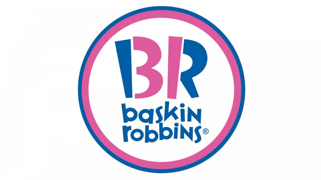
In 2007 Baskin-Robbins again decided to transform their logo to a more simple modernized yet effective logo design, opposite to its predecessors. The current logo is represented by the letter ā€œBRā€, what makes it unique however is the clever use of the BR. If focused on, the center on the number 31 can be seen within the center of the logo ā€œBRā€ the color pinked colored 31 number serves as a representation of the spoons used to sample and serve when selecting from amongst the flavors while looking at the logo as a whole shows the initial first letter of both the owners last names. The word mark uses a new zigzag font similar to the Variex regular font beneath the BR initials which gives of a playful and happy mood.
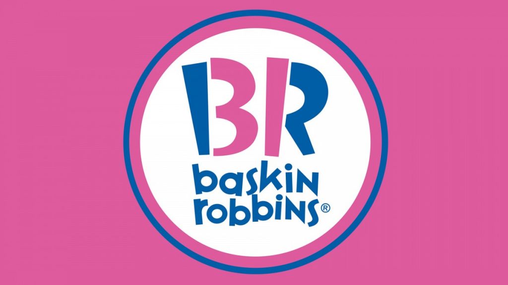
Baskin Robbins Logo

Baskin Robbins Logo

2007- Present

With the exception of its first logo Baskin-Robbins color scheme palette has mostly remained the same of pink, blue and white with interchangeable backgrounds.