3 Companies I would work for in NYC.

There are so many companies I would like to work for in NYC and around the work, but I could only choose 3 companies that are in NYC. I would work for Stinkdigital, Sagmeister & Walsh, and Domani because they all have one thing in common; do digital work. I want to work for these companies because I feel like I would enjoying the projects I would have; its challenge and fun.

Stinkdigital:
http://www.stinkdigital.com/work

Sagmeister & Walsh
http://sagmeisterwalsh.com/work/

Domani:

Work

Rhythm Song Book (What did I learn?)

For this second project, I learned that rhythm and movement are the related to each other. Movement is an  illusion motion using lines shapes, colors cause the eyes to move along with the shapes. Rhythm is a repetition of shapes and lines drawn in one direction. I also learned the 3 types of rhythm, regular, flowing and progressive; regular rhythm repeats a elements over a predictable interval; it is the less interesting. Flowing rhythm is elements created in natural pattern using movement feelings. The elements are not similar the previous one which is why it is unique.  Progressives rhythm sequence form in a shape or a line. A good example would be Staircase.

DESIGN THAT INSPIRED ME

design-that-inspired-me2

There are many things, many designs that inspired me, I can really say the design above is the only thing that inspired me. The category that inspires me the most are geometric and art photography.

Students Perks

One of my favorite student perks is Adobe creative cloud for $20.00 per month. I like the Adobe Illustrator and lightroom the most in that pack it. The Adobe Creative package has a lot for me to explore. Another of my favorite perks is my camera; my iPhone 6s camera and my Canon T6i. These cameras take great photos when I’m doing a photo shoot with my friends. Of course, I can’t leave out my most favorite perks my editing apps, VSCO, FaceTune, Snapseed, etc. I use editing apps to turn my photos into something amazing.

Cooper Hewit

cooperhewit1 cooperhewit2 cooperhewit3

Rhythm is created when repetition is used and it created a pattern through a flow. I choose these 2 designs because I believe that they have developed a rhythm in the design. It has achieved all the requirements for rhythm. They have repeated the shapes and created a flow in the design.

Eye Catching Poster

poster

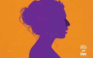
This poster used a silhouette of a young lady which stand out a lot from the ground background. Then I notice the darker color on purple on the lady’s nose, which had drawn my attention to the text on the bottom right.

Fashion Poster II

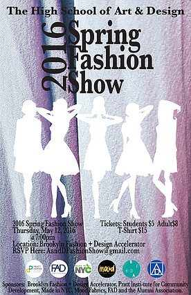
This may not be a poster on the train station billboard, but it is a poster I designed last year for my school Fashion Show. The first thing you will notice is the text “2016 Spring Fashion Show” because it’s a very high contrast compare to the foreground. Then your eyes go down to the figure-ground the white silhouette of ladies posting. Next, your eyes follow the text the poster and read the details.

advertje

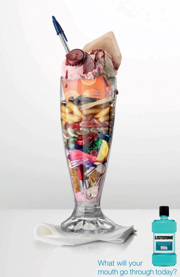
The first thing you notice on this poster this sundae cup, then you notice the types junk food that is in the cup. Later you notice the Listerine bottle. Lastly, you read the text next to the Listerine bottle.

  29

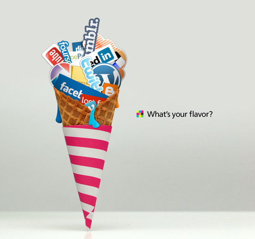
I like this poster because the designer had all social media in the ice- cream cone. The first thing I notice was how the poster looked like ice-cream in a cone, but when I look into the poster it was all the social media in the cone. Then I notice the question on the poster.

janiceeposter

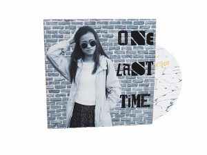
Even though this is not a poster in some random train station; it’s a poster cover CD design I did last year for my major class. I believe it strongly catches your attention; first, it’s a picture of someone you are familiar with. Besides that, it’s a contrast between the photo and the words are strong. The first thing you will notice on this poster is the person than the words.

How successful are they in reality and how successful are they digitally?

img_1320 img_1321 img_1331 img_1333

The texture, in reality, are successful because you can feel the texture and it stands out. the feather you can feel it through visual because it stands out in digital.  With the gum wrapping paper, you can see the folded lines on the paper.  The balloons you can see the shine and they’re on top of each other. Overall the texture is successfully in digital and reality.

What is the difference between art and design?

The difference between art and design is that art is a way for the artist to express their feelings. People usually can relate to an artwork. The design conveys a message in a poster, book cover, product, etc  the message usually motivates the viewers. One sends out varies of a message while the other sends out one message to the audience. Art has whole images there’s usually a lot going on, while the design is simple and easy to get.

Art expresses the artist feelings while they are drawing or painting a drawing, it allows the viewers to understand the artist feelings. Art has no restriction on the canvas. They can use any materials on the canvas. The artist can draw whatever on the canvas as long as the viewers understand.

Design convey a message on the poster to pursue the viewers to buy the product. The designer itself has their own way to convey a message rather it’s minimalistic or not; as long as the message is on the poster that’s designed. The design has a lot of restriction; you have to make sure every color, shapes, lines, and elements work well together as a whole and that the message is clear.

For Example:

art-eporfilo

Fashion Poster II

https://www.reference.com/art-literature/difference-between-art-design-136fa32f252f23b2