11 – Copyright

In class, we spoke on ethical issues such as copyright. As an artist, we would like to protect our own creations, but how and what is actually protected? Learning about the infringement copyright case between Comic Mix and Dr. Seuss Enterprises, brought a lot of questions as to what protection is usually provided for artists. In this court case, Comic Mix published a book “Of the Places You Will Boldy Go!” as a parody derived from Dr. Seuss’ book “Oh the Places You’ll Go!” Below are images from both books and you can determine how similarly they resemble each other. In my opinion, I believe that beyond being able to use the same techniques, they did go ahead and mimic the same art results. So, I do agree with the statement that copyright infringement did occur.
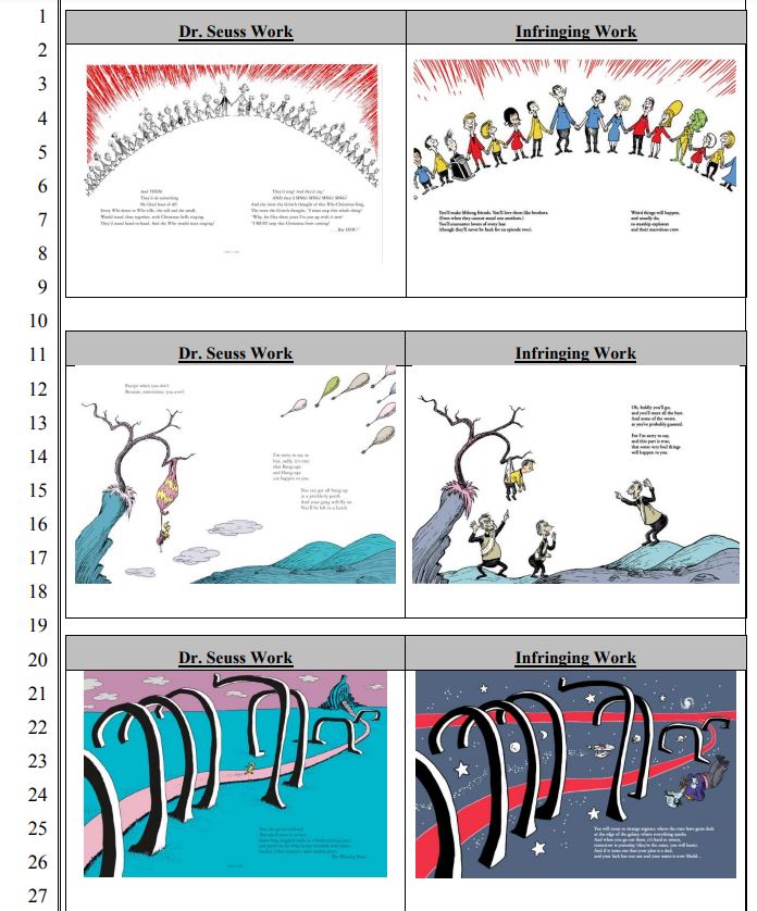
Sourced from Court Case Document

This is what I mean by, do you know what is protected in the artworks you create? I read an article by design Week called “6 Things Designers Should Know about Copyright” and it helped me better understand how I can avoid copyright because the last thing I would like to do is be in the middle of a legal matter.

These were a couple of my favorite takeaways. First, by being the author and creator of your artwork, you are automatically provided a copyright for each creation. Copyright lasts a long time and you would have to wait over 70 years after the individual has passed before you are able to legally use it again. I am sure we have seen someone else use someone else’s art on occasions where the creator is being paid for it in some agreed way. This is very important if you are working for a client. You want to make sure that all sides of the possible infringements and licenses are covered before it goes out into the world.

Lastly, my favorite was knowing what is actually protected! You may think everything about your artwork would be protected but it is only the piece you make that is. This means that others can use the techniques such as elements in your visual language, materials, or colors you used in their artwork. This appears to be a fine line because it could potentially appear that someone is stealing your style.
Visual Quote Project

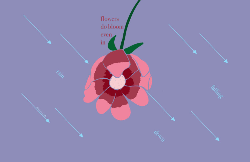
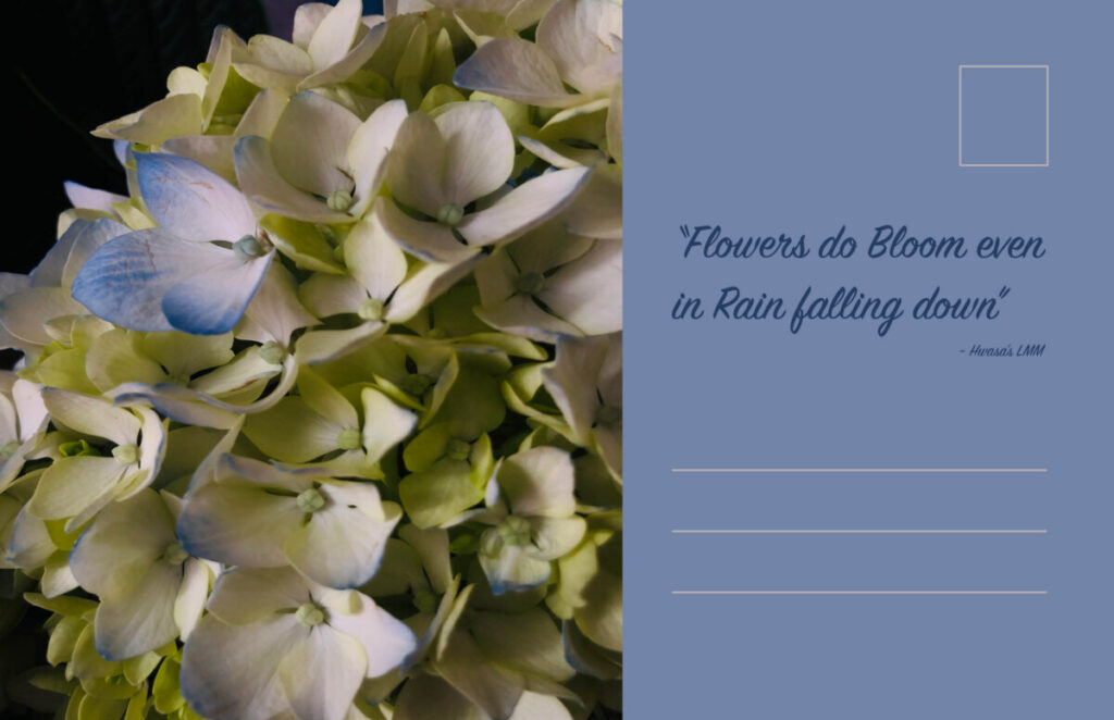
In this assignment we had to choose a quote from any form of reference such as a movie line, song lyric, book, and etc. I chose the quote “Flowers do bloom even in rain falling down” from a song called LMM. This song is by Hwasa and she is a Korean artist that I have been listening to lately as she recently released her first album. LMM is a song about strength and fears, and about being able to face forward even though it seems that everyone is pulling you down. Within this quote, I see the word ‘Flowers’ as her or us, individually, and the word ‘rain’ as the obstacles coming down at you.

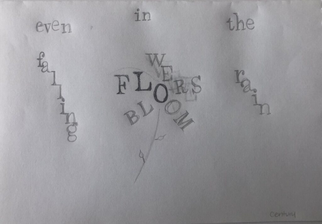
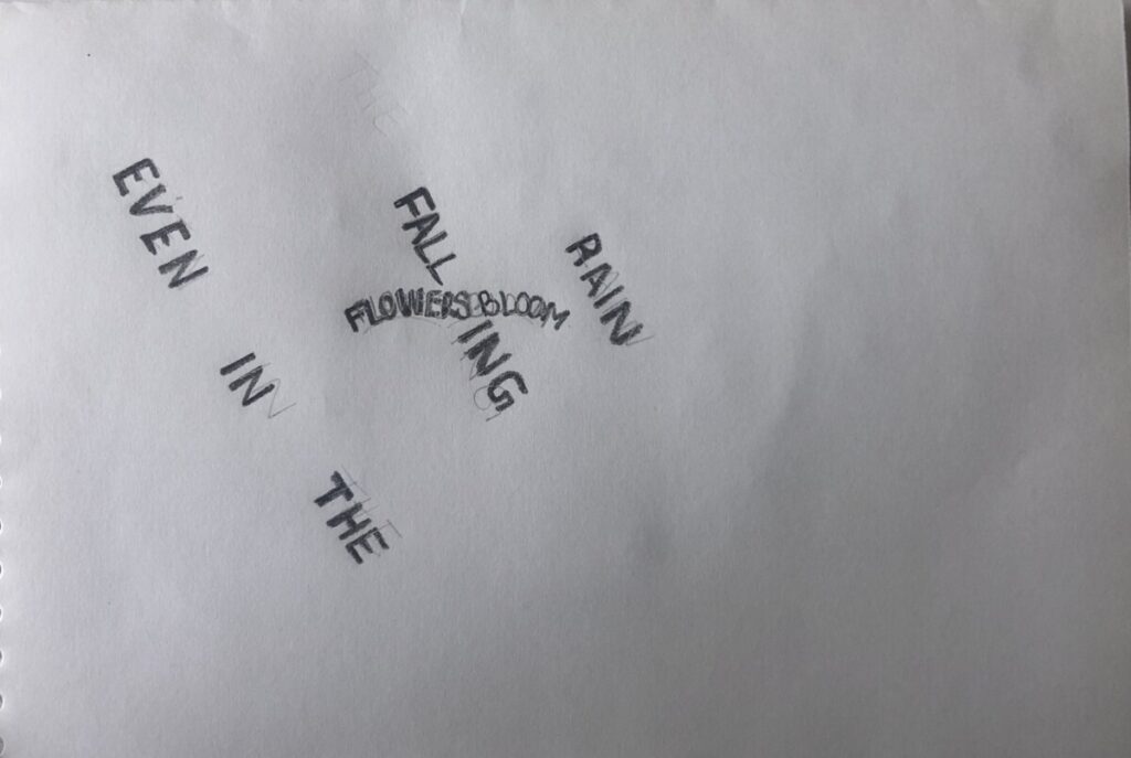
Before finalizing on my three pieces, I worked on some sketches to see in which direction I wanted to go. I knew I wanted to incorporate a flower because they’re seen as easily destroyed if not well taken care of. I also wanted to incorporate rain as attacks, but not leaning far away from actual rain. Here are some sketches that I started with:

Concept 1

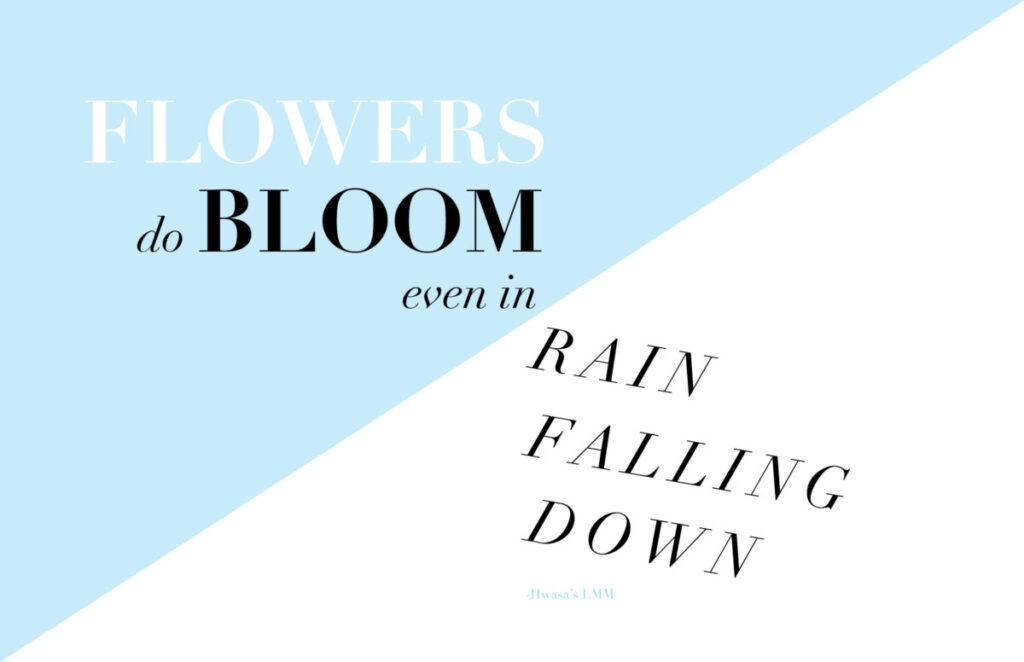
In my first concept, I wanted to focus more on the type. I used Didot as my typeface because I like the lightness on the letters. Using the bold font, the thin stems can be seen on some letters and this resonating with me as having some fragility. In the first half of the quote, ‘Flowers’ and ‘bloom’ aretwo focal points I wanted the viewer to see so I made both ‘Flowers’ and ‘bloom’ bold. The end of the quote, I wanted the type to mimic the rain falling at a diagonal so I used italic font on ‘rainfalling down’. All the texts are stacked on top of each and both parts of the quote are on opposite sides of not only the color solid but also the page. Initially, to split up the type, I had gone with a vertical split approach and I changed it to a diagonal because I saw the ‘Flowers’ rising over the ‘rain’.

Concept 2

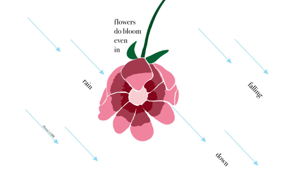
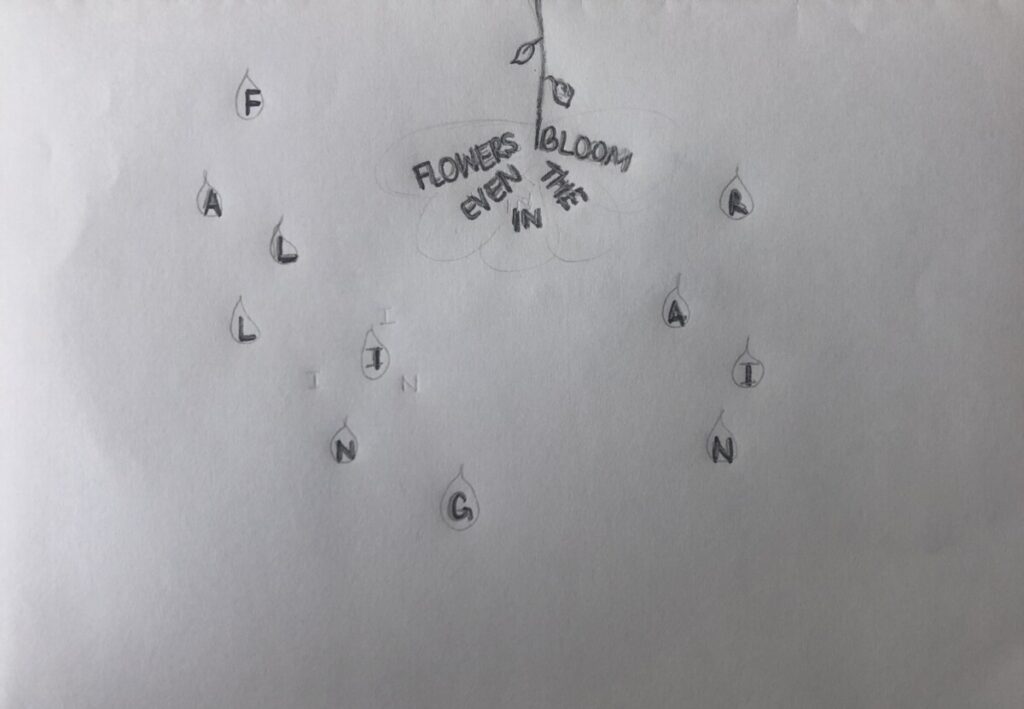
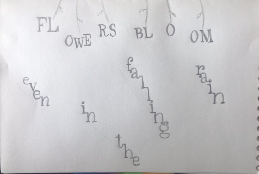
In my second concept, I wanted to introduce a bit of line art so I went ahead and sketched a flower and rain that look like arrows. I drew the flower coming down from the top just like the rain does because flowers usually are on the ground and it seems like the rain is attacking them. In this concept, I can show the flower blooming even as the rain falls and due to gravity, the rain would just slip away downwards. I kept the words ‘rain falling down’ are raindrops and so I also used italics to give it a diagonal visual. As for the raindrops, I gave them triangle shapes at the bottom of each one to make them look like arrows. In this case, I wanted the rain to be something hurtful to signify and enhance the sort of obstacles one has to face. Figure 1 shows these descriptions in its original form. In figure 2, I decided to add some color to complement the flower and to create an environment.

Concept 3

In my third concept, I wanted to use a photo and type to have it seem like a postcard. This is the reason as to why I have two sides. On the left I used a photo I took of some flowers I had and particularly this photo because it contained some shades of blue that give it color against a rainy day. On the right side, I also included a light blue shade to read off as calmness and strength. I wanted to emphasize on flowers blooming more and so I had the photo take over the majority of space. As for the text, the first half remained on the left side on the top of the flowers, giving it a light yellow shade so it can be legible and to correlate with the flowers behind it. On the right side, I kept the ‘rain falling down’ as italics and aligned each word on top of each other but at different starting points to mimic rain.

Nassau County Museum of Art Virtual Tour

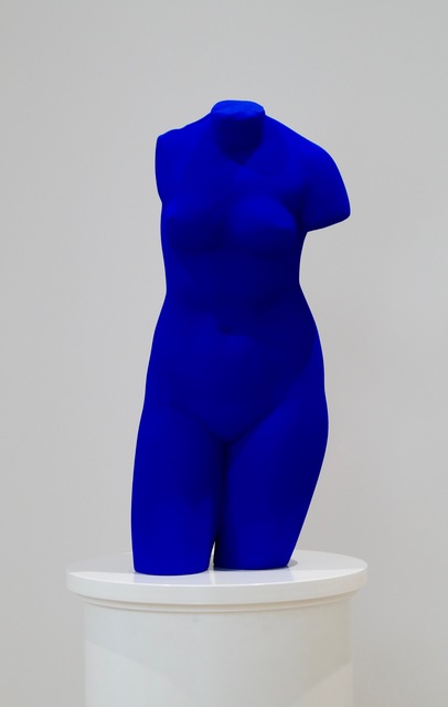
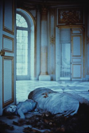
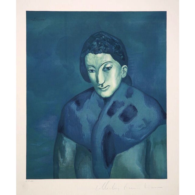
Due to the pandemic we are going through at this time we are limited from the places we’re allowed to go to. Instead of going in person our class was able to go through a virtual tour for the blue exhibition at the Nassau County Museum of Art. This exhibition displayed multiple art pieces from various artists that have incorporated the color blue.

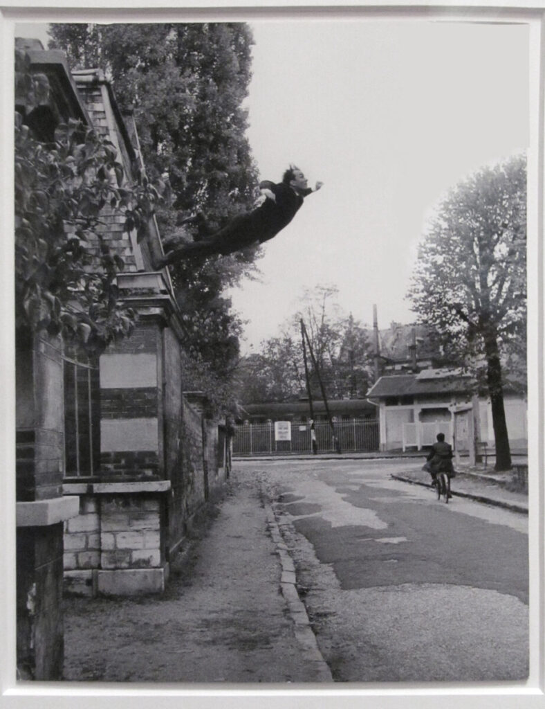
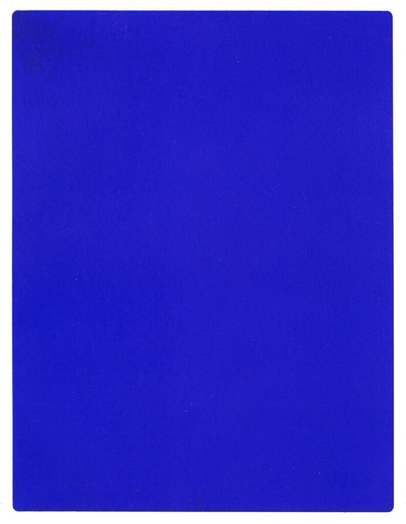
There are three pieces that have caught my eye and recognized. The first piece I enjoyed was Yves Klein’s Venus Bleue done in 1962. This piece resonated with me because I had done a presentation on his famous photography piece called Leap into the Void. He was very fascinated with the voidness and the whole concept of capturing the invisibility of art that we don’t see until after. His famous pieces are the monochromatic with the color blue so much so that the color International Klein Blue was created. This piece, Venus Bleue, is a painted plaster sculpture representing the greek goddess in a more modern way. By using sponges and rollers he was able to apply the paint to create textured surfaces.

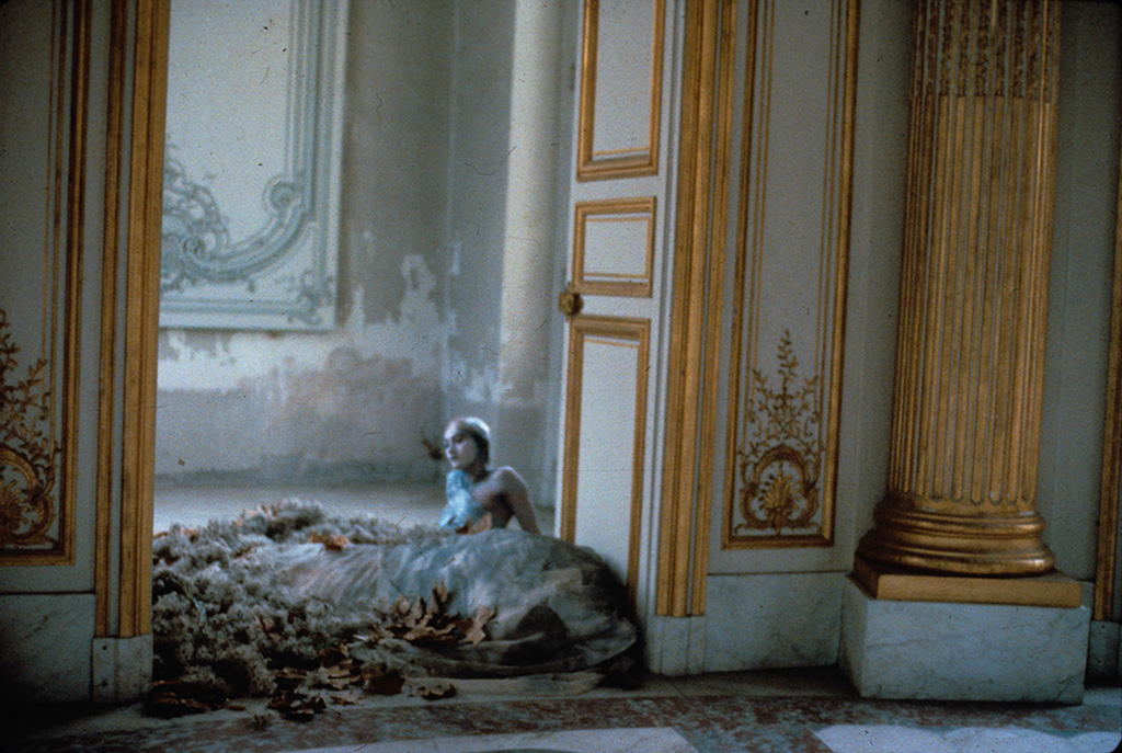
Another piece that caught my attention by its dreary look was Deborah Turbeville’s Unseen Versailles: Aurelia Weingarten done in 1980. This is a small print photograph measuring in 9 x 13 inches. What caught my eye was a statement that Turbeville said, “I like to hear a clock ticking in my pictures”, and this statement is something that I do feel when looking at it. The photograph has a woman laying on the ground and the color overall is a pale blue, almost deadly. The gradation of blues get darker on her making her the focal point. It invites feelings of dread, mystery, and something dark. It felt like I was in a fogging dream of fear. This image is one of many where she explores a different approach rather than the work done by other photographers who brightly lit the models.

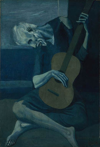
The third piece that I enjoyed was Pablo Picasso’s lithograph Buste de Femme done in 1902. This piece was part of the series of works he has done during his blue period. I mainly thought of this piece because it is Picasso and another piece from his blue period I loved is The Old Guitarist done in 1903. For Picasso, his blue period was the reflection of poverty and sadness. It is said that the color blue is meant to calm and give a feeling of serenity, but in both pieces I’ve mentioned he uses darker tones of blues. The darker tones mixed in with little hints of lighter blues gave me a sense of distance and heaviness. I also like how he chose to paint the heads at a downwards angle, which emphasizes more of the sadness or gloom.

Raster and Vector Graphics Project

default fallback image

Project Description

Nulla quis lorem ut libero malesuada feugiat. Curabitur non nulla sit amet nisl tempus convallis quis ac lectus. Quisque velit nisi, pretium ut lacinia in, elementum id enim. Nulla porttitor accumsan tincidunt.

Reflection

Donec rutrum congue leo eget malesuada. Curabitur non nulla sit amet nisl tempus convallis quis ac lectus. Curabitur aliquet quam id dui posuere blandit. Quisque velit nisi, pretium ut lacinia in, elementum id enim. Quisque velit nisi, pretium ut lacinia in, elementum id enim. Nulla porttitor accumsan tincidunt. Vivamus magna justo, lacinia eget consectetur sed, convallis at tellus. Vivamus suscipit tortor eget felis porttitor volutpat. Mauris blandit aliquet elit, eget tincidunt nibh pulvinar a. Vestibulum ac diam sit amet quam vehicula elementum sed sit amet dui.

Additional Images

Foundation Drawing Project

default fallback image

Project Description

Nulla quis lorem ut libero malesuada feugiat. Curabitur non nulla sit amet nisl tempus convallis quis ac lectus. Quisque velit nisi, pretium ut lacinia in, elementum id enim. Nulla porttitor accumsan tincidunt.

Reflection

Donec rutrum congue leo eget malesuada. Curabitur non nulla sit amet nisl tempus convallis quis ac lectus. Curabitur aliquet quam id dui posuere blandit. Quisque velit nisi, pretium ut lacinia in, elementum id enim. Quisque velit nisi, pretium ut lacinia in, elementum id enim. Nulla porttitor accumsan tincidunt. Vivamus magna justo, lacinia eget consectetur sed, convallis at tellus. Vivamus suscipit tortor eget felis porttitor volutpat. Mauris blandit aliquet elit, eget tincidunt nibh pulvinar a. Vestibulum ac diam sit amet quam vehicula elementum sed sit amet dui.

Additional Images

Type and Media Project

default fallback image

Project Description

Nulla quis lorem ut libero malesuada feugiat. Curabitur non nulla sit amet nisl tempus convallis quis ac lectus. Quisque velit nisi, pretium ut lacinia in, elementum id enim. Nulla porttitor accumsan tincidunt.

Reflection

Donec rutrum congue leo eget malesuada. Curabitur non nulla sit amet nisl tempus convallis quis ac lectus. Curabitur aliquet quam id dui posuere blandit. Quisque velit nisi, pretium ut lacinia in, elementum id enim. Quisque velit nisi, pretium ut lacinia in, elementum id enim. Nulla porttitor accumsan tincidunt. Vivamus magna justo, lacinia eget consectetur sed, convallis at tellus. Vivamus suscipit tortor eget felis porttitor volutpat. Mauris blandit aliquet elit, eget tincidunt nibh pulvinar a. Vestibulum ac diam sit amet quam vehicula elementum sed sit amet dui.

Additional Images

Graphic Design Principles 1 Project

default fallback image

Project Description

Nulla quis lorem ut libero malesuada feugiat. Curabitur non nulla sit amet nisl tempus convallis quis ac lectus. Quisque velit nisi, pretium ut lacinia in, elementum id enim. Nulla porttitor accumsan tincidunt.

Reflection

Donec rutrum congue leo eget malesuada. Curabitur non nulla sit amet nisl tempus convallis quis ac lectus. Curabitur aliquet quam id dui posuere blandit. Quisque velit nisi, pretium ut lacinia in, elementum id enim. Quisque velit nisi, pretium ut lacinia in, elementum id enim. Nulla porttitor accumsan tincidunt. Vivamus magna justo, lacinia eget consectetur sed, convallis at tellus. Vivamus suscipit tortor eget felis porttitor volutpat. Mauris blandit aliquet elit, eget tincidunt nibh pulvinar a. Vestibulum ac diam sit amet quam vehicula elementum sed sit amet dui.

Additional Images