After presenting our OpenLab website findings, the next step was to find good examples of website designs that create a simple, easy-to-understand experience. The OpenLab website has a lot of content to present, so the goal is to create a design that is easy to navigate while showcasing the content.
We were assigned to find single-page websites that would be good themes for OpenLab users who want to create a simple yet well-designed ePortfolio. We were also tasked with doing research on other non-academic websites that are good design examples.
At first, I searched award-winning websites that would help me get started to see what was getting the most attention and try to pinpoint what worked so well. One of the main things I noticed with these award-winning websites was that they all were “aesthetically focused”. What I mean by this is that these websites weren’t actual websites designed to be used by any user for a specific task. These websites were made for the sole purpose of being visually pleasing. They are filled with images, videos, motion graphics, and animated scrolling. These websites are nice to look at but for this assignment, this was not what I was looking for.
The next thing I did was to look at articles to learn more about what makes a good website. Specifically what elements are to be focused on to create a well-designed website? What I learned from this article from Forbes is that hierarchy matters a lot in web design. They talk about how creating impactful headings will give the users a sense of what they’re looking at. These headings are used as “the pitch” of your website, specifically because you have to let the website do that talking. You want to engage the user in learning what the website is about, why it matters, and how to complete the task they’re looking for.

The image above was a good example of the Forbes article used to show an excellent use of headings. You can clearly see the use of hierarchy in this example.
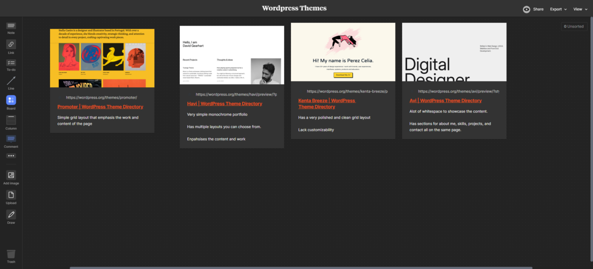
After completing this research, I moved on to my next assignment which was to find good themes on the WordPress directory that may be used in the OpenLab for ePortfolios. While browsing the list of hundreds of themes, I found that there are a lot of different styles people publish onto the directory. There are a variety of styles and types of themes for blogs, portfolios, commerce, etc. While browsing for portfolio themes, I found that a lot of these websites appeared visually well-designed, but as a theme for a beginner, they were hard to use. This is what the OpenLab wishes to avoid, the conflict of having their users deal with design issues when wanting to showcase their work on their ePortfolio. With this in mind, I picked the following themes:
- Avi: A lot of whitespace to showcase the content. Has sections for about me, skills, projects, and contact all on the same page.
- Kenta Breeze: Has a very polished and clean grid layout although lacks customizability
- Havi: Very simple monochrome portfolio. Has multiple layouts you can choose from. Enpahsises the content and work
- Promoter: Simple grid layout that emphasis the work and content of the page.


