CUNY Internship app
Class Assignment
This was a class group UX research project that was about an internship app for CUNY. Each week we would have to use different research methods to learn about the user. The problem statement was “Creating an internship app would allow busy students to easily find and track opportunities without any complications.”
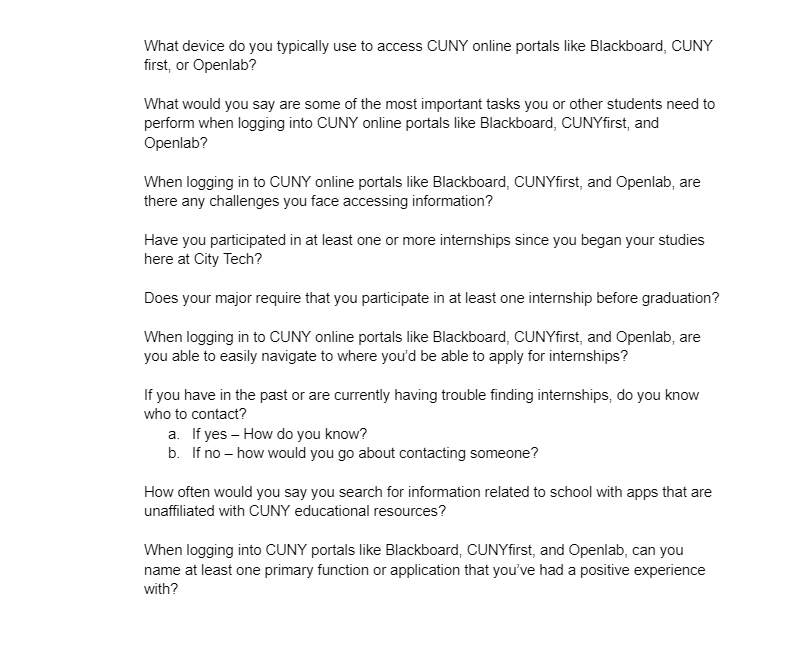
We then created interview questions to learn more about their pain points and figure out how to empathize with them. Busy students struggle to find and manage internship/job opportunities. This app prototype is designed to solve this problem by being an efficient and user-friendly solution tailored to CUNY students’ needs.
It was interesting to learn more about what other students think about and their unique situations. I was surprised how similar each interviewee’s opinion were.
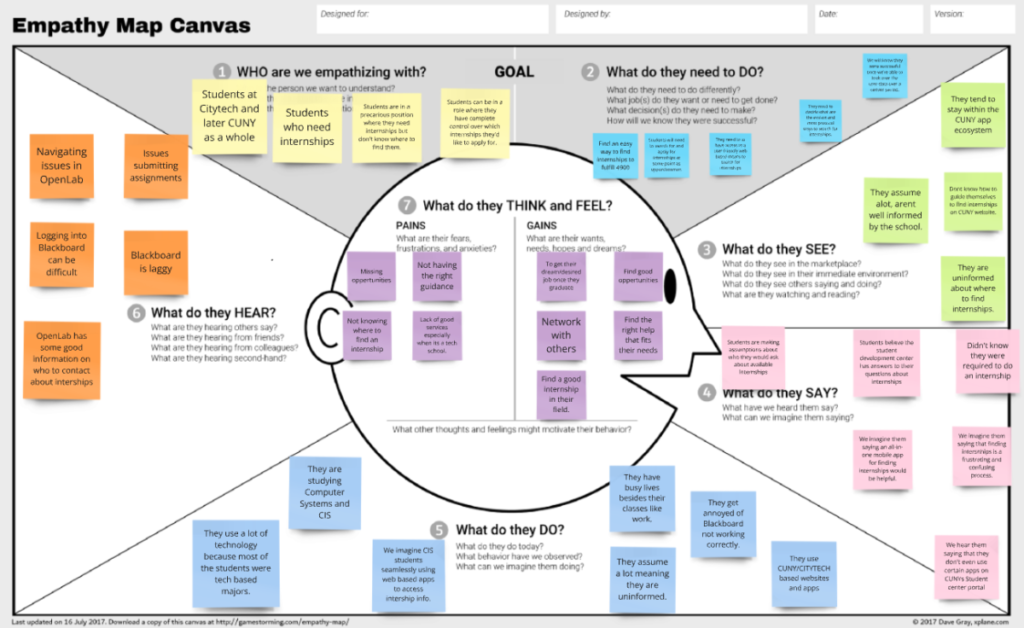
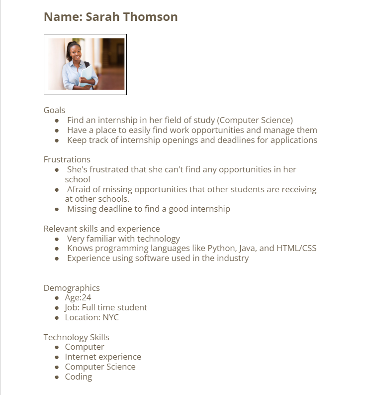
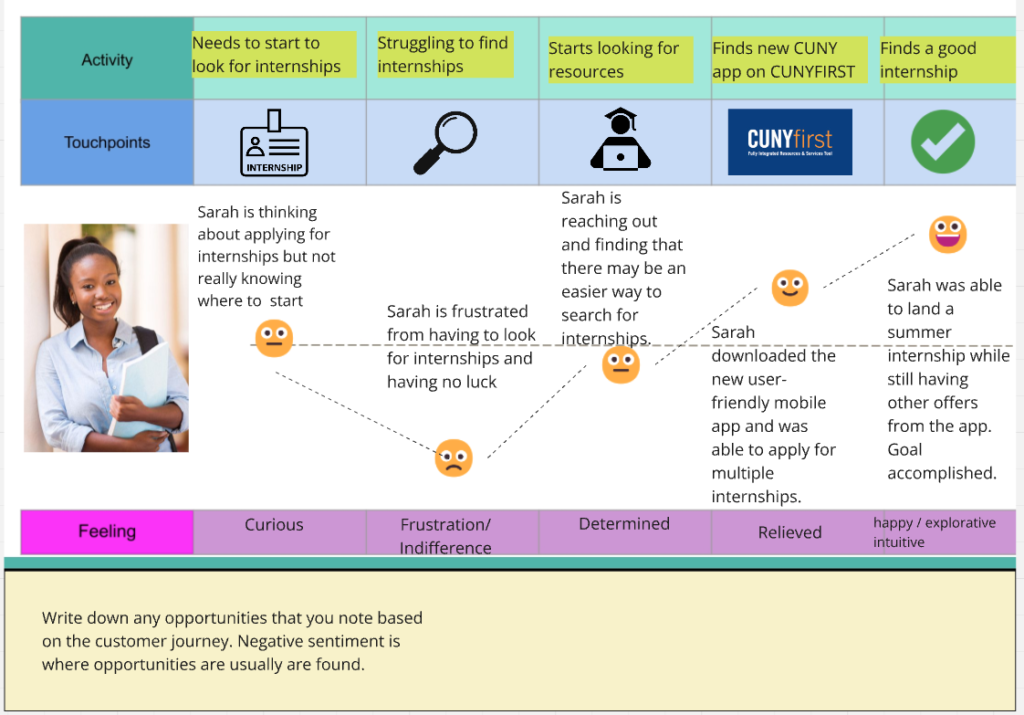
The mission is to save CUNY students time when they have to look for internships. The app will be fully integrated into the CUNY ecosystem, allowing for easy access and a smart algorithm that gives personalized recommendations based on what the students need. It will feature an easy to navigate UI, designed to save time. Have seamless integration with CUNYs ecosystem. And personalized internship recommendations based on the students’ preferences.
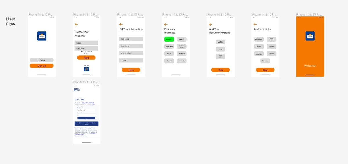
We learned that the college students find it irritating that there are little to no resources on finding internship opportunities or learning where to get help. With their limited time due to classes, assignments, and exams, their unable to find an internship. Using this information from the interview we, then were able to create an empathy map, user persona, and user flow chart.
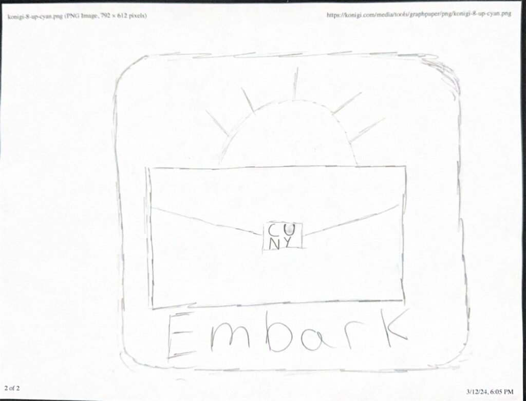
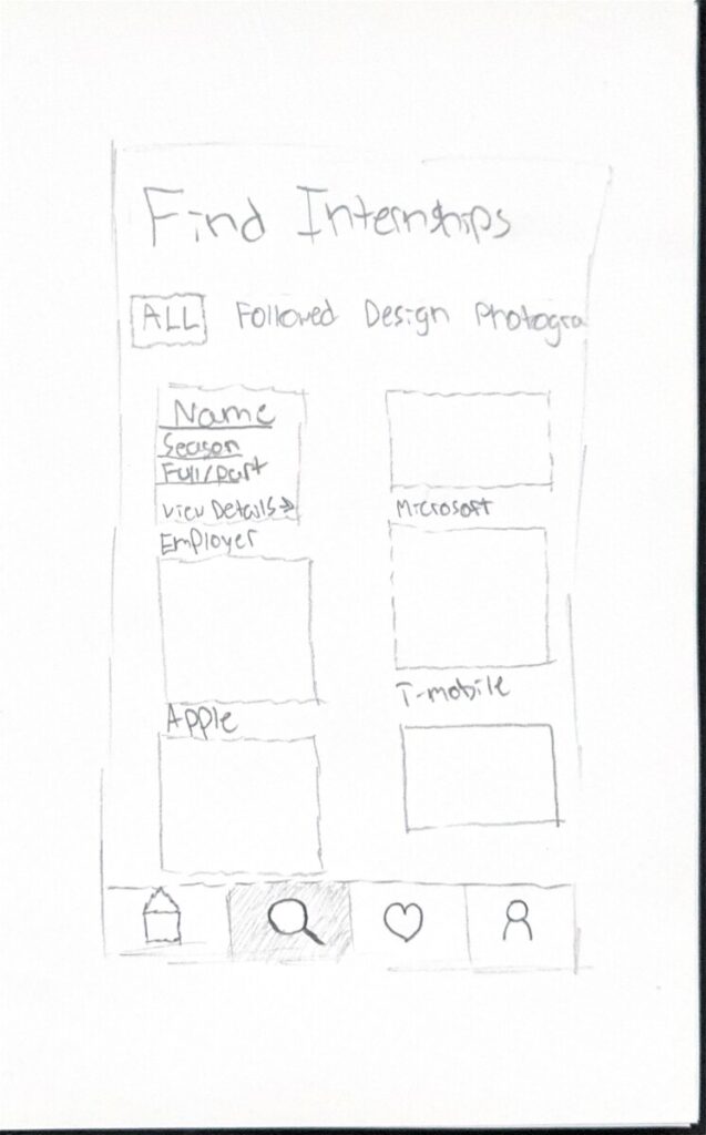
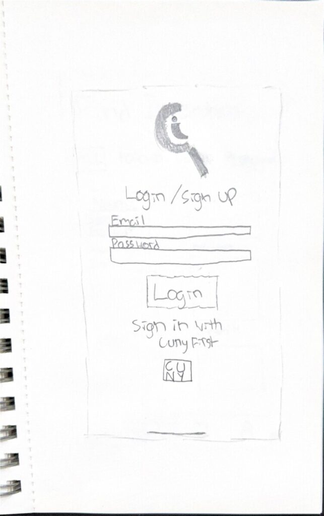
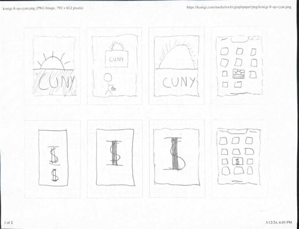
These are some of my initial sketches for wireframes and logo ideas. For the logo my idea was to combine a briefcase with the sun in the background. The briefcase would symbolize job searching and the sun would signify the user going on a new journey. This is why I also thought about the name “Embark”, because they’re embarking on a new journey.
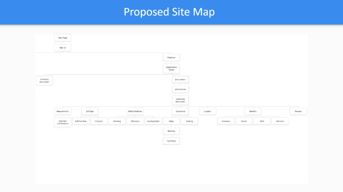
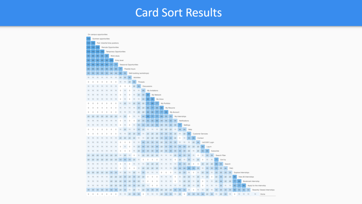
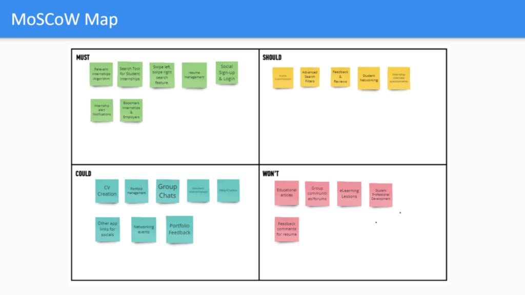
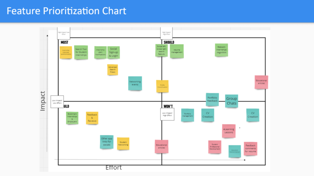
We used card sorting techniques and similarity matrix to group the features of the app. With this we created our site map for the app.
This was my final CUNY Internship app deliverable. This wireframe was an individual project. The prototype I made is focusing on the onboarding process. It’s designed to be smooth, understandable, and easy to navigate.
The goal was to create an app that can save CUNY students time with finding an internship. As I progressed during the project, there were some adjustments that had to be made to help focus on things that were important like focusing on the benefits of the app’s algorithm by including questions in the onboarding process of the prototype. Despite these changes, the prototype was successful in creating a solution to the students needs.

