These three concepts are from the Society of Illustrators
“You don’t call England, you call your dad”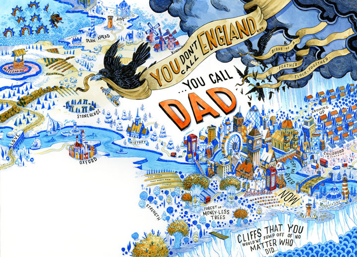
John Hendrix
Medium: pen and ink with acrylic washes
Art Director: Jaclyn Rink
Client: AT&T
Category: Advertising
The “You don’t call England, you call your dad” shows the color contrast between black and white. Beside the color contrast, there is one thing which is different from the normal illustrations. It is the order of viewing. We usually read things from left to right, but this illustration leads people’s eyesight to view from right to left by using the crows fly to the left. It provides a time line to shows from the past to the future of a person’s lifetime. In addition, those flying crows are acting like crossing the time line. And they bring a message to us, it’s “you don’t call England… you call dad”. It gives people a message that whenever you want to make a call to anyone or somewhere, it is not difficult at all, just like making a call to you dad.
“Jazzoo”
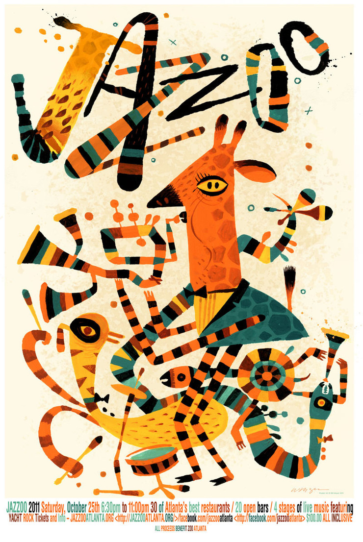
Bill Mayer
Medium: Gouache and digital
Art Director: Jeff Stewart
Client: The Atlanta Zoo
Category: Advertising
Most of the time, when we visit a zoo the animals are sleeping or doing nothing. However, from this poster I can feel this zoo is different than the other zoos because those animals are more vivid. They are playing different kind of musical instruments. It creates a picture that they are having a festival every day. The zoo animals are trying their best to bring happiness and a wonderful memory to everybody. It overthrows that zoo is a boring place. The poster is inviting people to visit them in the zoo and you may get something unimagined.
“Target Butterfly”
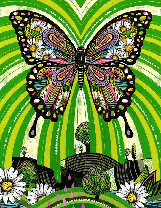
Gina Triplett
Medium: Acrylic
Art Director: Ted Halbur
Client: Target
Category: Institutional
The “Target Butterfly” by Gina Triplett uses a huge colorful butterfly to represent the company’s main target, the customers, in order to show people that the company’s ethic is putting the customers first. Also, it uses lots of warm colors to catch people’s attention and provides a friendly visual that it presents their target market is diversified. The green lines from the butterfly to the background present the butterfly is getting things from all places and shares things to all places. The background trees and flowers are presenting the different kinds of costumers from everywhere can get what they want from the Target.
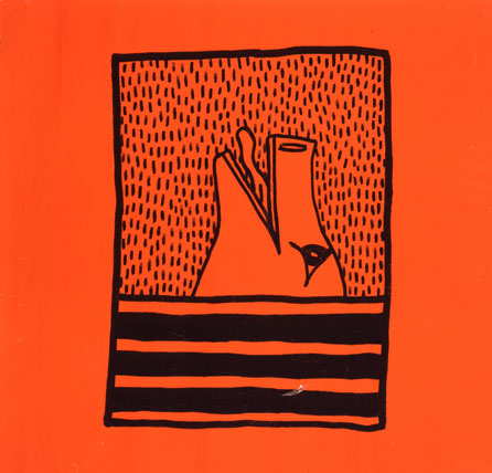
Keith Haring (American, 1958–1990). Untitled, 1980. Ink on orange paper, 36 x 35 1/2 in. (91.4 x 90.2 cm)
In this concept, it uses a lot of empty spaces to pop the focus on the animal head. The background looks like it’s raining and the animal head is facing to the top and opening its mouth and drinking the rain from the striping. Maybe, this is the idea of what the artist Keith Haring was thirst at something or he wanted to do something different than usual.

Keith Haring (American, 1958–1990). Untitled, 1982. Sumi ink on paper, 107 x 160 in. (271.8 x 406.4 cm)
This is a very large concept, also it is the biggest modern art I had ever seen, and it wasn’t created by any computer software, it was drawn by hand. Also like most of his concept, the focus is big and gives less detail. I think in this concept he wanted to show us sometime we want to get something, we must sacrifice something first. The man is holding a other man to the monster, and the people around them are not look like want to save the man to be the sacrificial lamb.
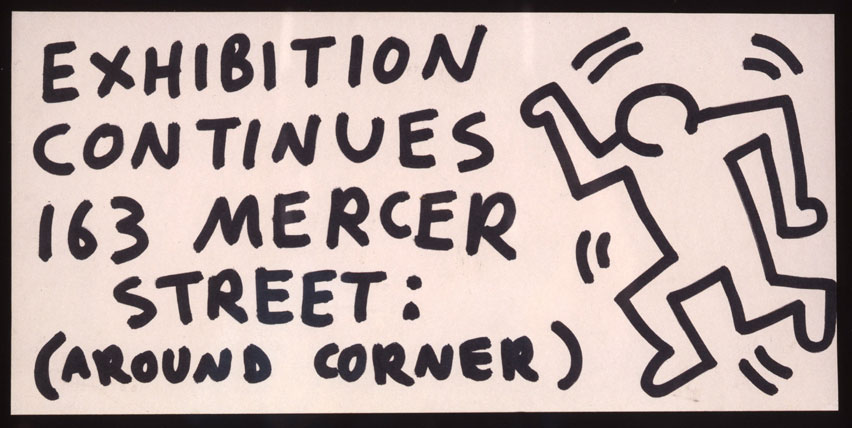
Keith Haring (American, 1958–1990). Untitled (Exhibition Continues 163 Mercer Street), 1982. Felt-tip pen on paper.
Again, less detail on the figure, but the difference to the other is at this concept it has words. Because this is the sign he designed to show his exhibition. So he has make the figure looks like moving and has energy. Then he used all capital letters on the text.

