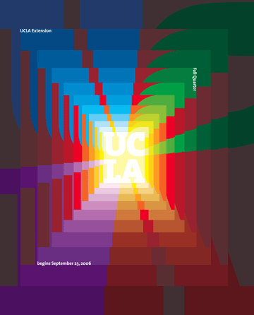
I really like the colors and how they move. the alignment of the shaded colors match up with UCLA.The colors are bold and contrast well with the golden UCLA in the middle.The repetition of the symbols really help stand outlives it the perception of depth which is cool because its on a 2d page.

