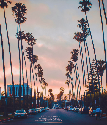
This image stood out to me cause it was more photography based. The typography is well blended on the bottom of the concrete of the image. This helps the image create a suddle look but still be able to convey the message across. The image itself created a balance and some sort of symmetry. Since the photograph was taken in the middle of the street, it created a balance due to the contrasting colors as well as the trees facing each other. Via USLA Extension Master Cover
UCLA Cover Series