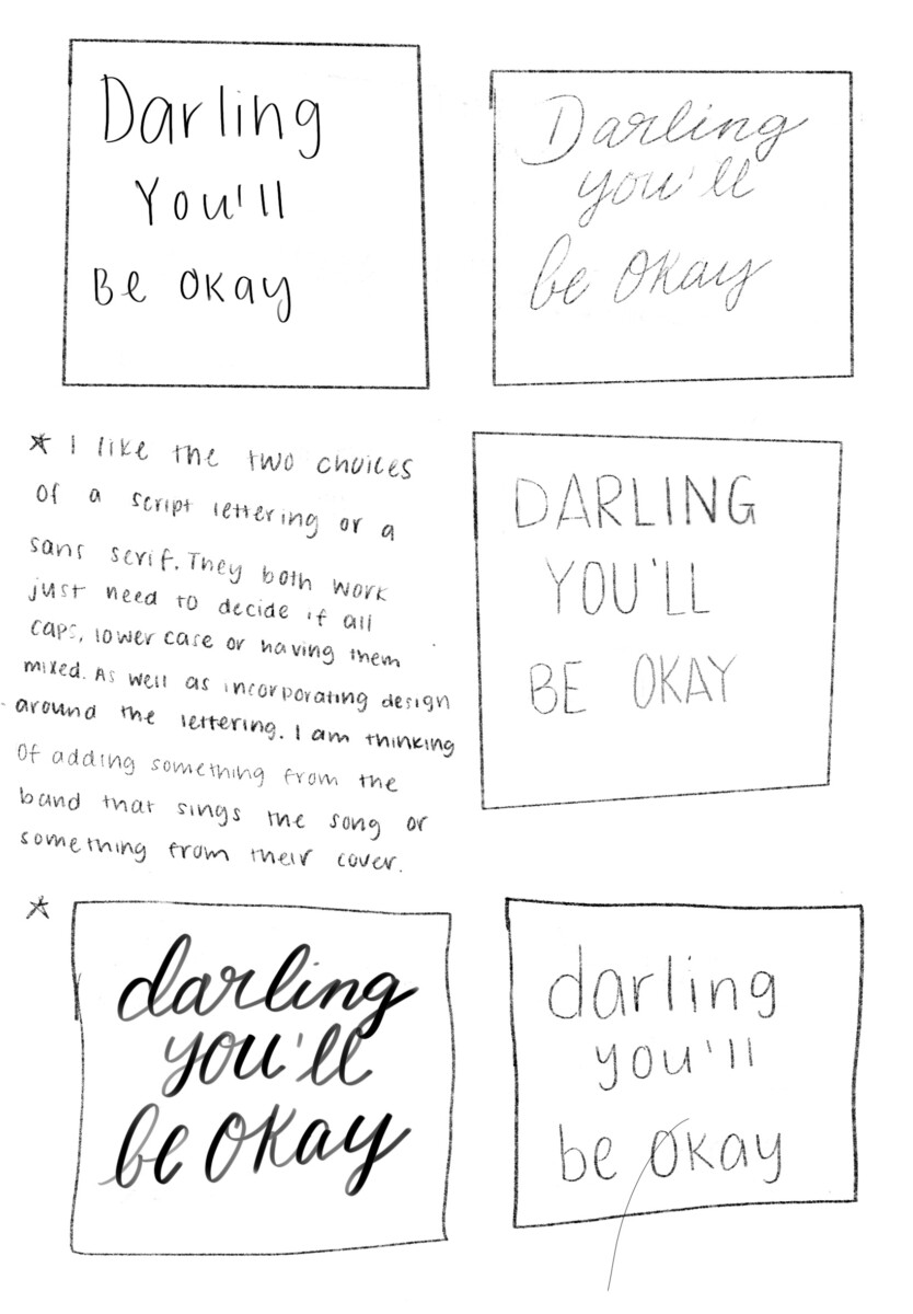
I chose this quote from a band that I listen to called Pierce The Veil, it’s a quote that everyone can have a pick me up from a hard time or a hard day. It’s always a reminder to myself that at the end of the day I will be okay and manage through my troubles.
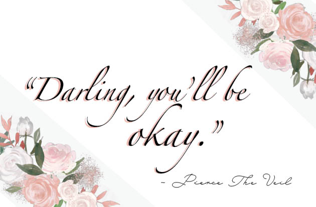
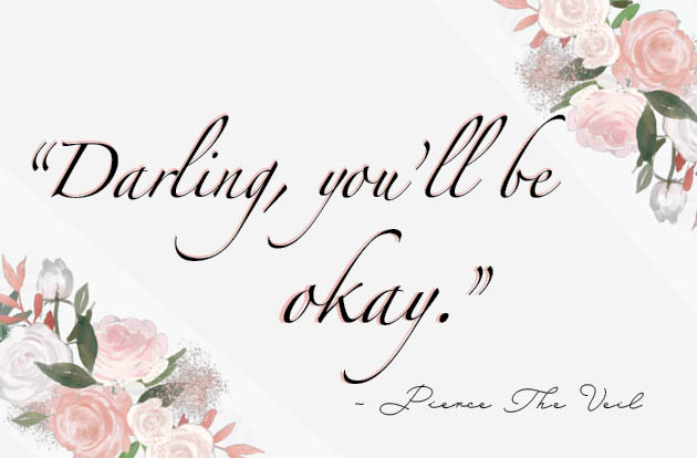
In this design I wanted a floral design and had a background tint to the lettering to combine it with the design of the flowers in the back. I made the word “okay” bigger to give more of a impact rather than keeping it the same size and to not leave so much white space around one word.

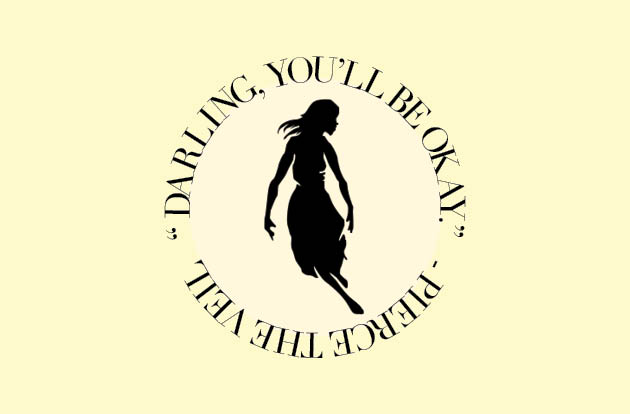
In this design I researched to find what color signified hope since the quote is more on the inspirational/ motivational side. Which was yellow and combined it with the logo from one of Pierce The Veils album. I decided to have a text wrap around the image then have a smaller circle on the inside with a different tone of yellow to give it a pop of color.
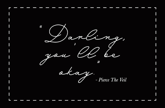
In this design I wanted to go with black and white and thought it would be a nice contrast with the tones. The handwriting font gives it more of a personal look like if someone handwritten it for you. Since the type itself was more decorative I didn’t think of having too much design around it and just had a dotted line boarder for some visual effect.

