I went with my Digital Media Foundations class to the Museum of the City of New York. I had never heard of this museum until this trip, so I was excited to check it out. I’ve been on class trips to museums before, and they were pretty boring, so I didn’t expect to enjoy myself as much as I did. As a design student, I was drawn to the look of the museum itself as well as some of the specific exhibits.
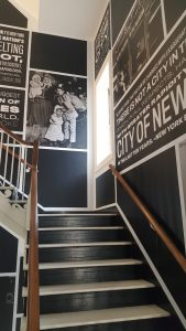
This photo isn’t from an exhibit, but I still wanted to include it in my report. This was taken in a staircase at the museum. I loved the attention to detail in the museum’s design. Most places don’t do much, if anything, with their staircases. This look is echoed in the signage and the permanent exhibits of the museum. I really enjoyed the white-on-black layout of the quotes paired with the black and white photography.
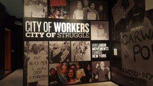
I took this photo on my way out of the museum. I didn’t see this exhibit while I was there, but I was drawn to this design on the wall of the entrance. It is designed the same way as the staircases, letting me know that it is a permanent part of the museum. The few full color photos really pop against the black painted wall and the black and white photos. As a designer, I especially enjoyed the grid-based layout of the photography and type.
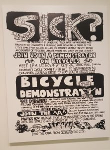
This is a flyer designed in 1972 for Action Against Automobiles. I enjoyed the whole “Cycling in the City” exhibit that this was in, but the design of this flyer made me do a double-take. I looked at it in passing and liked the handmade, illustrative style. What caught my attention when I got closer to it was the design of the word “Sick”. What looks like random scribbles or decorations in the letters are actually drawings of tiny cars. I found that really clever and something I would love to recreate for my own project.
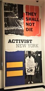
The last photo may be one of my favorites from the everything I saw that day. This is at the entrance to the “Activist New York” exhibit. I was impressed by everything I saw in the actual exhibit, but this sign is what got me to check it out in the first place. I really liked the “ripped paper” effect. That along with the bright primary color scheme and bold typography really captured the energy and mood of the topic the exhibit was about.


