Typeface: Nobile
Font: Regular
Size: 50pts
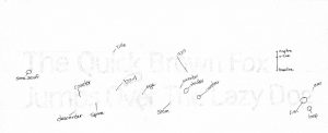
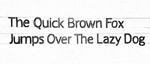
The hardest part about kerning were how to space round letters besides straight ones. The extra space made it hard to keep the same amount of spacing throughout a word, and eventually words, even. For the second attempt, I looked over my first try and paid attention to any irregularities, such as the last few words which had wonky spacing. The first try not all my letters touched the cap-line or x-line correctly so I made to watch out for that as well.


Hi Julie!
– Your Typeface is really great. I would just watch out for the line spacing because it looks a bit crooked.
-Also, pay attention to the kerning between the “U” & “M” in the word JUMPS.