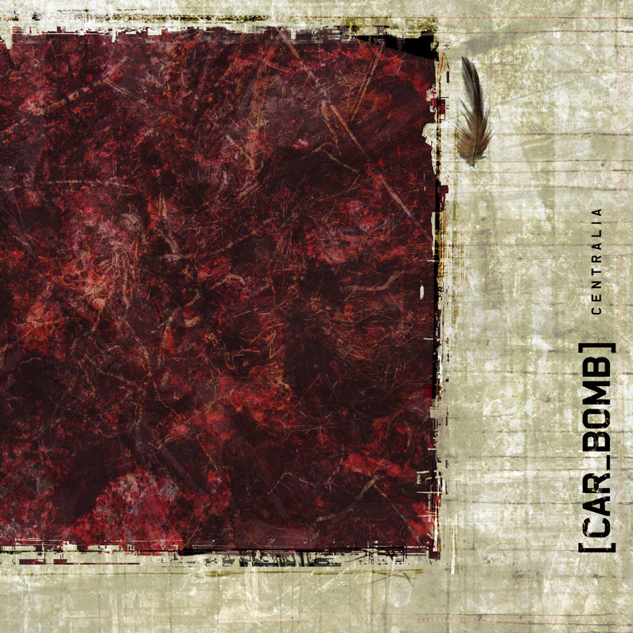
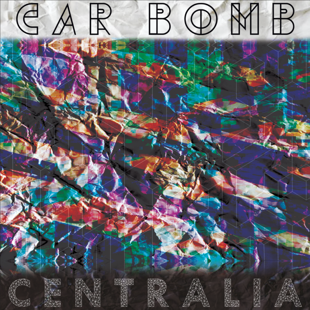
Here is a redesign of “Centralia,” an album from one of my favorite bands, Car Bomb.


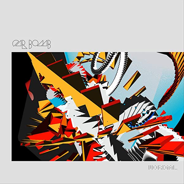
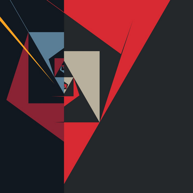
My thought process for this design was to include the elements present in later albums from the band, while maintaining the broken, scratched up aesthetic of the old album design. I decided this because of how edgy and dark their first album is compared to their newest releases, but there are still elements that they have carried over.


As you can see, the band started to use geometric designs in their latest releases, which corresponds well to the less-edgy, more philosophical lyrics of the songs.

This kind of duality between chaos and geometric cohesion is most eloquently illustrated in their music videos; or if you just pay attention very closely to the music.


