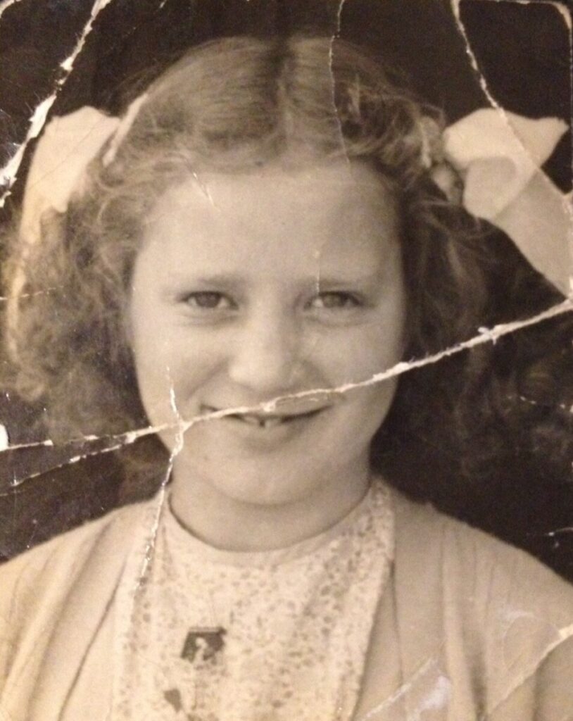
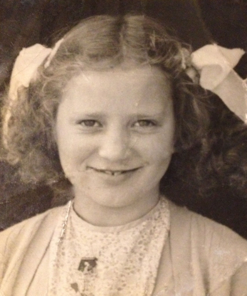
This project’s theme is time travel. While its a bit abstracted, the first thing I thought when I heard time travel was the Terminator. So, I took a recognizable image, and I added the signature terminator eye glow to it with a few other additions reminiscent of the first movie.
Author: Jason Birchfield
Trailer
I had loads of trouble with making this, but nonetheless, I think it’s still pretty enjoyable to watch. Most of my mistakes come from the resolution errors and some of the cut-away’s not being completely correct.
At first, I wanted to do something with Jim Carey, then quickly moved on. Then, I started making something with Mr. Bean, before realizing it doesn’t really work with what I was trying to accomplish. Then, I found this video on Youtube with Pee-wee Herman inserted into Halloween, which inspired me to do this.
Mashup/Remix song
I didn’t really know what to do for this project, so I just kinda mashed a bunch of stuff I enjoyed together with some samples from a sample pack that I downloaded.
The lyrics are from Danny Brown and JPEGMAFIA’s album “Scaring the Hoes,” but I only used Danny Brown’s lyrics for this project. Since it’s an album with two people on it, it was a little hard to get a full song with only Danny Brown’s lyrics, so I used some lyrics from other places as well. Some were from songs, others from their documentary that they did for the entire album.
The main pronounced samples are from Ginuwine’s “Pony” and Lauryn Hill’s “Ex-Factor” respectively.
Horror Ambience
Here is some horror ambience made in Adobe Audition. My main inspiration for this is the concept of nominal spaces and I tried to encapsulate what makes it scary.
Here is a redesign of “Centralia,” an album from one of my favorite bands, Car Bomb.
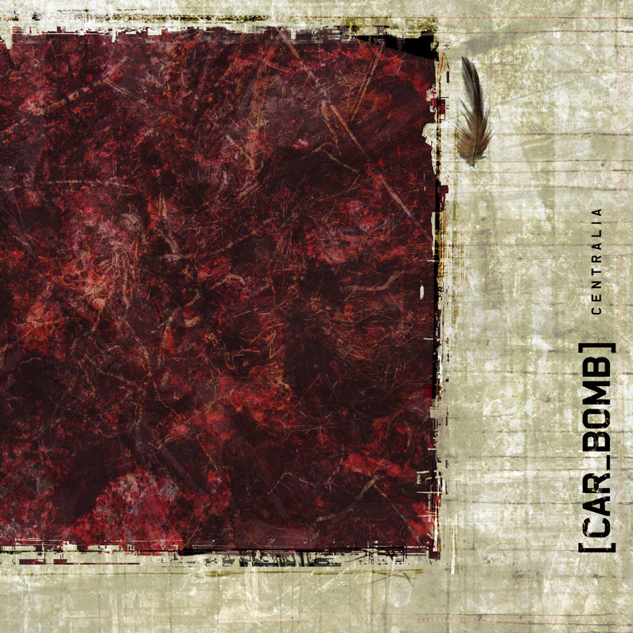

My thought process for this design was to include the elements present in later albums from the band, while maintaining the broken, scratched up aesthetic of the old album design. I decided this because of how edgy and dark their first album is compared to their newest releases, but there are still elements that they have carried over.
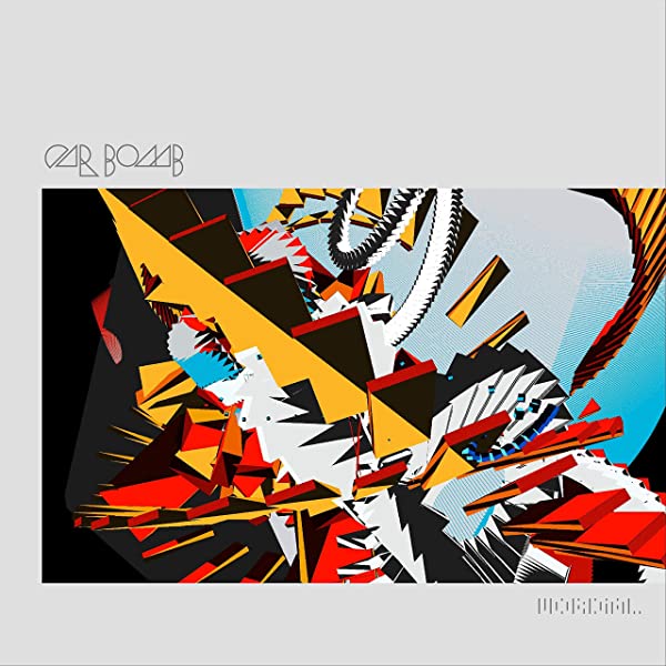
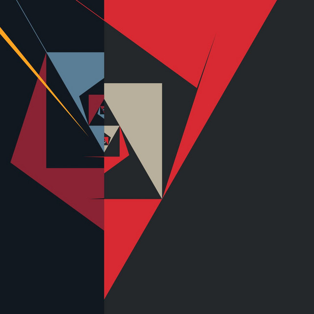
As you can see, the band started to use geometric designs in their latest releases, which corresponds well to the less-edgy, more philosophical lyrics of the songs.
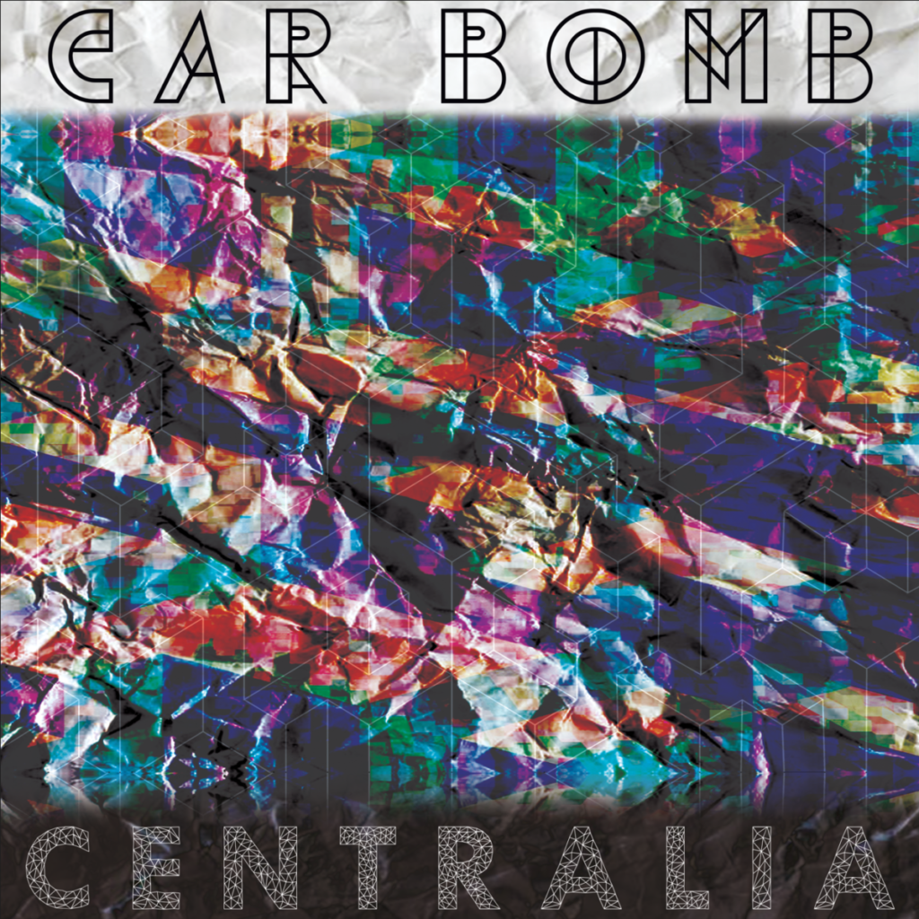
This kind of duality between chaos and geometric cohesion is most eloquently illustrated in their music videos; or if you just pay attention very closely to the music.
Corrected Image
Photoshop Images
Here are some images created with the following ideas: scale, “time machine”, and hyper realism.
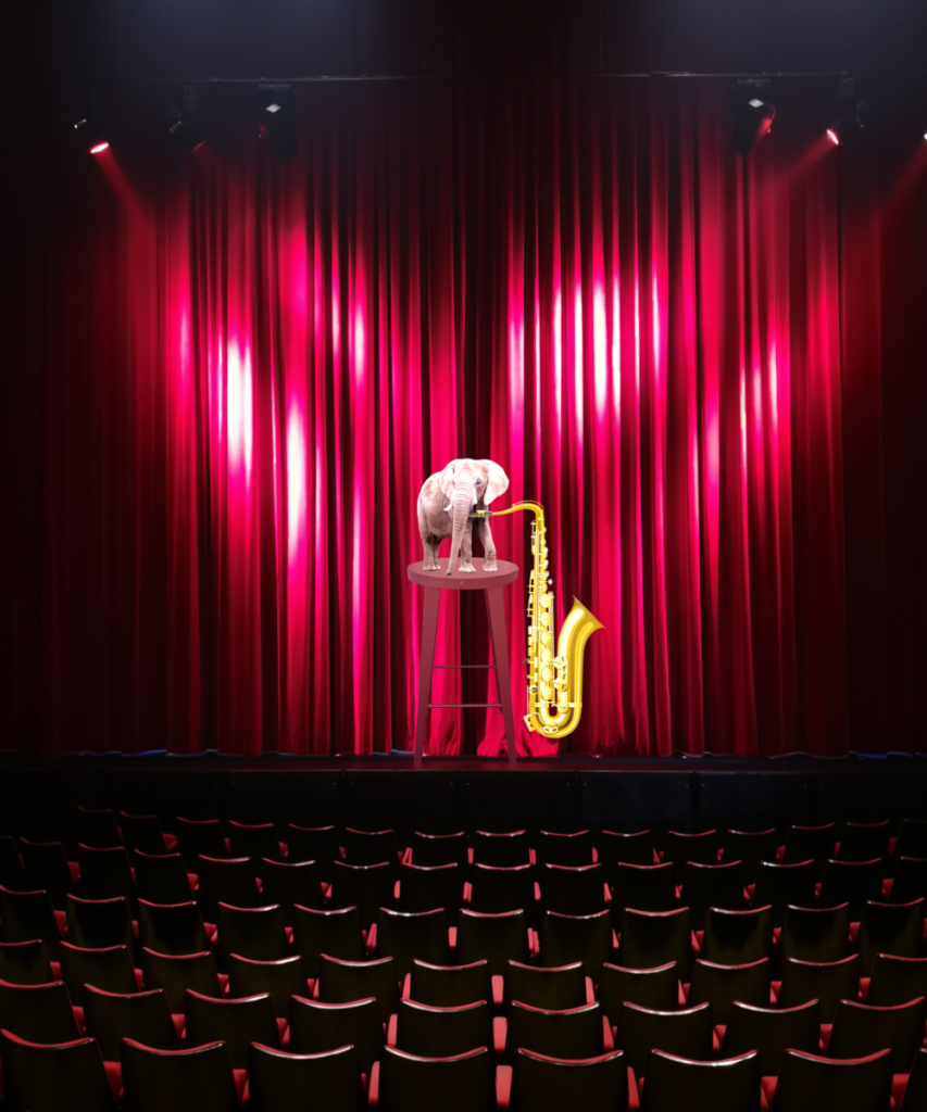
The “scale” of this image is the small elephant as opposed to the large saxophone, which is at least twice as big as it.
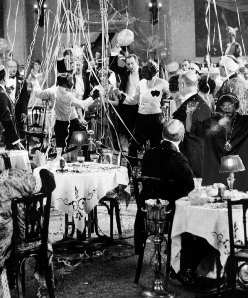
The “time machine” aspect of this image is the hip-hop artist Snoop Dogg masked into the right side of the image, which is set in the roaring 20’s.

The “hyper realism” of this image is the obvious physical impossibility of a duck having large muscles.
Business Cards
Here are two business cards designed; one has copied ideas from a previously existing card, while the other is an original design.
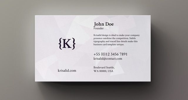
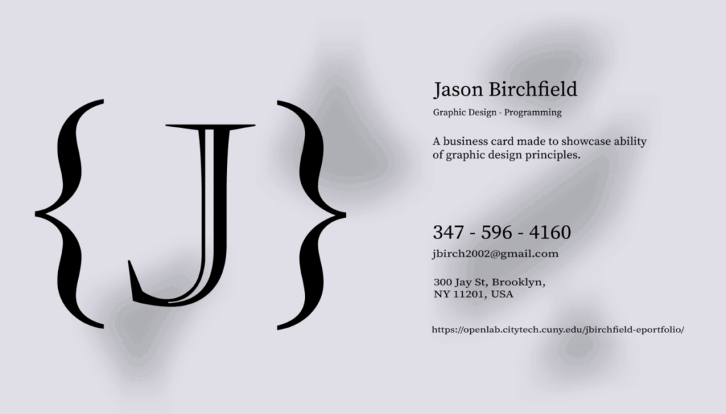
You can see the obvious inspiration, with pretty much the only difference being the design in the background.
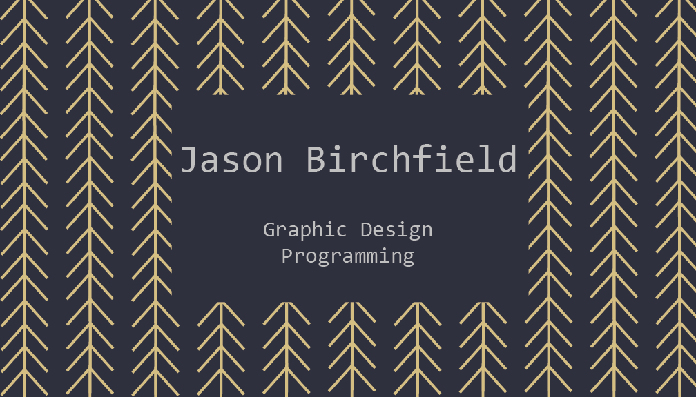

Here is a simple original card design using the gestalt and visual hierarchy design principles. It was made by drawing a simple arrow with the pen tool and duplicating it.
Tracing
Here are various traces of musical objects and my favorite vocalist Jens Kidman from the band Meshuggah.


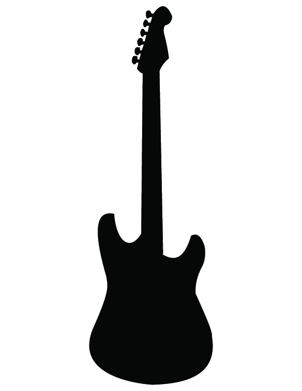
A simplistic, minimalist trace of a guitar.
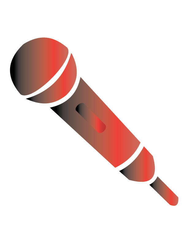
A microphone utilizing negative space with a linear gradient. The colors of black and red being consistent among the traces.
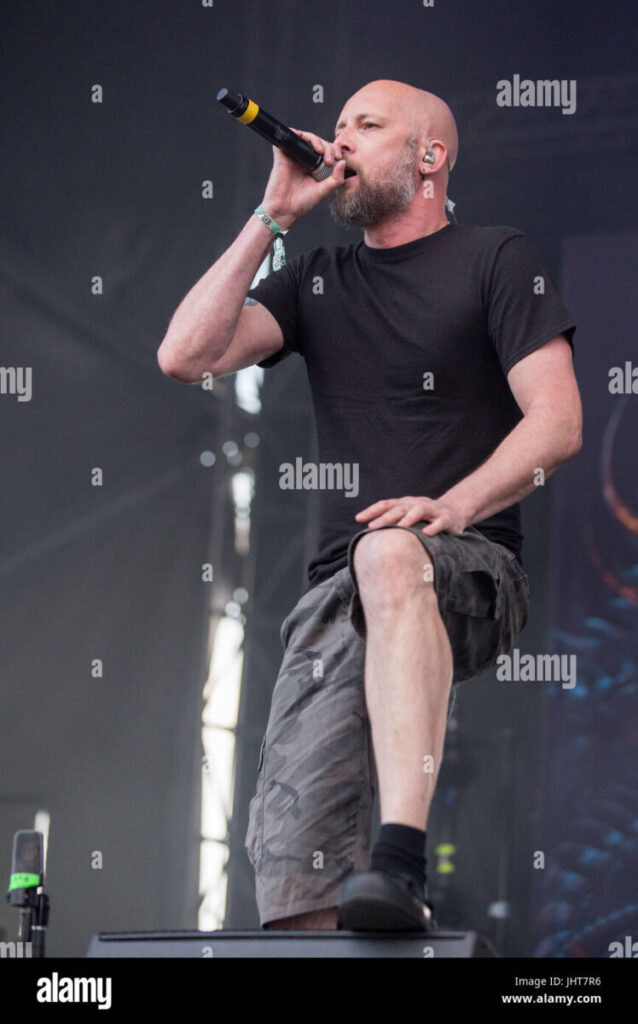
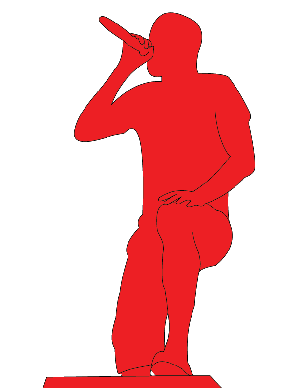
A tracing of Jens Kidman on stage with negative space to accurately capture the picture being traced.
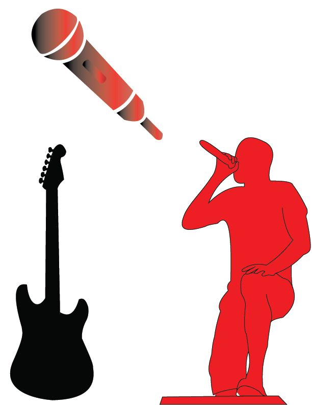
All of the traces together.
Logos
The prompt used to design these logos was “lazy.” I tried to incorporate a few stereotypical objects synonymous with the word.


A minimalistic representation of a couch.

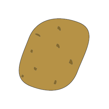
A design of a potato. My line of thinking was: when people are lazy, they’re generally described as “couch potatoes” or a “sack of potatoes.”


An old-fashioned TV. When thinking of a television, people generally think of this design as opposed to a flat screen.
