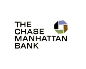
The Chase logo, created by Chermayeff & Geismar in 1961, is represented as a stylised octagon. The original logo was an outline of the United States and featured “Chase Manhattan Bank” “Worldwide Banking” and “Chartered in 1799.” This abundance of text and typographical choice lead to the eventual change. The 1961 logo had the colors of green, blue, brown and black and was inspired by the primitive water pipes used in NYC. This symbol is supposed to embody “a simple yet powerful geometric form embodying a strong feeling of motion and activity.” The designers also thought that, “like the bank itself, the symbol is a single unit made up of separate parts.”
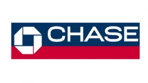
As we can see from these two pictures the first logo uses Serif and San-serif fonts. This gives a more conservative look. The type in the second picture is a strictly san-serif font, which gives a modern look to it. The logo below was a change in 1976 that lasted until 2004. This particular one, did not change the logo at all but only the background color. Going from the original, green, blue, black and brown to the blue and red. I could not find much information on this specific one but I do theorize it was inspired by the colors of the American flag.
Finally in 2004 Chase Bank adopted the current logo of the notable blue octagon we see all over today. This logo is seen all over New York City, specifically Manhattan. It is not uncommon to walk a few blocks and not come across a Chase Bank or an ATM with the Chase logo branded on it. In addition you can see the logo on credit and debit cards, their website and the even have their own stadium called Chase Field. Chase Bank is one of the largest, if not the largest, banks in NYC. Users have access to a web portal and an app that allows you to bank from anywhere. Eliminating the need for you to go to an office. The website and app both feature this logo.
Even the ATMs have a glowing blue light always there if you need to make a deposit or withdrawal. Checkbooks, letters, physical branches, etc, all have this logo and it’s hard to escape when banking with or without this company. From the conservative type and long name, to the earth tone colors, and the American inspired red, white and blue the bank used to don, Chase has now taken on a more modern approach with the sky blue. This can give a more forwarding thinking look and express a calming emotion on people that see it.


