
A Communication Design Portfolio
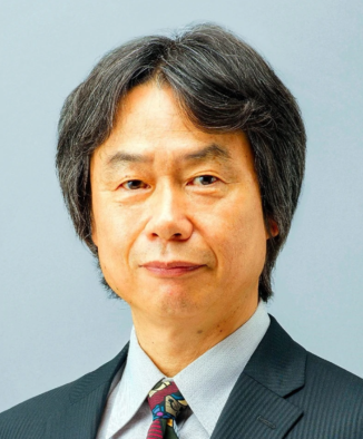
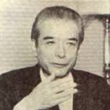
Shigeru Miyamoto, often regarded as the “Walt Disney” and “Stan Lee” of video games, is a Japanese artist and designer for Nintendo. He is the creator of early game classics like Donkey Kong, Super Mario Brothers, The Legend of Zelda and Pikmin. Additionally, he is responsible for the “Mario” hit series that dominated twice the combined box office earnings of the Star Wars movies with a whopping $7 billion and more. Shigeru remains one of Nintendo’s top contributors, helping to build and shape it into a multinational video game and consumer electronics company—which today stands its ground alongside major video game companies like Sony, Sega, and Microsoft. His creative talents show within his easily recognizable aesthetics in the gaming industry, having created colorful, cartoonish, and whimsical characters and stories, writes Zev Borow in Wired Online. Shigeru went as far as to pioneer the use of original soundtracks in Nintendo video games, the development of nonlinear games, and the shift from two-dimensional to 3-D, all part of the “DNA” for present-day game titles. Many top game developers grew up playing Nintendo games, which shows how influential of a designer Shigeru is, placing Nintendo as one of the largest sellers of video games in the world. What does fame mean to Shigeru? Nothing! He says Nintendo allows him to create and be a part of something bigger than himself, which he furthers there is nothing else he needs other than that. Shigeru has also stated “I think what’s really the most ideal thing is for the players themselves, within their own imagination, to carve out what they view as being the essence of a character… Players are artists who create their own reality within the game.” For Shigeru, a game was more than what early arcade games displayed; he wanted the essence of a story, notable characters, and unique tunes, all based on his adventures and life experiences growing up in Japan. It was the duty of designers and programmers to show all that was capable with the available resources to deliver an outstanding customer experience.
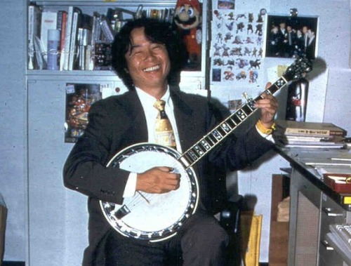
Shigeru Miyamoto was born on November 16, 1952, in the town of Sonobe in Kyoto, Japan, also where Nintendo started out. As a child, he loved exploring around his town, one day finally building up the courage to enter a nearby cave with a lantern—which like many of his other experiences, would later influence his video games, particularly the Legend of Zelda series. In addition to exploration, Shigeru enjoyed drawing, bicycling, and participating in puppet shows, since at the time he and his family did not have access to television or a car. However, via train, him and his family would occasionally visit the city of Kyoto to see Walt Disney films, being a big fan of their stories. Soon after obtaining a television, fascinated by Japanese animation, he picked up manga in middle school and became further obsessed with drawing going into high school. Upon moving further into Kyoto with his family, he knew his path in life was to be an artist of some sort. Shigeru attended Kanazawa Munici College of Industrial Art & Design, where he started a banjo band and performed in various venues with classmates, taking inspiration from the Beatles. It wasn’t until after 5 years, finally graduating with a Bachelor’s Degree in Industrial Art & Design that he would be proposed to work at Nintendo in 1977. At the time, the president of Nintendo was Hiroshi Yamauchi, coincidentally a friend of Shigeru’s father, which was how he landed an interview. Here, Shigeru would showcase his toy ideas, such as a three-way seesaw, a clock designed for use at amusement parks, and children’s clothes hangers with animal designs on them—all of which granted him to be hired as a Concept Artist for Nintendo! He liked the variety of products Nintendo developed, believing they would let him do what he wanted with more creativity, thus becoming one of Nintendo’s most important employees. One of Nintendo’s first video game series was the Color TV series, and Shigeru’s first project was overseeing the housing designs for Color TV Racing 112 and a Blockbuster Color TV game. Not a big fan of Color TV Game 6 and 15, he added a wheel in the racing game, making the hardware more accessible. Additionally, in Japan, Space Invaders was in demand, so he created character designs for a knock-off of the game called Space Fever. Seeing the popularity of such games, eventually came the Radar Scope in 1980, aimed to go beyond its predecessor titles. Shigeru believed that in entertainment, companies often chased the success of another by recreating similar products and adding more to them.
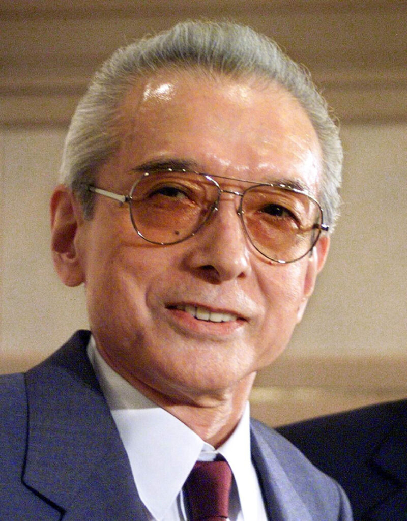

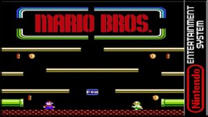
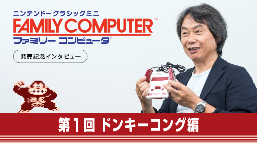
Furthermore, Nintendo was interested in the video game market for some time, despite some failures and a couple successes with their games, most being clones of other titles. They decided to branch out to North America, opening Nintendo of America in New York City, eventually expanding out to Seattle in Redmond, Washington as well. Nintendo’s next hit was the Radar Scope, which Shigeru was tasked with designing the casing of the arcade unit and other designs on the hardware. Only 1,000 units sold given it was an outdated game, so Minoru Arakawa, the president of the American branch, requested Nintendo to deliver. Though it was tough, Hiroshi betted on Shigeru to decide the fate of Nintendo of America, despite having no prior game design experience. However, Shigeru had a Nintendo veteran assist him in this weighted request, known as Gunpei Yokoi, who was knowledgeable in game design and created the Game & Watch franchise. Despite Shigeru’s love for maze games like Pac-Man and the overdone shooting/sports genres, he wanted something new and better, since he said, “The obvious objective of video games is to entertain people by surprising them with new experiences.” Gunpei taught him all that he knew and was to oversee the projects, providing his own input as well. Shigeru wondered why video games often had no plot, presenting mindless gameplay. He loved the Popeye films but was disappointed to see Nintendo could not obtain a license for creating a game on it, so he finally creates his own characters, his own Popeye. Olive would be replaced by Lady, later renamed Pauline, Brutus by Donkey Kong, and Popeye by Jumpman, later renamed Mario. His plot design consisted of gorilla, Donkey Kong, escaping Mario’s clutches, capturing his girlfriend Pauline, forcing Mario to climb to the top of a series of girders within a construction site. Many obstacles came as one climbed, like barrels and parkour, requiring Mario to use his jumping powers and hammer to proceed, later to reach the top and cause the platform to tumble down with Donkey Kong, finally rescuing Pauline—which was known as gaming’s first plot. Shigeru made this title one of the first to have multiple stages, elaborate cutscenes, and composed the soundtrack for it as well. The American branch was not pleased at first, but Hiroshi urged them to take a chance, replacing Radar Scope and placing Donkey Kong in two bars of the Seattle region for a short period. Nintendo saw each unit contained hundreds of dollars in quarters, so every Nintendo employee pitched in to remove the other two thousand Radar Scope units. It became such a hit that Nintendo could not keep up with demand, having to order thousands of more units, thus marking Shigeru Miyamoto’s first work as a designer to be the most successful venture for Nintendo in almost a hundred years! The success warranted a sequel, which Shigeru oversaw, creating Donkey Kong Jr., featuring Donkey Kong’s son, tasked with saving Donkey Kong from Mario’s caged prison, swinging through vines, and kicking Mario away. This eventually led to Donkey Kong 3 but did not sell well since it was not a platformer title like its predecessors. Finally, Shigeru decides to breathe more life into the Mario series, creating the platformer Mario Bros. title, adding a new character that was Mario’s brother, Luigi. An employee noted how alike they looked, so Shigeru designed them to be plumbers in the sewers of Brooklyn, New York, thwarting enemies of all sorts in various maps, providing a new multiplayer feature so two players could race to get the most coins and highest score. Moreover, this was an instant hit, which led to Hiroshi promoting Shigeru to control an entire gaming division that would lead him to become the most important video game developer in the world, following the release of their Famicom (Family Computer) console that released in 1983. Now, he had a team at his disposal and was to prove himself once more.

Now, Nintendo has clearly demonstrated that they meant business in the console market given the Color TV Games and, exclusively in Japan, their release of the world’s first commercial home video game console, the Magnavox Odyssey in 1972. It featured 28 games, like German American engineer Ralph Baer’s classic Pong game, also re-released in the Magnavox Odyssey 2 in 1978. Next, they would dive into the world of interchangeable cartridges with games that would focus on developing characters, exciting worlds, and stories. Although Shigeru did not direct every title, he had a strong, looming influence on all the developers who were employed by Nintendo. His first work for the Famicom in 1984 was Devil World, a Pac-Man-like game that released in select places due to its sensitive biblical themes. Following, Shigeru served as the role designer for one of the most successful games of all time, Excitebike. Although video games were booming in Japan, in America it was not the case after the fall of the Atari, an American video game developer, making them less popular. Console manufacturers quit making hardware, so arcades shut down across the country, making it Nintendo’s duty to save the world yet again. They re-released the Famicom as the Nintendo Entertainment System (NES) in 1985, given the Famicom had faulty chips that caused game-freezing issues. This time, the R.O.B. robot was included to interact with certain games, leading some to think it was a toy more than a console. However, what truly sold the console was the release of Super Mario Bros., the newest scrolling platformer that sold 40 million worldwide, featuring Luigi as player two, and the antagonist inclusion of Bowser—who became the most renown villain in the industry. Shigeru directed Super Mario Bros. 2 (also known as Super Mario Bros.: The Lost Levels) but did not release in Europe or America fearing it was too hard for Western players, but re-released in a bundle, Super Mario All-Stars, years later. Finally, Shigeru releases The Legend of Zelda, ported from the Famicom, inspired by notable events he experienced as a child. In this title, he took on the roles of director, producer, and designer, more than he’s ever worked on. Shigeru based this game with a philosophy he holds, saying, “When I create a game, I try to focus more on the emotions that the player experiences during the gameplay.”
He recalls how enjoyable it was to traverse an unknown city without a map, wondering what he may find at each corner, as well as the mazes and caves near his home as a child. Finding a lake, hiking, all these things brought him joy, so he believed it could be translated into a game for others to enjoy as well. Moving along, he was later involved with games like Doki Doki Panic, known as Super Mario Bros. 2 in America, which included the use of Mario, Luigi, Toad and Princess Peach—all with their own abilities and more interactive levels/bosses! Additionally, he was involved with the award-winning Ice Hockey, Zelda II: The Adventure of Link, and Mother, called Earthbound Beginnings in the west, but the major seller out of all these was Super Mario Bros. 3, still to this day considered one of the greatest standalone games in the whole series with its levels, bosses, and power-ups. All the stress he endured caused him terrible heart problems, but he would say that to create a new standard, one had to be up for the challenge and really enjoy it. Afterwards, Nintendo was ready to move on with the release of the Super Famicom, known as the Super Nintendo Entertainment System (SNES) in 1990.
To begin with, Nintendo wanted nine games to sell the Super Famicom with, so Shigeru and his team of 95 employees were tasked with that, and even though the Game Boy handheld console released in 1989, Shigeru would not produce a game for it until 1992. Super Mario World was the first game to be thoroughly worked on, a game produced by Shigeru but directed by Nintendo veteran Takashi Tezuka, who had been a key member in the development of the entire Mario Bros series. A game that took 16 people to make, alongside a memorable soundtrack composed by Koji Kondo, finally incorporates the character Yoshi, which only did not appear sooner due to technical limitations, was a green dinosaur that Mario could ride on and use to fend off enemies and pass obstacles with. Other grand series on the list were F-Zero and Pilotwings. These were all critically acclaimed, proving Shigeru’s adaptation to new console formats was feasible. Furthermore, he released another banger title, The Legend of Zelda: A Link to the Past, a game that has seen a remaster years later, which visits the roots of the first one, produced by Shigeru himself, in bird’s eye view perspective. The first title in the Mario Kart series also released in the SNES known as Super Mario Kart, one of the most influential because it used the console’s Mode 7 technology, giving the illusion of racing in a three-dimensional space, since he’d say our eyes, after all, see in 3D, and not like television, which is 2D. The colorful characters and weapons to use while racing became a blueprint for many racing titles known today, so it was majorly influential. Shigeru would emphasize— “I wanted to make something very unique, something very different.”
Then, he finally touched upon the Game Boy handheld console and produced Wave Race and The Legend of Zelda: Link’s Awakening, which also has a present-day remaster on the Nintendo Switch console. The Zelda games were always a hit because they were RPG games (Role-playing games), where you would collect a lot of items, use magic, and create new items from the collected items, a cool concept. Again, Shigeru was always trying to find a new way to keep players engaged, which is why he flourished. The next creation pushed the SNES to its limits, known as Star Fox, renowned for its polygonal graphics thanks to the Super FX chip, and being the first collaboration between an Eastern and Western developer. At first, he was unhappy with team Argonaut’s version, which wanted to flesh out pretty graphics but no underlying story, so Shigeru designed alongside Katsuya Eguchi the universe and story of Star Fox, creating characters he resonated with, like Fox McCloud, inspired from Japanese Shrine of Inari, dedicated to foxes. Inari is portrayed as being able to fly, which paved the way for Fox flying through space arches in space pods. The other characters, done by Takaya Imamura, were also inspired by animals and Japanese folklore, since Shigeru was tired of conventional superheroes and sci-fi robots. A bird, rabbit and toad were added, as well as dogs and monkeys as the Cornerian Army, referencing a Japanese expression about “fighting like dogs and monkeys”. Shigeru then created puppets for the cover art since he did love puppet shows, and this became one of Nintendo’s most loved series, and the dedication to plot and character design truly shows why. As a result, Shigeru would often say, “A delayed game is eventually good, but a rushed game is forever bad.” Moreover, the game did so well in Europe that Nintendo was able to open a branch there known as Nintendo of Europe.
At last, Shigeru was nearing the completion of the SNES, directing the release of Super Mario All-Stars for the SNES, which included a bundle of all the previous Super Mario Bros games with improved graphics and sounds. He then released Yoshi’s Safari with the light, over the shoulder gun, the Super Scope, to be used with the game, also including a 6-in-1 bundle. Following, was Kirby’s Adventure, his only credited Kirby title, and then going on to publish Donkey Kong ’94 on the Game Boy, and Stunt Race FX on the SNES. Shigeru also had a cool idea for the next Mario game, Super Mario World 2: Yoshi’s Island, where he instructed his team to create graphics that resembled pastel crayons, and this game was also in a way, the origin story for Yoshi, Mario, Luigi, and Bowser, with a beautiful soundtrack. Later, he releases the first Mario RPG game known as Super Mario RPG: Legend of the Seven Stars for the SNES, thus ending his career on both systems and now preparing for the next bigger console, the Nintendo 64, to release in 1996.
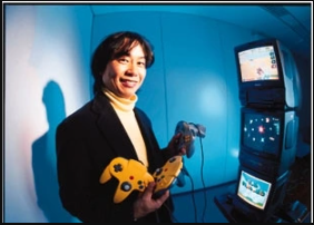
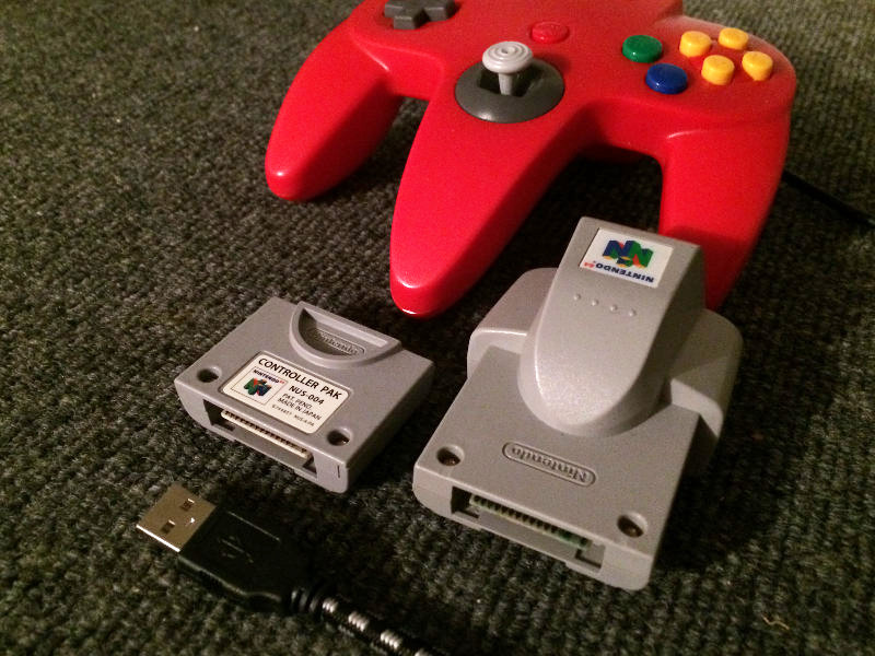
Now a producer, Shigeru did not expect to direct another Mario game, but with the release of the Nintendo 64, it needed a pivotal game to be attached with it, and that was Super Mario 64—the most legendary Mario game in existence, paving the way for how Mario games, and other 3D games, were developed in general. He had been producing concepts for the game for years but could only speculate just a while before its release, and having worked on polygonal shapes with Star Fox, he wanted to improve the way the graphics would look just like he did on the SNES, which took 5-6 years to complete from the game’s early conception. Upon release, the game sold millions, eventually delivering a whopping 11.91 million units sold worldwide, and to this day it is regarded as one of the most important video game titles of all time. Additionally, he released titles like Pilotwings 64, Mario Kart 64 (9.87 million units sold), Wave Race 64, Yoshi’s Story, and Star Fox 64 (4 million units sold), which included the major innovation known as the Rumble Pak, an attachment for the controller that provided vibrations for certain game actions. Shigeru has stated, “I don’t think as a creator that I could create an experience that truly feels interactive if you don’t have something like force feedback that you can feel from the controller.”
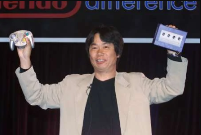
Shigeru only did the basic design and left his colleagues to finish the rest. Despite not being 100% satisfied, he felt they did an excellent job in using the Nintendo 64’s capabilities with it more than they did in Super Mario 64. At this same time, he became an inductee in the Academy of Interactive Arts and Sciences’ Hall of Fame. Afterwards, he worked on 1080 Snowboarding and F-Zero X, both great, but what would become the greatest, most critically acclaimed title for the Nintendo 64, was the release of The Legend of Zelda: Ocarina of Time, as it revolutionized video games. It was one of the earliest games with such a detailed development process, containing four co-directors for many segments with their own responsibilities that Shigeru would oversee, almost becoming the director of everything himself, but still remaining the producer. He produced the idea of the horse, the game’s most enchanting image, and allowing Link to ride the horse was amazing, alongside the captivating soundtrack. It did so well, that in 2000, the game earned a sequal called The Legend of Zelda: Majora’s Mask for the Nintendo 64, completely directed by Eiji Aonuma, a previous leader of its predecessor. And thus, the other titles we know and love released; Mario Party, Super Smash Bros., and Paper Mario. But alas, a new console awaits yet again… After all, Shigeru said “Nintendo’s philosophy is never to go the easy path; it’s always to challenge ourselves and try to do something new.”
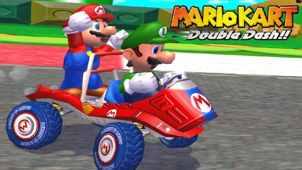
The years 2001-2004 were blooming and revolutionary in many ways. Nintendo wanted to ensure sales would continue to stay afloat for its next console, the Nintendo GameCube, originally known as Dolphin. Around this time, they also released the successor to the Game Boy Color, known as the Game Boy Advance. Shigeru designed Mario 128, a prototype game, to display the unique features the GameCube could perform, where 128 Marios dropped from the sky. This console was able to manage more graphic-heavy games. Shigeru started with the production of Pikmin, where one could control Captain Olimar and his army of Pikmin, with numbers going up to 100, with innovative gameplay, which would inspire future console real-time strategy games. Initially, it was meant to be a co-operated game called Adam and Eve, but instead we got Pikmin. Eventually, it would earn a sequal of Pikmin 2 in 2004. For the Game Boy Advance, Shigeru produced Super Mario Advance (a remastered version of Super Mario Bros. 2 and Mario Bros. platformer) and Mario Kart: Super Circuit, the successor to Super Mario Kart. The GameCube received titles that are still widely played to this day, like Luigi’s Mansion, Wave Race: Blue Storm, Super Smash Bros. Melee and Metroid Prime—which is one of the first 3D shooter Nintendo games to be featured in first person perspective, which required a lot of convincing for Retro Studios, who wanted it to be third person. It was the first Metroid game that mentioned Shigeru’s name in the credits and was a highly praised title. Moreover, in 2002, he released a fan-favorite, or what Nintendo referred to as “Player’s Choice” for their best titles, which was Super Mario Sunshine. He also worked on producing Super Mario Advance 3: Yoshi’s Island, a remastered version of Super Mario World 2, which released alongside Star Fox Adventures. The GameCube controllers had the rumble pak feature automatically installed into them, with much more rumble feedback for nearly all the titles, in almost any form imaginable, whether you’re spraying water with Mario’s utilities in Super Mario Sunshine, or using a speed boost in Mario Kart: Double Dash—one of the only racing games that allowed TWO people to operate a single vehicle; one shoots items, the other drives, and can rotate! Shigeru always asks himself, “When I am making video games today, I want people to be entertained. I am always thinking, how are people going to enjoy playing the games we are making today? And as long as I can enjoy something, other people can enjoy it, too.”
Shigeru Miyamoto is a great people person, always considering the consumer base, their most loyal fans, and catering to the younger generation, despite having games that are exceedingly popular with adults as well. He always believed adults are just kids deep down who are convinced they must behave like adults, and these video games exist to bring them back to a time of remembering and figuring things out, because anyone can enjoy video games. Many more big titles released, like The Legend of Zelda: The Wind Waker for GameCube, Paper Mario: The Thousand-Year Door, and Mario And Luigi: Superstar Saga for the Game Boy Advance, another revolutionary title that used two distinct characters in one solid, single player experience, and opening up the Mario universe to its very core, from characters to environments, music and sound/voice effects.
Finally, we reach Shigeru Miyamoto’s booming years of 2004 to present day. Firstly, the Game Boy franchise was nearing its end, and the successor was revealed: the Nintendo DS, which was a handheld console with two screens and stylus to interact with both screens for nearly every Nintendo DS game to exist. This also featured a bottom compartment that allowed for the use of Game Boy Advance games, because Nintendo knows how much those games stuck to adoring fans. Additionally, this even had a microphone, which worked with games like Nintendogs franchise, allowing you to call your pets to you and having them recognize your voice. Truly, this console was ahead of its time. Shigeru worked with the hardware developers and served as producer on its primary launch title, Super Mario 64 DS, a remastered version of Super Mario 64 that included Luigi, Yoshi, and a new character, Wario, all with their own unique abilities, power-ups, and exclusive levels and minigames, all packed into one tiny cartridge! Nintendo ensured Shigeru oversaw this console as they wanted him to feel good about it so it could reflect on the games he would produce, seeing how his magic sparked when he fully endorsed something—as Shigeru would be at the helm of these triple-A titles. Other consoles followed, like the Nintendo Wii and the Nintendo Wii U. Shigeru produced titles that would be ported from the GameCube as well, like The Legend of Zelda: Twilight Princess, where Link could turn into a wolf and had assistance from a female creature with powers named Midna.
Shigeru was known to immediately rearrange things in discussions if he deemed something would not fit the title being worked on, in a considerate manner. The release of The Legend of Zelda: Twilight Princess was delayed due to all the amazing ideas put on the table, which made him relieved because he always believed a late game is better than a rushed, bad game, as stated earlier. This decision earned the game many awards when it later released. To this day, that game is still constantly being talked about. Furthermore, he supervised Super Paper Mario, Mario Strikers: Charged, and Super Mario Galaxy—a game with a phenomenal soundtrack, surreal worlds and a beautiful, touching story full of well-developed characters. Shigeru, for years, had wanted to experiment with gravity and spheres, but director Yoshiaki Koizumi and then Nintendo president Satoru Iwata did not understand, until seeing the prototype. He welcomed any innovative ideas that altered the Mario formula, because he knew this was perfect for the theme, and upon release it became one of the best rated games of the year and to date is the third highest rated video game of all time. Then, came other titles like Mario Kart Wii, Wii Fit, a fitness-centered game that let people be widely interactive with their environment and the game, and Super Smash Bros. Brawl. Shigeru Miyamoto is always involved with every new software Nintendo publishes. Unfortunately, Satoru passed away in 2015, which led Shigeru Miyamoto and Genyo Takeda to take the positions of co-presidents in the interim period before the selection of the next president. He has since made some appearances, like in the release of the environmentally interactive mobile game, Pokemon GO. Following September 16, 2015, he was given the position of Creative Fellow at Nintendo. Now, he is in more of a supervisory role to video game development, as he is overseeing new venues for Nintendo, like the upcoming Super Mario Bros. Movie, and the collaboration of Universal Studios for the creation of the Super Nintendo World line of theme parks in Japan. To sum things up, that is the biography of elite game designer, Shigeru Miyamoto!
In conclusion, video games are a work of art, and to put it simply, they are a compilation of poetry, music, storytelling, and visuals. It is no surprise that this is the path video game designer and artist Shigeru Miyamoto chose, as he is often regarded as a movie director in the form of video games for his exceptional use of story, visuals, and character design. But Shigeru says, “Our job as the game creators or developers – the programmers, artists, and whatnot – is that we have to kind of put ourselves in the user’s shoes. We try to see what they’re seeing, and then make it, and support what we think they might think.”
For Shigeru, it is about assessing all the capabilities of the available technology at his disposal, going further as to find out, is it fun? Does it work? Will it satisfy Nintendo players? He never thinks about the result or benefits, but rather a clear, well-established theme, how it will make the players feel, how he can place himself in their shoes, and how he can be unique, different and go about bringing new experiences. His mind is always moving forward and trying something else, which his why he is without a doubt, the Stan Lee and Walt Disney of video games. Ladies and gentlemen… Shigeru Miyamoto!
WORKS CITED
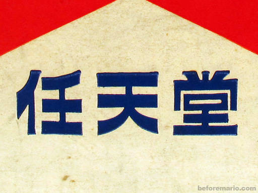
Nintendo is a multinational Japanese video game and consumer electronics company, originating in Kyoto, Japan. It was founded in 1889 by Fusajiro Yamauchi, and in present day 2022, it ranks #12 in Japan’s top, largest-leading companies with a whopping $59.9 billion revenue. Initially, it started out as a premium playing cards publisher, later joining in on the era of electronic toys and video games. Nintendo started out as “Nintendo Koppai”, the Japanese name of “Nintendou”, which in translation goes by 任 (Nin: entrusted), 天 (ten) and 堂 (dō: heaven); basically phrasing “leave luck to heaven”. The 1889 logo was a horizontally stretched rectangle in light-cream shade with blue, bold Japanese Kanji lettering in the bottom line of the badge—a simple, yet bright insignia, which would be placed directly on the card packs until 1950. Much goes into consideration when designing a logo, what compliments it, as well as typeface and color changes, all of which will be observed with detail in the company’s development over the years. It is key to consider many elements in the making of a logo and branding of a company, since “A logo is not a brand… A brand incorporates every interaction with consumers and every marketing practice that differentiates your business, product or service from another.”, (Melissa Sorini). Such elements consist of visual design, marketing, communications, and messaging, all of which make up the consumer experience with a given business, just like Nintendo.
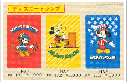
In 1950, Sekiryo Yamauchi is succeeded by his grandson, Hiroshi Yamauchi, who renames the company as Nintendo Playing Card Co. Ltd upon seeing years of success in the sales of Hanafuda playing cards, which people were able to play a multitude of games with, like Koi-Koi, a game translating to “come on”, which was played by forming special card combinations called Yaku (a term for bonus) from accumulations of point piles, either through matching cards, drawing, or with the cards on table. The cards used to be very high in quality, that the company had to make them cheaper to sell replacements, renew decks and keep a large consumer base, like in Osaka, where the demand for card games were high. Moreover, Hiroshi makes two very important trips, firstly to the United States Playing Card Company in1956, which was the largest card making company in the world at the time, where he hoped to find alternatives for enlarging Nintendo. The second trip in 1959, being The Walt Disney Company, was where proposals of publishing Disney characters like the princesses and Mickey Mouse on their hanafuda cards were negotiated, which led Hiroshi to return home with one of the most beneficial licenses in the entire world. Even today, Nintendo and Disney maintain a good standing, as present-day video games like Kingdom Hearts include Disney characters Donald, Goofy and Mickey in popular Nintendo game franchises.
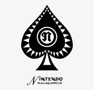
Additionally, it is then from 1950-1960 where we see a new logo of Nintendo unfold, one with the black Ace of Spades emblem on a new monochrome badge, placed above the wordmark, then written in English. All of this is complimented by a light gray triangular pattern and have a double circle stylized with a lowercase “N” right in the middle, thus moving away from hieroglyphics to the Latin alphabet, followed by an Old-Style Serif lowercase “N” in the center, and lastly at the bottom a clear, Sans Serif typeface. The font used, Pretendo, has since then stayed the same. Playing cards used to be illegal in Japan and used for gambling, but now with the legality of playing cards and the licensing of Disney, Nintendo had a new, younger target audience, which they created books with game explanations for the playing cards to be sold with. More ventures soon came, like a taxi company, a short stay hotel chain, instant rice food and more, but the one that would mostly succeed and put them on the radar—was the toy making chain, among others.
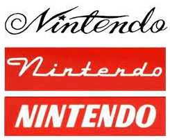
Throughout the 60s, Nintendo was staying afloat in the toy industry, despite previous financial struggles. It was thanks to the hiring of maintenance engineer Gunpei Yokoi in 1965, who’s mechanical extending arm invention caught the eye of Hiroshi, urging him to ask Gunpei to develop the Ultra Hand in 1966 as a proper product, released just in time for Christmas. Fun fact, this product eventually got a video game called “Grill-Off with Ultra Hand!”, released as an arcade game on the Nintendo Wii console and appears in other franchises. Present-day makings of Nintendo clearly call upon their original roots. Gunpei, now in product development, made more electronic toys, like the Love Tester, which at the time was amazing for Nintendo since they were one of few companies developing toys, so they could charge more and increase profits. Furthermore, from the years 1964-1970, the logo underwent various changes; all in design, typeface, and color. In 1960, the company started branding itself using simple, cursive logotype as the only source of its visual identity, paired with elegant and sleek inscription of black, along with curved, elongated letter lines. The cursive was a creative take in a dominant, sans serif world. Then, in 1964, the logo was stylized in white inscription upon a scarlet red background, with the title case inscription having all the letters connected on their bottom line. Additionally, it had a bold, italicized version in a rounded sans serif typeface, written solidly black—all of which made the big letters look delicate. Following 1965 and 1966, the logo adopts a stylized monogram enclosed in a thin, circular frame with a red and white color palette, becoming the brand’s signifiers. By this point, Nintendo is clearly experimenting with color, realizing that it has a psychological effect on consumers, going further into its effect on emotions, values, and recognition.

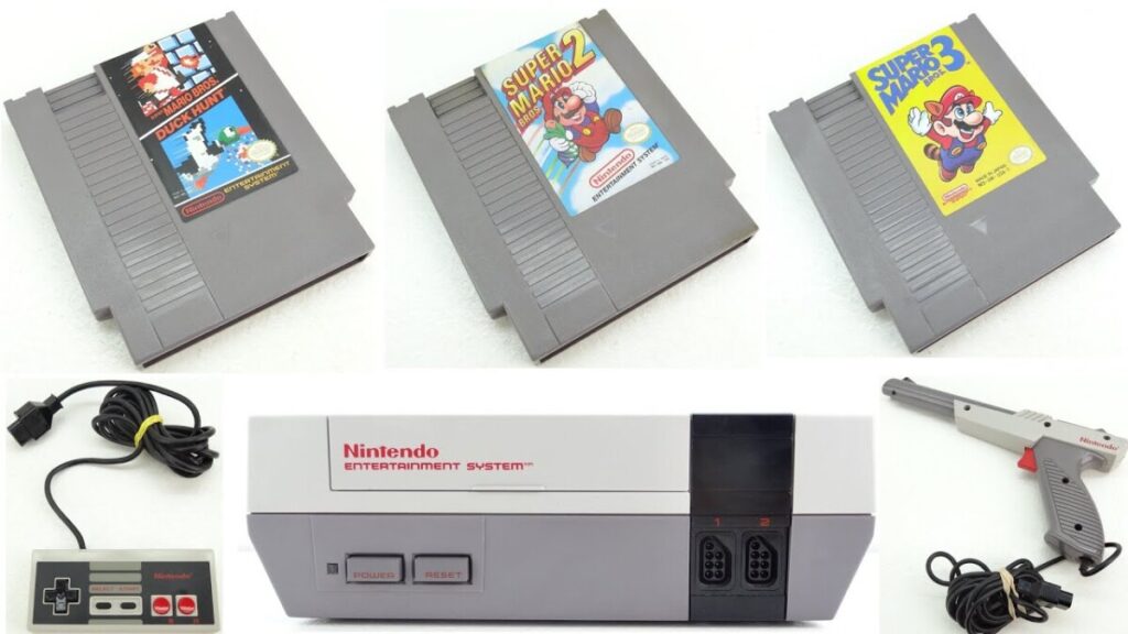
Finally, Nintendo begins to take interest in the popularity of video games. They first secured the rights to distribute the Magnavox Odyssey, which released in Japan in 1972, becoming the world’s first commercial home video game console. It is the famous console that included German American engineer Ralph Baer’s game of Pong, which was simply two controllable lines on the left and right of the screen that bounced a ball across, until it passes through the line of either player. It did not stop there, as they then decided to develop their own games for home and arcades, following up with the release of EVR Race in 1975, a basic mechanical horse racing betting game, designed by Genyo Takeda. Then, the company started experimenting with handheld electronic devices, creating the Game & Watch device in 1980, a predecessor of the Game Boy, also made by Gunpei Yokoi, which would release later in 1989. The handheld had its title placed below the screen in Gill Sans Bold Italic font, with some line tracking and width/height stretching. It is insane to imagine games that were played in arcades, like Pac-Man, would eventually release on such a small, handheld game console. It is also worth noting Shigeru Miyamoto, a rising rock star in the gaming industry, who created the famous Donkey Kong arcade game and is the creator of Mario—who also first appeared in the Donkey Kong game, serving as a “Popeye-like” protagonist in rescue of the princess that Donkey Kong captures, throwing barrels for Mario to avoid on his way up. In 1983, the realm of consoles was a deep exploration for Nintendo, as they released the Famicom (Family Computer), later re-released in 1985 as the Nintendo Entertainment System (NES) due to faulty chips causing game-freezing issues in the original Famicom. The NES was released in the United States as well, which consisted of much better games than its predecessor had, like the renown Super Mario Bros—a game that truly needs no introduction, as it was a huge milestone that would later lead, going into present day video game sales.

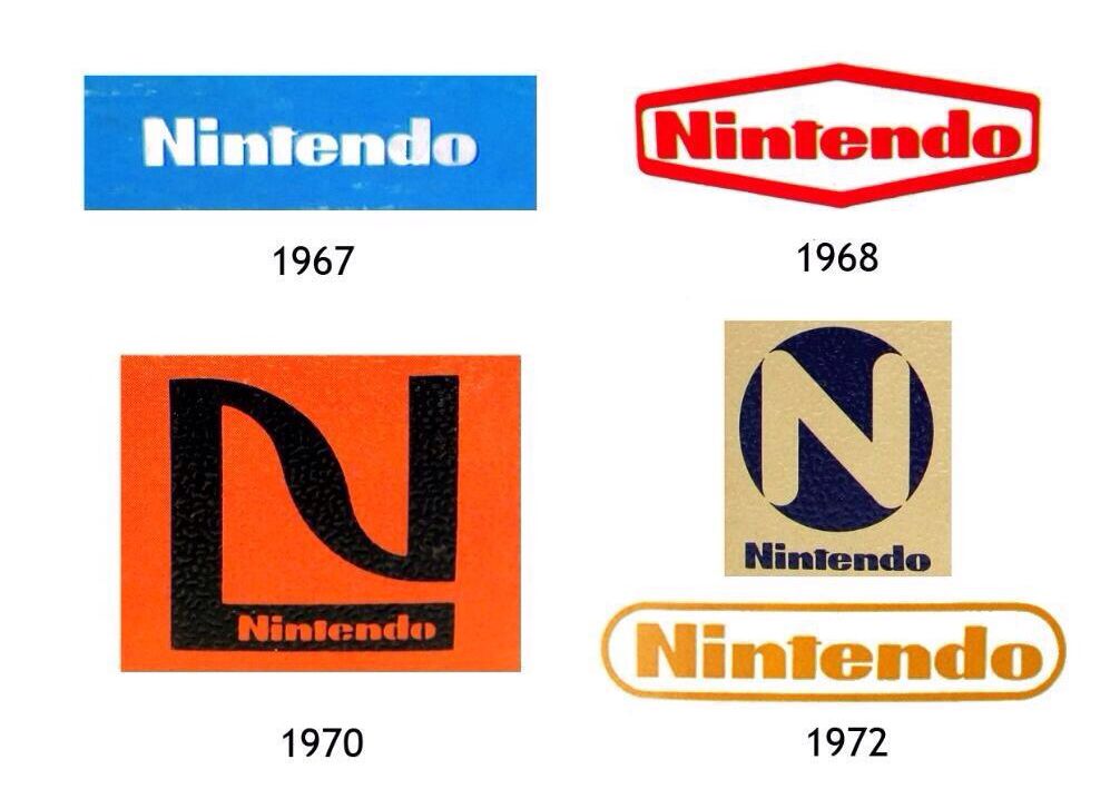
While the company was trying out the video game industry, their logos changed a handful of times from 1967 to 1982. The 1967 redesign is much like the one seen today, utilizing a bold inscription with the “N” capitalized in a modified, extra-bold sans serif Helvetica Condensed Black typeface and Pretendo font that had square shapes of the letters, and straight cuts in a blue, square background. It is placed in a white hexagonal badge with a distinctive red outline, thus having the brighter shade of red make the image appear more passionate and vivid. The logos used in 1968-1979 featured a rounded, monochrome inscription in two levels, having “Nintendo” enlarged on top, and “Company” under it in other versions, with smaller and more rounded letters. The 1970-1972 versions are like the “NG” from the 60s, enclosing the “N” in a square, one with “Nintendo” written on the bottom right part of the “N” in black, which is over an orange background to color in the “Nintendo” part. The 1972 version was a golden box with a black circle that had a sans serif “N” inside it, and “Nintendo” written under it in black. The “N” was the background’s color and the letter’s edges blended into the background. Surprisingly, in 1973 the company decided to introduce the brand name in Japanese, the second non-English version of the badge in its history, which was in a monochrome inscription with bold lines and rounded angles, with the text being black and the background as light blue. Most of these were preliminary logos that eventually would pave way to the 1975-1983 logos that are still in use today. This logotype was refined in 1976 with a monochrome version written in black and executed in a title case of modern sans serif typeface, with clean contours of the letters that included bold, confident lines. It is often used in copyright notices, Game Boy boot up screens and its corporate headquarters in Kyoto, being the sole logo until 1977. Then, the logo reached its final form in 1982, utilizing the 1975 logo of “Nintendo”, but placed into a horizontally stretched rectangular frame with rounded angles, used with thinner letters and a stricter color palette that was all black.
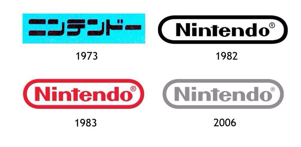
Finally, in 1983-2008, the wordmark is a little bolder with the rectangle fitting tighter around the text; the border and the text being a scarlet red color with the copyright symbol at the end. In 2006, it was silver with a smaller copyright symbol, to debut with the release of the Nintendo Wii console, which is still used in trailers, games, and some game cartridges, as well as some of their social media platforms. This combination looked professional, stable, and evoked a sense of reliability and loyalty of the company to its customers. For 2016 going until present day, the logo phased out the gray variant and reintroduced the red color as a background against the white variant of its logo, mirroring the Nintendo Switch branding, where the logo is normally within a red box. It was also used in their Nintendo 3DS console and Amiibo products. This logo presents a stylish, confident, and progressive feel on the company regarding its consumer base, furthering the loyalty Nintendo has with them and vice versa. Overall, it has a hi-fi nature and sports a simple, yet attractive logo design that immediately brings the company’s illustrative creations to mind. It compliments their image amongst their competitors and followers, and it is evident that the secret behind their success could very well be their use of an expressive, simple logo that is both intelligent and precise—just like that of their video games!
To conclude, it is necessary to ask, well what does it all mean? The success of a brand is driven by an intelligent logo design, but it does not end there. A straightforward logotype helped Nintendo establish its name and enhance customer loyalty, hence why although they changed the styling of the logo a few times, they ultimately kept the same logo variations, and people often remember the logo the same way, with those variations as well. Famous Logos states that Nintendo’s logo appears in a simple, pulsating manner, and “It is a logo that is equally popular among children, teenagers, adults and the elderly … known for some of the most popular video games on the planet. Color of the Nintendo Logo … is red which is due to its high visibility and attraction factors. It reflects the company’s vivacity and passion for quality entertainment. A tint of red leaves behind a legacy on the player and reminds the person of the good time he/she had while engaged to the Nintendo.”
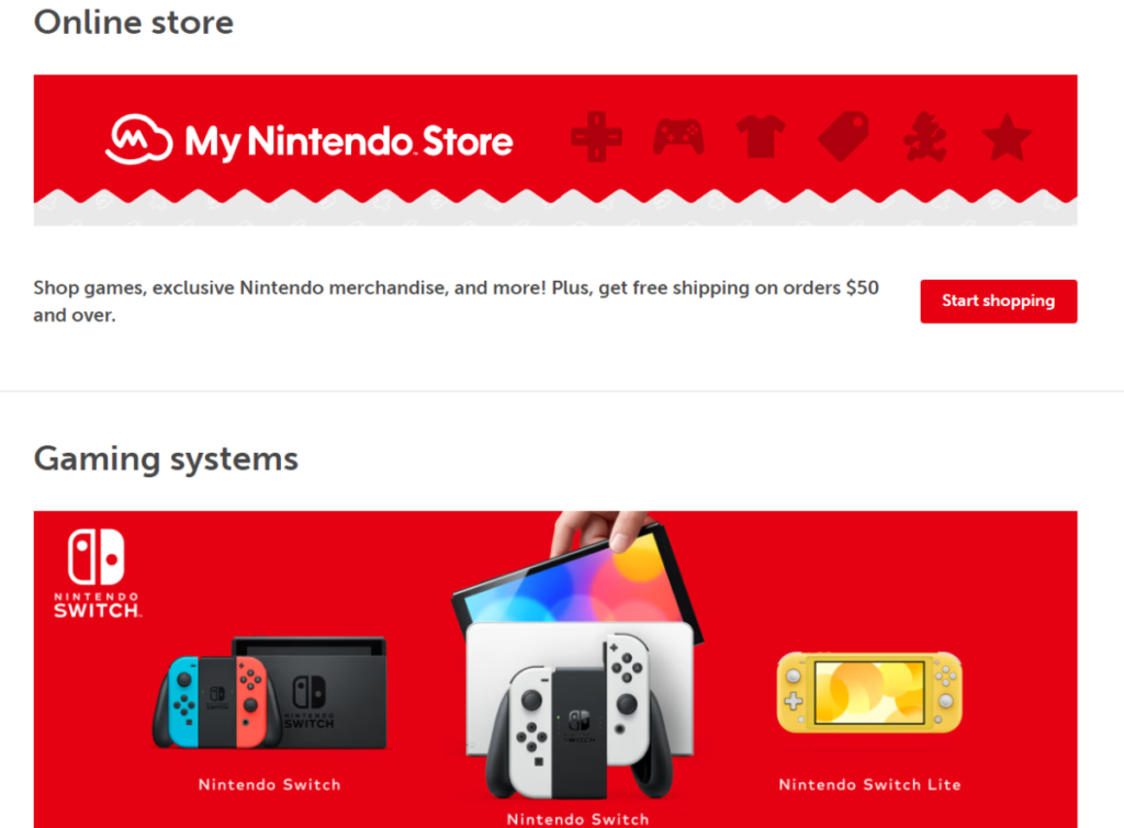
Essentially, this goes to show that color plays an important role in logos and branding. Colors help a brand connect with consumers on a deeper, psychological level, selecting the emotions and associations to evoke within the design—it sets the mood and grabs the attention. The image above is from the Nintendo website, another perfect example of branding, as the colors and typography all speak for themselves when taking into consideration the above information; great color vibrancy, simple logo designs (Nintendo Switch), and the distinction of things with their use of typography. Typography provides a direction to the voice and message of a logo, directly influencing the audience and inducing the right, necessary emotions from both readers and viewers. In websites, it establishes strong visual hierarchy, graphic balance, and sets the tone of a product. As a result, Nintendo has an effective logo and the company’s history with it shows why it continues to remain one of the most profound, impactful, and well-established brands in Japan and the rest of the world.
Works Cited
Blog RSS, https://www.famouslogos.us/nintendo-logo/.

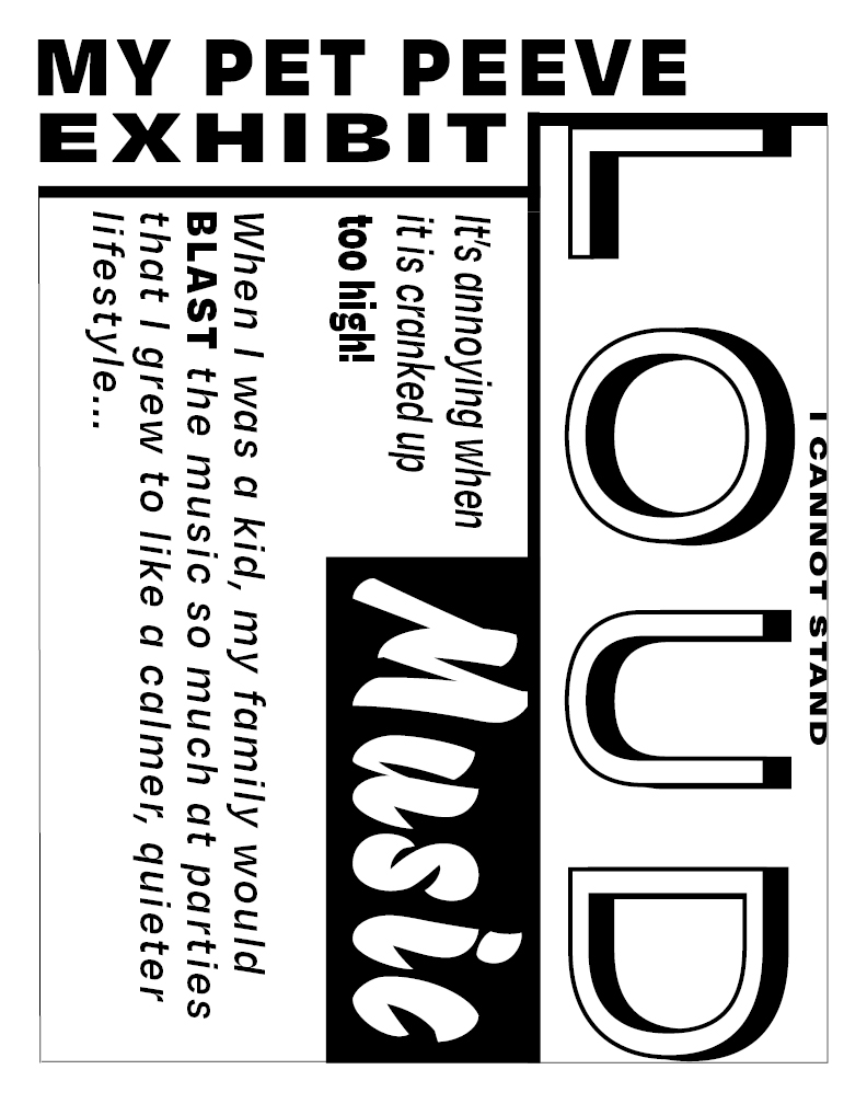
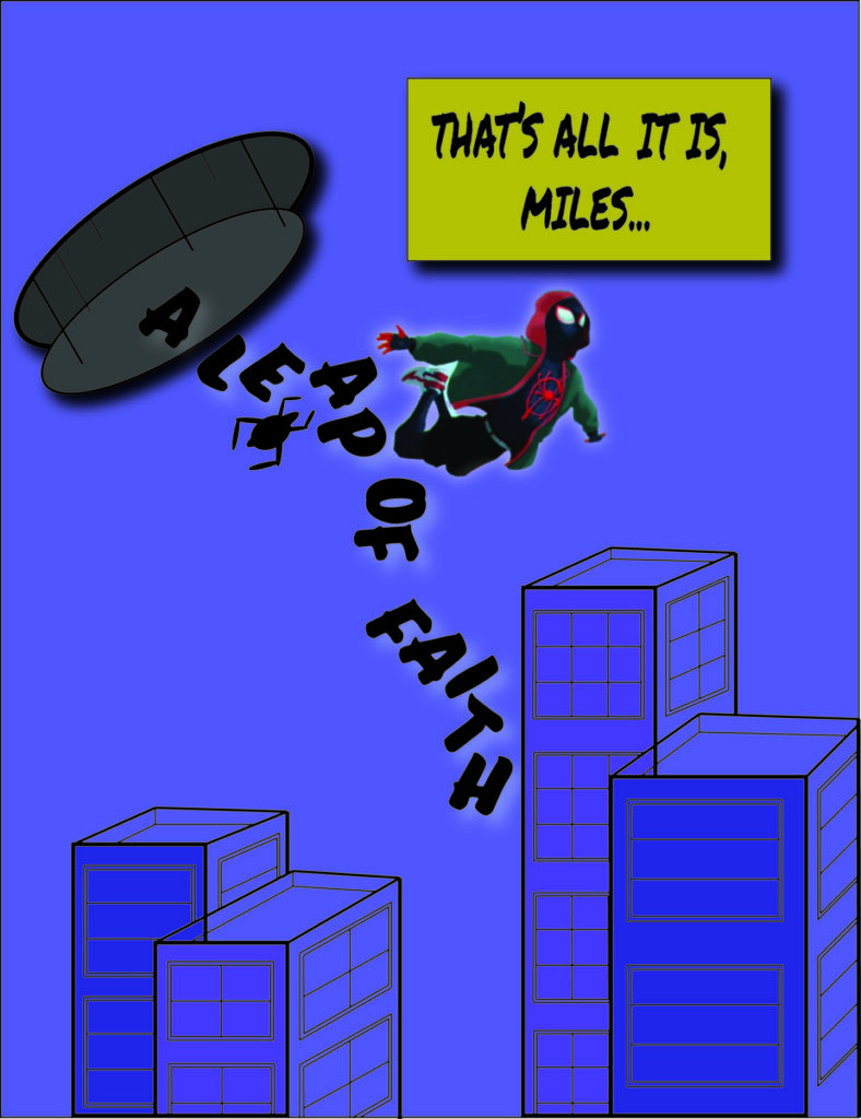
For this project, the goal was to choose a quote from any literary work, whether that is a saying, quote from a book, or from a movie to be developed in three phases. Two phases included typography elements, as well as line art, whereas the third involved photographic images. For this project, I chose a quote from the movie “Into the Spider-Verse” that comes up throughout the movie, but emphasized at the end, when Miles Morales has to trust himself with his newfound powers in becoming the next Spider-Man in his universe. Peter B. Parker (Spider-Man) tells him “That’s all it is, Miles… A leap of faith.“, and that is the quote I chose because it rings bells for me, metaphorically. I started off with two concepts done in sketches.
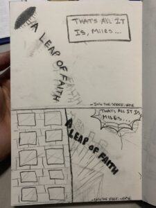
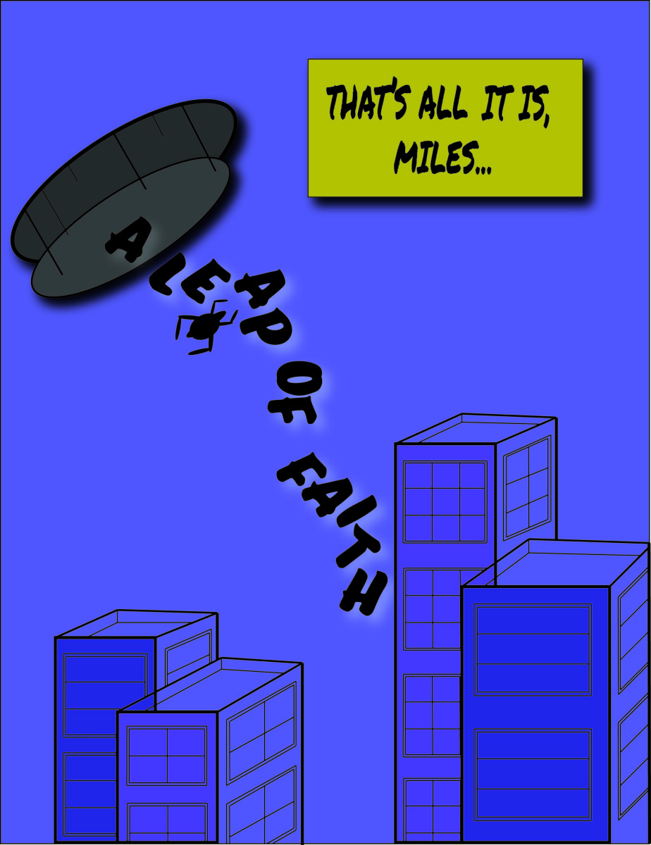
In the movie, multiple variants of Spider-Man are brought into Miles’ universe, hence the first sketch showing “A LEAP OF FAITH” dropping out of a portal.
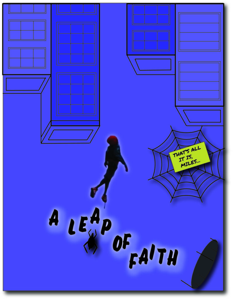
For the second sketch, I wanted to give it more of a Spider-Man kind of feel, so I drew a building with “A LEAP OF FAITH” literally leaping out, while the first part is stuck in a web. I was trying to give life to the quote, while sticking to its theme. Sans-Serif typefaces were used, since they resembled comic book font the best to me, as this movie is based on the Marvel comics of Spider-Man.
To start off, the first concept sets the background, tone and scene without any images, all done in Adobe Illustrator. The portal represents the variants of Spider-Man dropping into the universe. The buildings, made with shapes and lines, emphasize Miles’ leap of faith, as he jumps into his new path of a life as a superhero, believing he is ready. Originally, the buildings did not have lines to detail them. I obtained Sans-Serif typefaces from Adobe Fonts; Permanent Marker Pro for the yellow text box and Eds Market Bold Slant for the portal text because they both resemble comic book fonts, which is also why I chose yellow for the text box, commonly used in comics. Tones of purple and blue were used for the background colors, as these were the main colors used in the movie and comics. The Spider is pieced in to add more elements of the Spider-Man series, also done in a way that references the scene at night when Miles takes his leap of faith.
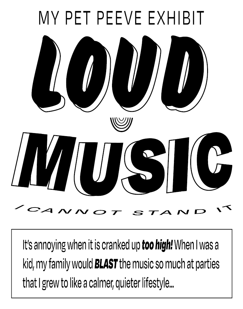
Moving along, the second concept imitates a wallpaper moments after Miles has taken his leap and is falling into the buildings, forced to call upon his powers to web swing. The web was added to further the theme of Spider-Man, since Miles was bitten by a radioactive spider and can shoot webs of his own. I stuck the text box to the web (done with illustrator) in a falling angle, as this is the moment where Miles believes in himself and sticks a web to a building, trusting his powers. His perspective is upside down, showing us what he sees after the leap. This likely is what the other Spider-Men saw when the portal shot them into Miles’ universe, moments after Kingpin caused a ripple in time, bringing them in, and thus falling the same way. Originally, Miles was drawn with shapes, but with Adobe Photoshop, I added him in from the wallpaper I referenced. He glows with the leap of faith text since that is what he just did.
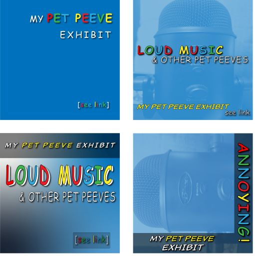
Lastly, the third concept dives further into photoshop, providing a higher resolution cut-out of Miles, taking a more confident, angled leap from the text, diving straight into the buildings with style. I styled this one to be more like a comic book cover art, and if Marvel wants to sponsor me they surely can, haha. This is my favorite one; the finished product of the first two. The surrounding theme of this visually enhanced quote is that we are ready to take the leap– that leap into the unknown, to discover what we really are about. Like Miles, I had to believe in my intuition, I had to believe in myself. We must take our leap of faith into the skies, into our future, and go on swinging… Because with great power, comes great responsibility!

Nulla quis lorem ut libero malesuada feugiat. Curabitur non nulla sit amet nisl tempus convallis quis ac lectus. Quisque velit nisi, pretium ut lacinia in, elementum id enim. Nulla porttitor accumsan tincidunt.
Donec rutrum congue leo eget malesuada. Curabitur non nulla sit amet nisl tempus convallis quis ac lectus. Curabitur aliquet quam id dui posuere blandit. Quisque velit nisi, pretium ut lacinia in, elementum id enim. Quisque velit nisi, pretium ut lacinia in, elementum id enim. Nulla porttitor accumsan tincidunt. Vivamus magna justo, lacinia eget consectetur sed, convallis at tellus. Vivamus suscipit tortor eget felis porttitor volutpat. Mauris blandit aliquet elit, eget tincidunt nibh pulvinar a. Vestibulum ac diam sit amet quam vehicula elementum sed sit amet dui.
The OpenLab is an open-source, digital platform designed to support teaching and learning at City Tech (New York City College of Technology), and to promote student and faculty engagement in the intellectual and social life of the college community.

