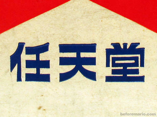
Nintendo is a multinational Japanese video game and consumer electronics company, originating in Kyoto, Japan. It was founded in 1889 by Fusajiro Yamauchi, and in present day 2022, it ranks #12 in Japan’s top, largest-leading companies with a whopping $59.9 billion revenue. Initially, it started out as a premium playing cards publisher, later joining in on the era of electronic toys and video games. Nintendo started out as “Nintendo Koppai”, the Japanese name of “Nintendou”, which in translation goes by 任 (Nin: entrusted), 天 (ten) and 堂 (dō: heaven); basically phrasing “leave luck to heaven”. The 1889 logo was a horizontally stretched rectangle in light-cream shade with blue, bold Japanese Kanji lettering in the bottom line of the badge—a simple, yet bright insignia, which would be placed directly on the card packs until 1950. Much goes into consideration when designing a logo, what compliments it, as well as typeface and color changes, all of which will be observed with detail in the company’s development over the years. It is key to consider many elements in the making of a logo and branding of a company, since “A logo is not a brand… A brand incorporates every interaction with consumers and every marketing practice that differentiates your business, product or service from another.”, (Melissa Sorini). Such elements consist of visual design, marketing, communications, and messaging, all of which make up the consumer experience with a given business, just like Nintendo.
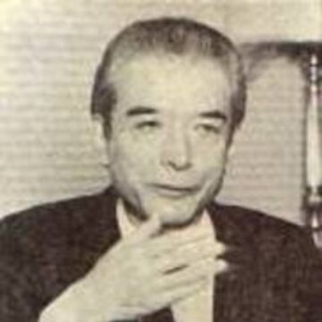
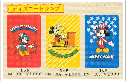
In 1950, Sekiryo Yamauchi is succeeded by his grandson, Hiroshi Yamauchi, who renames the company as Nintendo Playing Card Co. Ltd upon seeing years of success in the sales of Hanafuda playing cards, which people were able to play a multitude of games with, like Koi-Koi, a game translating to “come on”, which was played by forming special card combinations called Yaku (a term for bonus) from accumulations of point piles, either through matching cards, drawing, or with the cards on table. The cards used to be very high in quality, that the company had to make them cheaper to sell replacements, renew decks and keep a large consumer base, like in Osaka, where the demand for card games were high. Moreover, Hiroshi makes two very important trips, firstly to the United States Playing Card Company in1956, which was the largest card making company in the world at the time, where he hoped to find alternatives for enlarging Nintendo. The second trip in 1959, being The Walt Disney Company, was where proposals of publishing Disney characters like the princesses and Mickey Mouse on their hanafuda cards were negotiated, which led Hiroshi to return home with one of the most beneficial licenses in the entire world. Even today, Nintendo and Disney maintain a good standing, as present-day video games like Kingdom Hearts include Disney characters Donald, Goofy and Mickey in popular Nintendo game franchises.
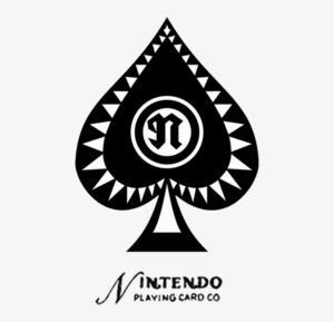
Additionally, it is then from 1950-1960 where we see a new logo of Nintendo unfold, one with the black Ace of Spades emblem on a new monochrome badge, placed above the wordmark, then written in English. All of this is complimented by a light gray triangular pattern and have a double circle stylized with a lowercase “N” right in the middle, thus moving away from hieroglyphics to the Latin alphabet, followed by an Old-Style Serif lowercase “N” in the center, and lastly at the bottom a clear, Sans Serif typeface. The font used, Pretendo, has since then stayed the same. Playing cards used to be illegal in Japan and used for gambling, but now with the legality of playing cards and the licensing of Disney, Nintendo had a new, younger target audience, which they created books with game explanations for the playing cards to be sold with. More ventures soon came, like a taxi company, a short stay hotel chain, instant rice food and more, but the one that would mostly succeed and put them on the radar—was the toy making chain, among others.
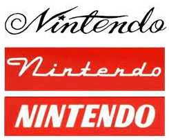
Throughout the 60s, Nintendo was staying afloat in the toy industry, despite previous financial struggles. It was thanks to the hiring of maintenance engineer Gunpei Yokoi in 1965, who’s mechanical extending arm invention caught the eye of Hiroshi, urging him to ask Gunpei to develop the Ultra Hand in 1966 as a proper product, released just in time for Christmas. Fun fact, this product eventually got a video game called “Grill-Off with Ultra Hand!”, released as an arcade game on the Nintendo Wii console and appears in other franchises. Present-day makings of Nintendo clearly call upon their original roots. Gunpei, now in product development, made more electronic toys, like the Love Tester, which at the time was amazing for Nintendo since they were one of few companies developing toys, so they could charge more and increase profits. Furthermore, from the years 1964-1970, the logo underwent various changes; all in design, typeface, and color. In 1960, the company started branding itself using simple, cursive logotype as the only source of its visual identity, paired with elegant and sleek inscription of black, along with curved, elongated letter lines. The cursive was a creative take in a dominant, sans serif world. Then, in 1964, the logo was stylized in white inscription upon a scarlet red background, with the title case inscription having all the letters connected on their bottom line. Additionally, it had a bold, italicized version in a rounded sans serif typeface, written solidly black—all of which made the big letters look delicate. Following 1965 and 1966, the logo adopts a stylized monogram enclosed in a thin, circular frame with a red and white color palette, becoming the brand’s signifiers. By this point, Nintendo is clearly experimenting with color, realizing that it has a psychological effect on consumers, going further into its effect on emotions, values, and recognition.

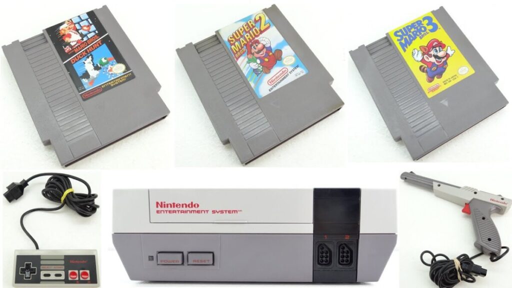
Finally, Nintendo begins to take interest in the popularity of video games. They first secured the rights to distribute the Magnavox Odyssey, which released in Japan in 1972, becoming the world’s first commercial home video game console. It is the famous console that included German American engineer Ralph Baer’s game of Pong, which was simply two controllable lines on the left and right of the screen that bounced a ball across, until it passes through the line of either player. It did not stop there, as they then decided to develop their own games for home and arcades, following up with the release of EVR Race in 1975, a basic mechanical horse racing betting game, designed by Genyo Takeda. Then, the company started experimenting with handheld electronic devices, creating the Game & Watch device in 1980, a predecessor of the Game Boy, also made by Gunpei Yokoi, which would release later in 1989. The handheld had its title placed below the screen in Gill Sans Bold Italic font, with some line tracking and width/height stretching. It is insane to imagine games that were played in arcades, like Pac-Man, would eventually release on such a small, handheld game console. It is also worth noting Shigeru Miyamoto, a rising rock star in the gaming industry, who created the famous Donkey Kong arcade game and is the creator of Mario—who also first appeared in the Donkey Kong game, serving as a “Popeye-like” protagonist in rescue of the princess that Donkey Kong captures, throwing barrels for Mario to avoid on his way up. In 1983, the realm of consoles was a deep exploration for Nintendo, as they released the Famicom (Family Computer), later re-released in 1985 as the Nintendo Entertainment System (NES) due to faulty chips causing game-freezing issues in the original Famicom. The NES was released in the United States as well, which consisted of much better games than its predecessor had, like the renown Super Mario Bros—a game that truly needs no introduction, as it was a huge milestone that would later lead, going into present day video game sales.

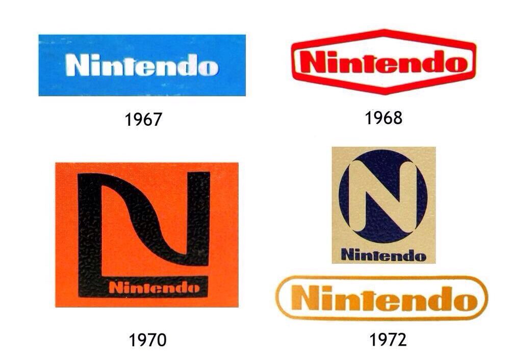
While the company was trying out the video game industry, their logos changed a handful of times from 1967 to 1982. The 1967 redesign is much like the one seen today, utilizing a bold inscription with the “N” capitalized in a modified, extra-bold sans serif Helvetica Condensed Black typeface and Pretendo font that had square shapes of the letters, and straight cuts in a blue, square background. It is placed in a white hexagonal badge with a distinctive red outline, thus having the brighter shade of red make the image appear more passionate and vivid. The logos used in 1968-1979 featured a rounded, monochrome inscription in two levels, having “Nintendo” enlarged on top, and “Company” under it in other versions, with smaller and more rounded letters. The 1970-1972 versions are like the “NG” from the 60s, enclosing the “N” in a square, one with “Nintendo” written on the bottom right part of the “N” in black, which is over an orange background to color in the “Nintendo” part. The 1972 version was a golden box with a black circle that had a sans serif “N” inside it, and “Nintendo” written under it in black. The “N” was the background’s color and the letter’s edges blended into the background. Surprisingly, in 1973 the company decided to introduce the brand name in Japanese, the second non-English version of the badge in its history, which was in a monochrome inscription with bold lines and rounded angles, with the text being black and the background as light blue. Most of these were preliminary logos that eventually would pave way to the 1975-1983 logos that are still in use today. This logotype was refined in 1976 with a monochrome version written in black and executed in a title case of modern sans serif typeface, with clean contours of the letters that included bold, confident lines. It is often used in copyright notices, Game Boy boot up screens and its corporate headquarters in Kyoto, being the sole logo until 1977. Then, the logo reached its final form in 1982, utilizing the 1975 logo of “Nintendo”, but placed into a horizontally stretched rectangular frame with rounded angles, used with thinner letters and a stricter color palette that was all black.
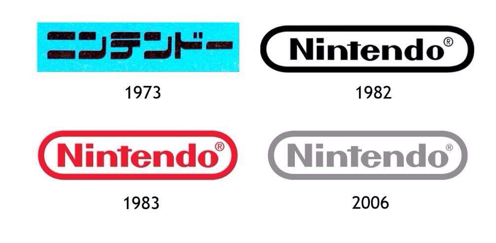
Finally, in 1983-2008, the wordmark is a little bolder with the rectangle fitting tighter around the text; the border and the text being a scarlet red color with the copyright symbol at the end. In 2006, it was silver with a smaller copyright symbol, to debut with the release of the Nintendo Wii console, which is still used in trailers, games, and some game cartridges, as well as some of their social media platforms. This combination looked professional, stable, and evoked a sense of reliability and loyalty of the company to its customers. For 2016 going until present day, the logo phased out the gray variant and reintroduced the red color as a background against the white variant of its logo, mirroring the Nintendo Switch branding, where the logo is normally within a red box. It was also used in their Nintendo 3DS console and Amiibo products. This logo presents a stylish, confident, and progressive feel on the company regarding its consumer base, furthering the loyalty Nintendo has with them and vice versa. Overall, it has a hi-fi nature and sports a simple, yet attractive logo design that immediately brings the company’s illustrative creations to mind. It compliments their image amongst their competitors and followers, and it is evident that the secret behind their success could very well be their use of an expressive, simple logo that is both intelligent and precise—just like that of their video games!
To conclude, it is necessary to ask, well what does it all mean? The success of a brand is driven by an intelligent logo design, but it does not end there. A straightforward logotype helped Nintendo establish its name and enhance customer loyalty, hence why although they changed the styling of the logo a few times, they ultimately kept the same logo variations, and people often remember the logo the same way, with those variations as well. Famous Logos states that Nintendo’s logo appears in a simple, pulsating manner, and “It is a logo that is equally popular among children, teenagers, adults and the elderly … known for some of the most popular video games on the planet. Color of the Nintendo Logo … is red which is due to its high visibility and attraction factors. It reflects the company’s vivacity and passion for quality entertainment. A tint of red leaves behind a legacy on the player and reminds the person of the good time he/she had while engaged to the Nintendo.”
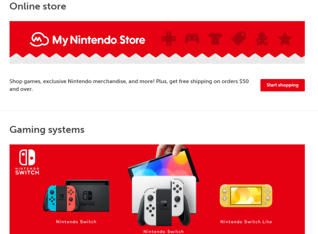
Essentially, this goes to show that color plays an important role in logos and branding. Colors help a brand connect with consumers on a deeper, psychological level, selecting the emotions and associations to evoke within the design—it sets the mood and grabs the attention. The image above is from the Nintendo website, another perfect example of branding, as the colors and typography all speak for themselves when taking into consideration the above information; great color vibrancy, simple logo designs (Nintendo Switch), and the distinction of things with their use of typography. Typography provides a direction to the voice and message of a logo, directly influencing the audience and inducing the right, necessary emotions from both readers and viewers. In websites, it establishes strong visual hierarchy, graphic balance, and sets the tone of a product. As a result, Nintendo has an effective logo and the company’s history with it shows why it continues to remain one of the most profound, impactful, and well-established brands in Japan and the rest of the world.
Works Cited
- Carrasco, Ashley. “Nintendo’s Logo Research.” Ashleys EPortfolio, https://openlab.citytech.cuny.edu/acarrasco-eportfolio/2017/12/10/nintendos-logo-research/.
- Jones, Tegan. “The Surprisingly Long History of Nintendo.” Gizmodo, Gizmodo, 20 Sept. 2013, https://gizmodo.com/the-surprisingly-long-history-of-nintendo-1354286257.
- Marriott, Andrew. “Why Typography Plays an Important Role in Logo Design – Typography.” The Logo Creative | International Logo Design & Branding Studio, 19 Oct. 2021, https://www.thelogocreative.co.uk/why-typography-plays-an-important-role-in-logo-design/.
- Miller, Perkins. “Nintendo Playing Cards.” Nintendo, https://nintendo.fandom.com/wiki/Nintendo_playing_cards.
- Miller, Perkins. “Nintendo.” Logopedia, https://logos.fandom.com/wiki/Nintendo.
- Meagher, Gordon. “The Meaning behind Logo Colors.” Tailor Brands, 11 Jan. 2022, https://www.tailorbrands.com/logo-maker/logo-colors.
- Nintendo. “Nintendo Official Site: Consoles, Games, News, and More.” Nintendo Official Site: Consoles, Games, News, and More, https://www.nintendo.com/.
- Sorini, Melissa. “A Logo Is Not a Brand… but What Is the Difference?” Creative Revolution Digital Marketing and Website Design Agency, https://www.creativerevolution.com.au/blog/a-logo-is-not-a-brand-but-what-is-the-difference.
- Famous Logos. “Nintendo Logo – Design and History of Nintendo Logo.” Logo Design
Blog RSS, https://www.famouslogos.us/nintendo-logo/.
- Joe, Admin – LMW. LogoMyWay, 11 Nov. 2020, https://blog.logomyway.com/nintendo-logo/
- 1000 Logos. “Nintendo Logo.” 1000 Logos The Famous Brands and Company Logos in the World Nintendo Logo Comments, https://1000logos.net/nintendo-logo/.