The OpenLab at City Tech:A place to learn, work, and share
Support
Help | Contact Us | Privacy Policy | Terms of Use | CreditsAccessibility
Our goal is to make the OpenLab accessible for all users.
top
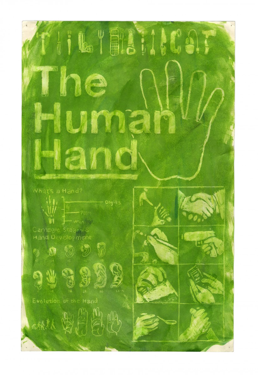
 Tim_Liedtke_Exceptional_DES_FA13_1_1_Hand Poster (2)