Nowadays there are lots of examples of violence, especially in families. When one is silent about situation, and another doesn’t care. I hope that people will think about this problem. And will decide, if they want the closest ones to suffer.
Field Trip
United Federation of Teachers
Our visit to United Federation of Teachers was very interesting and helpful for people who want to deal with design. The UFT, is a teacher’s union that helps aid and support teachers across the nation. They had a lot of machines for web printing that supporting with products only UFT. Machines are used throughout the day and producing up to 1000 copies. Different machine used for different purpose.
I found this one really useful, because it saves a lot of time for workers. Machine simply was sorting papers, then putting them inside envelopes and close them.
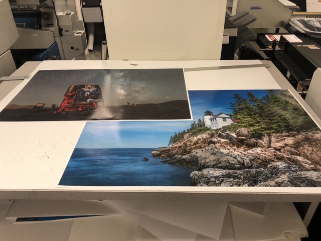
Also, liked the printer that is printing large posters that are 100×100. Moreover, we saw some examples of printing.
I enjoyed watching how T-shirts printing machine works. And that’s impressive, considering fact that sometimes they are getting orders of thousands of them for special event.
As designers we need to understand in what form is better to send files for printing. And to know what will be the next step after you send your work for printing.
Graphic Designer Research paper
Saul Bass
Saul Bass’s work touches people. Not just designers, or students, or observers of design, or those who know and can explain what a designer is and does, but simply people—many, many people.
Saul is very popular and accomplished graphic designer in history. I chose this person because, he has a lot of recognizable works. He also was a film maker and started something new in world of filmography. Saul is an example of successful person in graphic design and became an inspiration for many artists. Logos created by Bass are kept from 1970. During his 40-year career Bass worked for some of Hollywood’s greatest filmmakers, including Alfred Hitchcock, Stanley Kubrick, Otto Preminger, Billy Wilder, and Martin Scorsese.
Bass is famous for his use of simple, geometric shapes and their symbolism. Often, a single dominant image stands alone to deliver a powerful message. These shapes, as well as type, were often hand-drawn by Bass to create a casual appearance, always packed with a sophisticated message. His ability to create such a powerful message with basic shapes makes the work even more impressive.
Bass was born in 1920 in New York City, to Jewish immigrant parents. He was very creative from the earliest age. He graduated from James Monroe High School in the Bronx and studied part-time at the Art Students League in Manhattan until attending night classes with György Kepes at Brooklyn College. In 1938, Saul married Ruth Cooper and they had two children, Robert in 1942 and Andrea in 1946.
He worked in New York as a freelance commercial artist for advertising agencies and companies, including Warner Bros. In 1946 Saul Bass went to Los Angeles, where he continued to work as a commercial artist. By 1952 he had a practice of his own, which was registered from 1955 as Saul Bass & Associates. In the 1940s, Bass left New York for California. He worked mostly for advertising until his first major break: a poster for the 1954 film, Carmen Jones. The filmmakers were so impressed by his poster work, they invited him to design the title credits as well. This turned out to be a game changing decision.
Before 50s the title sequence was only for technical info and looked simply. In 1955, in Otto Preminger’s The Man with the Golden Arm film that focused on a musician’s struggle to defeat his heroin addiction. As to underline the intensity of then tabooed subject, he featured an animated paper cut-out arm in the film title which had a sensational effect on the audience. Besides, another notable filmmaker Alfred Hitchcock brought him on board for the title designing of his films. Bass developed iconic, influential and noteworthy title sequences employing distinguished kinetic typography for motion pictures, including North by Northwest (1959), Vertigo (1958) and Psycho (1960). He was the first to introduce this technique in Hollywood films which previously employed static titles. Bass once said that the audience’s involvement in the film should begin at the very first frame. He believed title sequences were responsible for setting the mental and emotional tone for the story that was about to be told. This innovation was start for new era in film industry.
There are a lot of examples proving that Saul Bass was a great graphic designer, and brand-new title sequence is one of them.
The Man with the Golden Arm, established Bass reputation as the master of film title design. In 1956 Mike Todd asked him to design the title sequence for Around the World in 80 Days, Bass produced a striking mini animation for the sequence, which was placed at the end of the movie. Thus, when the spectators getting ready to leave, the titles came on, and almost always, the entire audience set down again to watch the magnificent short animation.
For Alfred Hitchcock, Bass provided effective, memorable title sequences, inventing a new type of kinetic typography, for North by Northwest, Vertigo, working with John Whitney, and Psycho. It was this kind of innovative, revolutionary work that made Bass a revered graphic designer. Before the advent of Bass’s title sequences in the 1950s, titles were generally static, separate from the movie, and it was common for them to be projected onto the cinema curtains, the curtains only being raised right before the first scene of the movie.
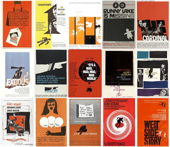
Saul Bass was creating not only title sequence, but also movie posters. His works was based on emotions that movie should represent, but not on cast in which where Marilyn Monroe, Frank Sinatra, Audrey Hepburn and other. Through his life Bass created more than fifty movie posters. Bass stepped up the sophistication of movie posters with his distinctive minimal style and he completely revolutionized the role of title credits in films. Traditionally, credits were static and drab. They were considered so unimportant, they would be projected onto the closed curtains which would only open for the first official scene of the movie.
In 1958 Bass designed the title sequence and poster for Otto Preminger’s keen-eyed adaptation of the Francoise Sagan novel “Bonjour Tristesse”. He captured the essence of the movie which was placed among the top 10 films of the year in Cahiers du Cinema’s year-end critics’ poll (with Francois Truffaut, Jean-Luc Godard, Claude Chabrol and Eric Rohmer all voting). Bass poster were a striking simple poster which in the words of Martin Scorsese was “an emblematic image, instantly recognizable and immediately tied to the film”.
Bass also designed some of the most iconic corporate logos in North America, including the original AT&T “bell” logo in 1969, as well as their later “globe” logo in 1983. He also designed Continental Airlines’ 1968 “jetstream” logo and United Airlines’ 1974 “tulip” logo which have become some of the most recognized logos of the era. Moreover, Saul directed the science fiction/horror film, Phase IV, and designed posters for the 1984 Los Angeles Olympic Games and for the Academy Awards celebrations from 1991-1996.
Another one of his philosophies stresses on rendering the ordinary, extraordinary, by acquainting the audience with familiar objects in an unfamiliar way. His graphic work in Walk on the Wild Side (1962) and Nine Hours to Rama (1963) are the epitome of this philosophy. The former features an ordinary cat as a dangerous predatory creature and the latter represents the internal mechanism of a clock embodying a large landscape. Some of his other popular title sequence creations include Spartacus, The Age of Innocence, The Shining and Casino.
He was a major influence on Bernard Lodge, a famous British graphic designer who worked for the BBC for many years and whose work included designing the logos and title sequences for the iconic science-fiction series Doctor Who (1963) during the William Hartnell, Patrick Troughton, Jon Pertwee and Tom Baker eras.
Saul Bass logos are kept for more than 34 years. Some of his work have yet to be replaced, like the brilliant designs for Kosé Cosmetics (1959), Kibun (1964), Warner Communications (1972), Girl Scouts (1978, with a slight modification made in 2010) and Geffen Records (1980). With designs as solid, thoughtful and timeless as these, they might never have to be. Because, good piece of graphic design will be popular and recognizable for ages.
Bass was prolific as a logo designer. His signature style and method behind conveying company identities have had true lasting power and still win admiration from the graphic design community today. Christian Annyas, a web designer, in 2011 studied Bass’ creations for longevity to discover that the average lifespan of one of Saul Bass’ logos is a staggering 34 years. That’s a heck of a long time when you consider the number of mergers, management changes and switches of agency partners big corporations and entities he worked with go through.
By the end of his life, Bass had created over 50 title sequences for Preminger, Alfred Hitchcock, Stanley Kubrick, John Frankenheimer and Martin Scorsese. He established the trend for the opening title sequence of films with animation and using graphic designs. In 1974. Bass returned to commercial graphic design. His corporate work included devising highly successful corporate identities for United Airlines, AT&T, Minolta, Bell Telephone System and Warner Communications. He also designed the poster for the 1984 Los Angeles Olympic Games. Among other films that Bass produced titles for are Broadcast News (1987), Big (1989) War of the Roses (1990), GoodFellas (1990), Cape Fear (1991), The Age of Innocence (1995), Casino (1995). In the early ’90s, Bass was honored with an exhibit at the Visual Arts Museum in New York. He passed away from Hodgkins’ lymphoma on April 25, 1996.
“In these titles I came to grips with what I think is the most challenging aspect of any creative endeavor and that is to deal with ordinary things. Things that we know so well that we ceased to see them. Deal with them in a way that allows us to understand them again. In a sense it’s making the ordinary extraordinary. For instance: Nine hours to Rama is about the nine hours which preceded the assassination of Mahatma Gandhi. By taking a clock – an ordinary object – a subjecting it to an unrelenting examination I hoped to create an intensification of one’s awareness of each moment.”— Saul Bass
Resources:
Smith, Laura, ”Saul Bass”, Internet database of films, and movie professionals (actors, directors, screenwriters etc.,
”Saul Bass”, Wikipedia
https://en.wikipedia.org/wiki/Saul_Bass
“ Saul Bass”, The History of Graphic Design, 2018
http://www.historygraphicdesign.com/the-age-of-information/the-new-york-school/182-saul-bass
”Saul Bass” Art of the Title, 2018
The Visually Enhanced Quotes
While reading the book “The Sun and Her Flowers” by Rupi Kaur I noticed the quote “You do not just wake up and become a butterfly, growth is a process”. I liked this quote, because some people think that to achieve something you don’t have much to do. But in real life, people are making mistakes, and if they can’t do something they would try again and again to reach their goal.
I choose this image, because it is related to the quote visually, with the image of Butterfly. The script font is showing tenderness of an image and the quote together. White color for the text helping to highlight it and make noticeable. 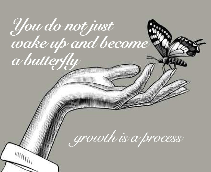
Next image is more colorful and alive. The image is related to the “growth” process, about which the quote is. To make image more simple I used Wire One font and used different green color shades for different parts of quote, that made a harmony between colors in the image and in text.
Looking at people in the front we can think about achieving a goal. And by using this image to the quote I wanted to show that, despite all difficulties they had, this people reached their goals and they had not easy way to it. I used Papyrus Condensed font and the black color for the text. Because background has a lot of colors and colored text will not look good.

The Logo Research Paper
Ford Motor Company
Oval Ford logo is well known for almost than 50 years, and now it is considering as one of the most recognizable companies. Ford Motor Company is one of the leading car brands in the automobile industry nowadays. Production of practical and not expensive cars, which organized Henry Ford, helped lot of people make their life easier and comfortable.
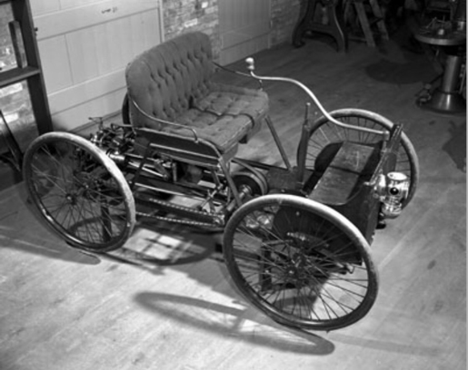
Henry Ford built his first experimental car in a workshop behind his home in Detroit in 1896. Henry Ford’s first vehicle rode on four bicycle wheels and was powered by a four-horsepower engine. Instead of a steering wheel, the Quadricycle had a tiller. The gearbox had only two forward gears with no reverse.
Henry Ford’s first attempt at a car company under his own name called the Henry Ford Company on November 3, 1901, became the Cadillac Motor Company on August 22, 1902. In 1903 company was changed into Ford Motor Company and they developed their first logo. It was created by the company’s first chief engineer/designer Childe Harold Wills. Ford was looking for a logo for his vehicles, so Wills, a friend of Ford’s who designed and printed business cards, used the calligraphy from his own cards to stylize the letters. It was placed on the first car of the company – Model “A”.
After formation of the Ford Motor Company, the first Ford car was assembled at the Mack Avenue plant in July 1903. The Ford Motor Company is incorporated. With 12 investors and 1,000 shares, the company had spent almost all its $28,000 cash investment by the time it sold the first Ford Model A on July 23, 1903. But by October 1,1903 Ford Motor Company had turned a profit of $37000.
History of Ford logo is very interesting, because it was changing with time and designers were trying to find out what people would like. The company was always developing and had changed their logos eight times.
In 1903 the first Ford logo wasn’t the one that we all know today, it was different in art nouveau style. It was on the beautiful frame on the black background and inside it was “Ford Motor Co. Detroit, MICH”.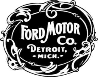
In 1904 Ford Motor Company of Canada is founded. Ford’s first international plant was built in Walkersville, Ontario, right across the Detroit River from Ford’s existing facilities. The company was a separate organization with its own set of shareholders. It was created to sell vehicles not just in Canada, but also across the then-current British Empire.
Ford introduces the scripted typeface of its trademark in 1907. Childe Harold Wills designed the Ford logo. He used his grandfather’s stencil set, which was based on the style of writing taught in schools when Ford and Wills were children. It has only black color with script font and no borders.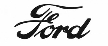
Then, same year it was changed in style, the script has the addition of long-tailed “F” and “D” letters while previously, in 1903, it had a frame, they decided to remove it. The logo was without borders, it was just a company name that was printed straight on the vehicles with the same script font. They thought that adding long-tailed letters will make logo more effective.
Ford first introduces the Model T in 1908. That put the world on wheels with a simple, affordable, durable automobile Ford sold 15 million Model T’s before ceasing production in May 1927, making it one of the best- selling vehicles of all time, and arguably the most famous car in the world. In 1908, there were only about 18,000 miles of paved roads in the US. TO deal with the primitive roads, Ford used light and strong vanadium steel alloy for critical parts. At the time, most of the automobiles in existence were luxurious novelties rather than affordable transport. But to appeal to the mass market Ford’s vehicle also had to be reliable and easy to maintain. Also, the company’s first international sales branch opened in Paris in 1908.
Logo that was created in 1907 was used up to the end of 1910. Model T has this logo, that was matching to this automobile. During this time Ford had a lot of competitors, which made a lot of new cars, and that’s why they thought about something unique and about what do people need. Henry understood that it would be more profitable to sell ten cars to ten people, than one car for the price of ten. Because, if the price decrease, they will have more customers, that are ready to buy a good car for the good price.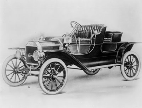
In 1912 Ford has its unsuccessful design in which they put the brand signature on top of blue winged pyramid and they added the bottom line “The Universal Car”. Although intended to show the product’s speed, grace, and stability, the logo was quickly removed after Henry Ford expressed his dislike of it. Customers may think about the freedom of the company because of the wings, and to my mind Henry Ford didn’t want to have this idea in his logo.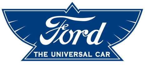
Designers right away changed the logo in the same year 1912 which brought a fundamental change in the history of the brand. The form of the logo was finally fixed: now the logo is an oval with a black text inside. And they removed that blue color from the background.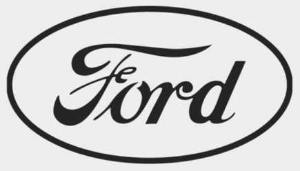
In 1917 Ford Motor Company produces its first ever truck. The Ford Model TT was a truck based on the Model T car, but with a reinforced chassis and rear axle. This early pickup was rated at one ton.
On the side of the truck there were “Ford Motor Co.”. And as they had new logo from 1912. They left for the truck logo from 1907 year.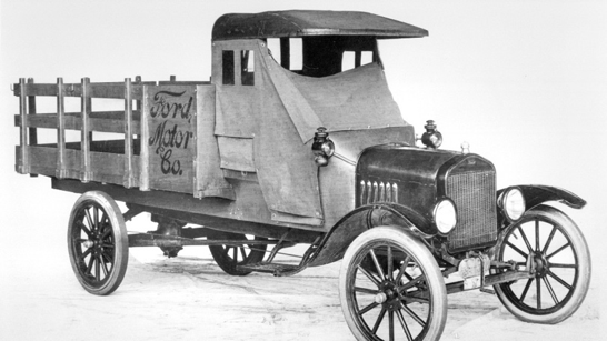
Edsel Ford succeeds Henry Ford as president of the company finally in 1919. Henry Ford put a plan in place to buy out his investors and make himself, Clara Ford, and Edsel the sole owners of the business Edsel’s interest in aesthetic automotive design brought a new dimension to Ford Motor Company, pushing the company to begin producing cars that were beautiful as well as practical. Edsel was also an extremely important art benefactor in Detroit, and one of the best- known paintings he commissioned was Diego Rivera’s Detroit Industry mural. His aesthetic legacy lives on in the original Lincoln Continental.
By the end of the 1920s, Ford had more than 20 overseas assembly plants in Europe, Latin America, Canada, Asia, South Africa, and Australia.
In 1922 Ford had acquired the Lincoln Motor Company (founded 1917), which would produce Ford’s luxury Lincolns and Continentals. In 1938 Ford introduced the first Mercury, a car in the medium-priced range.
1925 brings production of Ford Tri-Motor airplanes. Ford’s plane was nicknamed the “Tin Goose,” reference to the Model T’s nickname as the “Tin Lizzie.” The Tin Goose was one of the first airplanes used by America’s early commercial airlines. Combined with Ford’s reputation, application of assembly-line techniques and investment in Ford Airlines, the plane helped spur the creation of the commercial airline industry. And to further accelerate the industry’s development, Ford offered the plane’s 35 patents free of royalties, including his patent for the navigational radio beam.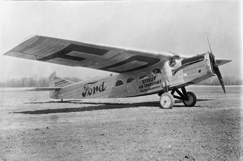
On their airplane, they used Ford logo with script font and no borders.
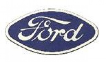
It didn’t take a long time for them to come back to the royal blue color. And in 1927 they made changes, also the shape was more rounded, than today’s oval. Moreover, designers evolve the logo with white stripe on the borders.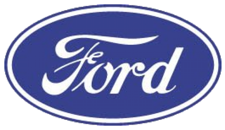
Ford begins selling the 1928 Model A. While the Model T dominated the auto industry from 1908 to the early 1920s, by the middle of the decade there was fierce competition from other automakers. After the 15 millionth Model T drove off the assembly line on May 26, 1927, Ford closed plants all over the world to spend six months retooling factories and perfecting the design of a new car. Ford called the new car the Model A, commemorating Ford Motor Company’s first car, the 1903 Model A. The car was the first vehicle to sport the iconic Blue Oval logo, and it included innovative features like a Safety Glass windshield. By 1931 Ford had sold over five million Model A’s despite the difficulties of the Great Depression.
Henry Ford I, becomes president of Ford Motor Company. The son of Edsel and the grandson of Henry Ford, Henry Ford I, served as president from 1945 to 1960 and as chairman and CEO from 1960 to 1979. When Henry Il took over, the company and its bookkeeping practices were in disarray. With the help of ten former U.S. Army Air Force officers nicknamed the “Whiz Kids,” Henry II transformed the organization into a disciplined company with modern management systems-prepared for the global challenges of the post-war world. Henry Ford II, who reorganized the company’s tangled system of financial management and reinvigorated its corporate culture by hiring talented younger managers.
In 1989–90 Ford acquired Jaguar, a British manufacturer of luxury cars.
From 1976 legend Ford logo change the background color into dark blue, that looked richer and they decided to make silver letters and silver frame around the logo which symbolize the aristocracy, restraint and impeccable reputation of the brand. Which encourage developers to make a new, progressive model that people need in their life’s.
From 2003 in honor of the 100-year jubilee designers add some details from the past logos and made it lighter and these changes were saved till now. From the 1907 the font wasn’t changing. It still script font, and I think that this is good idea for this company.
I can say that with company logo changes, changes come to the whole company too. Also, it makes a great first impression, a company with poor design and branding can become associated with their worst efforts. Strong logo design can help guarantee your company is always remembered in the best way possible. Because with the logo, the company can attract more customers or conversely. For instance, I really liked how the Ford logo looked in 1903, in the old art nouveau style, but maybe, if they left this style, they wouldn’t have so many customers, and they wouldn’t be so popular, as they are now. For some people the logo is just beautiful image, some nice colors. However, it could be associated with company’s background and values. It’s important to choose the right colors, structure and symbols. In addition, it distinguishes you from the competition; there are certain symbols that represent industries or products. You need to be unique to compete among the best companies. Logo is very valuable part in design, it’s showing creativity and goals in certain company. And changing it could be like a new stage, new beginning.
Resources and Bibliography
Widmar, Aaron,“Behind the Badge: Is that Henry Ford’s Signature on the Ford Logo? NewsWheel, August 13, 2013,
http://thenewswheel.com/behind-badge-is-that-henry-fords-signature-ford-logo/
“Ford Logo,” 1000logos Brands of the World, 2018
“Ford Motor Company” Wikopedia.com, November 9, 2018,
https://en.wikipedia.org/wiki/Ford_Motor_Company
“Why a Logo is important for your Brand.”, Taylor Brands
https://www.tailorbrands.com/logo-maker/why-a-logo-is-important
“Food Motor Company,” Encyclopedia Britannica, November 1, 2018
https://www.britannica.com/topic/Ford-Motor-Company


