

Saul Bass
Saul Bass’s work touches people. Not just designers, or students, or observers of design, or those who know and can explain what a designer is and does, but simply people—many, many people.
Saul is very popular and accomplished graphic designer in history. I chose this person because, he has a lot of recognizable works. He also was a film maker and started something new in world of filmography. Saul is an example of successful person in graphic design and became an inspiration for many artists. Logos created by Bass are kept from 1970. During his 40-year career Bass worked for some of Hollywood’s greatest filmmakers, including Alfred Hitchcock, Stanley Kubrick, Otto Preminger, Billy Wilder, and Martin Scorsese.
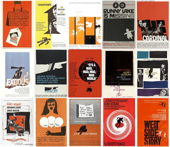
Bass is famous for his use of simple, geometric shapes and their symbolism. Often, a single dominant image stands alone to deliver a powerful message. These shapes, as well as type, were often hand-drawn by Bass to create a casual appearance, always packed with a sophisticated message. His ability to create such a powerful message with basic shapes makes the work even more impressive.
Bass was born in 1920 in New York City, to Jewish immigrant parents. He was very creative from the earliest age. He graduated from James Monroe High School in the Bronx and studied part-time at the Art Students League in Manhattan until attending night classes with György Kepes at Brooklyn College. In 1938, Saul married Ruth Cooper and they had two children, Robert in 1942 and Andrea in 1946.
He worked in New York as a freelance commercial artist for advertising agencies and companies, including Warner Bros. In 1946 Saul Bass went to Los Angeles, where he continued to work as a commercial artist. By 1952 he had a practice of his own, which was registered from 1955 as Saul Bass & Associates. In the 1940s, Bass left New York for California. He worked mostly for advertising until his first major break: a poster for the 1954 film, Carmen Jones. The filmmakers were so impressed by his poster work, they invited him to design the title credits as well. This turned out to be a game changing decision.
Before 50s the title sequence was only for technical info and looked simply. In 1955, in Otto Preminger’s The Man with the Golden Arm film that focused on a musician’s struggle to defeat his heroin addiction. As to underline the intensity of then tabooed subject, he featured an animated paper cut-out arm in the film title which had a sensational effect on the audience. Besides, another notable filmmaker Alfred Hitchcock brought him on board for the title designing of his films. Bass developed iconic, influential and noteworthy title sequences employing distinguished kinetic typography for motion pictures, including North by Northwest (1959), Vertigo (1958) and Psycho (1960). He was the first to introduce this technique in Hollywood films which previously employed static titles. Bass once said that the audience’s involvement in the film should begin at the very first frame. He believed title sequences were responsible for setting the mental and emotional tone for the story that was about to be told. This innovation was start for new era in film industry.
There are a lot of examples proving that Saul Bass was a great graphic designer, and brand-new title sequence is one of them.
The Man with the Golden Arm, established Bass reputation as the master of film title design. In 1956 Mike Todd asked him to design the title sequence for Around the World in 80 Days, Bass produced a striking mini animation for the sequence, which was placed at the end of the movie. Thus, when the spectators getting ready to leave, the titles came on, and almost always, the entire audience set down again to watch the magnificent short animation.
For Alfred Hitchcock, Bass provided effective, memorable title sequences, inventing a new type of kinetic typography, for North by Northwest, Vertigo, working with John Whitney, and Psycho. It was this kind of innovative, revolutionary work that made Bass a revered graphic designer. Before the advent of Bass’s title sequences in the 1950s, titles were generally static, separate from the movie, and it was common for them to be projected onto the cinema curtains, the curtains only being raised right before the first scene of the movie.
Saul Bass was creating not only title sequence, but also movie posters. His works was based on emotions that movie should represent, but not on cast in which where Marilyn Monroe, Frank Sinatra, Audrey Hepburn and other. Through his life Bass created more than fifty movie posters. Bass stepped up the sophistication of movie posters with his distinctive minimal style and he completely revolutionized the role of title credits in films. Traditionally, credits were static and drab. They were considered so unimportant, they would be projected onto the closed curtains which would only open for the first official scene of the movie.
In 1958 Bass designed the title sequence and poster for Otto Preminger’s keen-eyed adaptation of the Francoise Sagan novel “Bonjour Tristesse”. He captured the essence of the movie which was placed among the top 10 films of the year in Cahiers du Cinema’s year-end critics’ poll (with Francois Truffaut, Jean-Luc Godard, Claude Chabrol and Eric Rohmer all voting). Bass poster were a striking simple poster which in the words of Martin Scorsese was “an emblematic image, instantly recognizable and immediately tied to the film”.
Bass also designed some of the most iconic corporate logos in North America, including the original AT&T “bell” logo in 1969, as well as their later “globe” logo in 1983. He also designed Continental Airlines’ 1968 “jetstream” logo and United Airlines’ 1974 “tulip” logo which have become some of the most recognized logos of the era. Moreover, Saul directed the science fiction/horror film, Phase IV, and designed posters for the 1984 Los Angeles Olympic Games and for the Academy Awards celebrations from 1991-1996.
Another one of his philosophies stresses on rendering the ordinary, extraordinary, by acquainting the audience with familiar objects in an unfamiliar way. His graphic work in Walk on the Wild Side (1962) and Nine Hours to Rama (1963) are the epitome of this philosophy. The former features an ordinary cat as a dangerous predatory creature and the latter represents the internal mechanism of a clock embodying a large landscape. Some of his other popular title sequence creations include Spartacus, The Age of Innocence, The Shining and Casino.
He was a major influence on Bernard Lodge, a famous British graphic designer who worked for the BBC for many years and whose work included designing the logos and title sequences for the iconic science-fiction series Doctor Who (1963) during the William Hartnell, Patrick Troughton, Jon Pertwee and Tom Baker eras.
Saul Bass logos are kept for more than 34 years. Some of his work have yet to be replaced, like the brilliant designs for Kosé Cosmetics (1959), Kibun (1964), Warner Communications (1972), Girl Scouts (1978, with a slight modification made in 2010) and Geffen Records (1980). With designs as solid, thoughtful and timeless as these, they might never have to be. Because, good piece of graphic design will be popular and recognizable for ages.
Bass was prolific as a logo designer. His signature style and method behind conveying company identities have had true lasting power and still win admiration from the graphic design community today. Christian Annyas, a web designer, in 2011 studied Bass’ creations for longevity to discover that the average lifespan of one of Saul Bass’ logos is a staggering 34 years. That’s a heck of a long time when you consider the number of mergers, management changes and switches of agency partners big corporations and entities he worked with go through.
By the end of his life, Bass had created over 50 title sequences for Preminger, Alfred Hitchcock, Stanley Kubrick, John Frankenheimer and Martin Scorsese. He established the trend for the opening title sequence of films with animation and using graphic designs. In 1974. Bass returned to commercial graphic design. His corporate work included devising highly successful corporate identities for United Airlines, AT&T, Minolta, Bell Telephone System and Warner Communications. He also designed the poster for the 1984 Los Angeles Olympic Games. Among other films that Bass produced titles for are Broadcast News (1987), Big (1989) War of the Roses (1990), GoodFellas (1990), Cape Fear (1991), The Age of Innocence (1995), Casino (1995). In the early ’90s, Bass was honored with an exhibit at the Visual Arts Museum in New York. He passed away from Hodgkins’ lymphoma on April 25, 1996.
“In these titles I came to grips with what I think is the most challenging aspect of any creative endeavor and that is to deal with ordinary things. Things that we know so well that we ceased to see them. Deal with them in a way that allows us to understand them again. In a sense it’s making the ordinary extraordinary. For instance: Nine hours to Rama is about the nine hours which preceded the assassination of Mahatma Gandhi. By taking a clock – an ordinary object – a subjecting it to an unrelenting examination I hoped to create an intensification of one’s awareness of each moment.”— Saul Bass
Resources:
Smith, Laura, ”Saul Bass”, Internet database of films, and movie professionals (actors, directors, screenwriters etc.,
”Saul Bass”, Wikipedia
https://en.wikipedia.org/wiki/Saul_Bass
“ Saul Bass”, The History of Graphic Design, 2018
http://www.historygraphicdesign.com/the-age-of-information/the-new-york-school/182-saul-bass
”Saul Bass” Art of the Title, 2018

