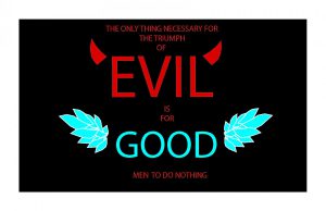
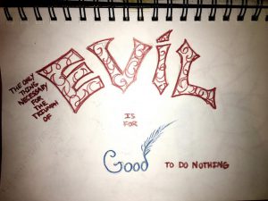
My first concept for my visual design quote is the quote itself making my own design using the words, I made the word evil stand out over taking the word good which I made into a different color and design. The color red makes everything pop up even more and is mostly related to something bad, the color blue is mostly associated with something good, I wanted the design to be simple but color being important.
irving fuentes's ePortfolio
A City Tech OpenLab ePortfolio


