
Type Journal 5
Type Journal 1
Harlan Gong
Type and Media
9/13/2018
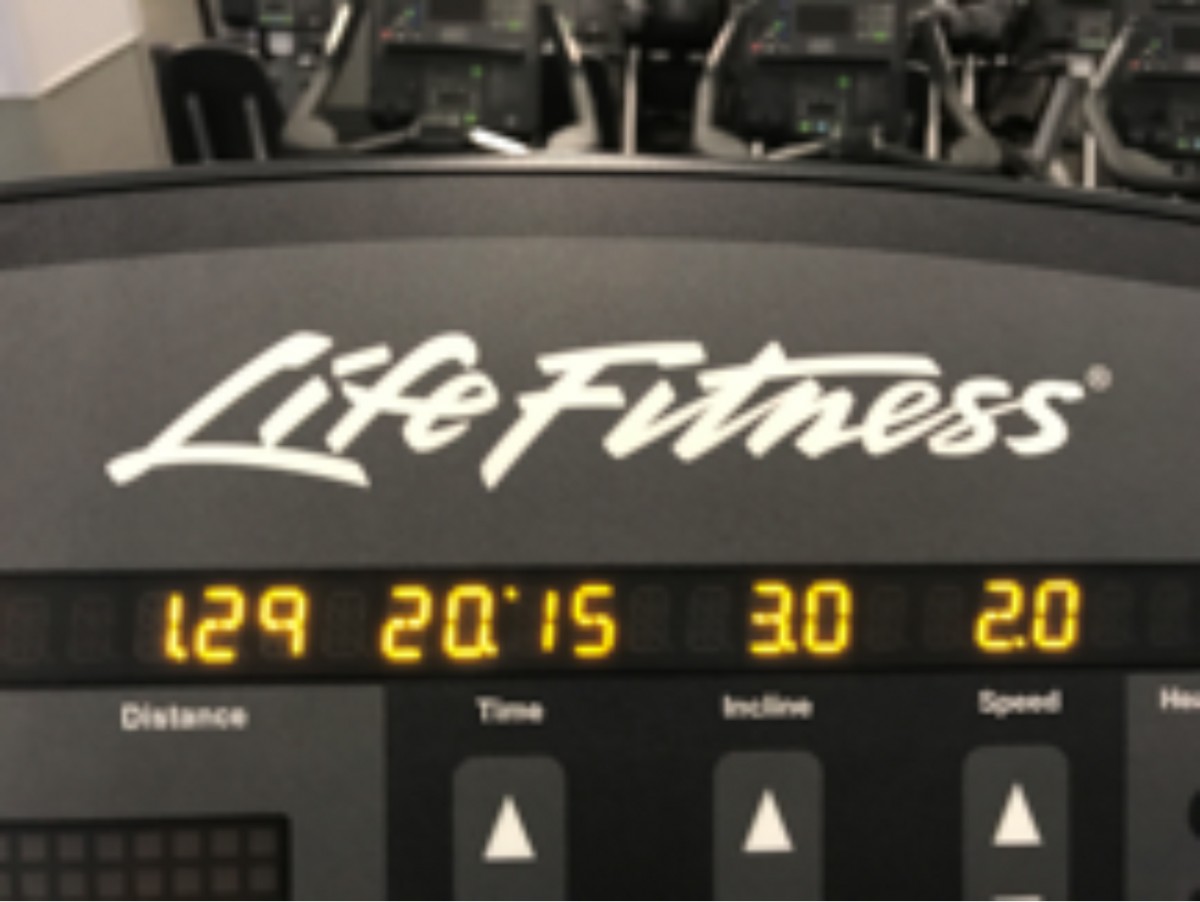
This is a photo of my local fitness center. This Blink has a typography that is similar to a gothic style. Particularly the lower case b that is is very similar to a gothic type style. Blink fitness is a commercial gym that has thousands of locations throughout the nation. The typography looks like its was designed by a team of professionals in design. For the most part the letters look like they were digitally produced on a design software. This brand was definitely created by a business because the brand is commercial. This is a photo of a piece of gym equipment in the fitness center. This treadmill brand has a very specific type of font. I would have to describe the font as some sort of script like text. It is not traditional script but rather it has the flow of script. The typography is well designed, but it is to be expected because it is a commercial brand. The type was most likely created digitally by a business.

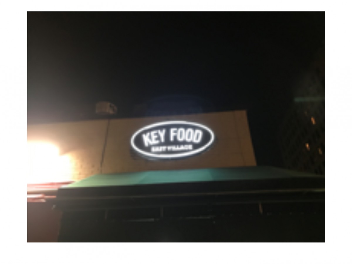
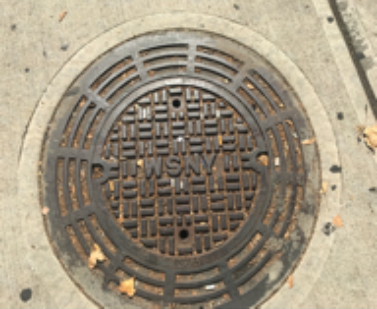
This is a photo of of a local supermarket in my neighborhood. The supermarket title has a type that resembles a modern style font. Of all the other type of fonts. The modern style is the only type that has the thickness and thin strokes. The Key Food brand is well crafted and looks like it was created by a professional designer on a digital platform. The photo of the manhole has text printed onto the center. The style of font resembles the a modern style. The text style was most likely designed by a professional. Since it is a manhole I assume that the manhole is mass produced by the city. This type was most likely created by the government because the city is responsible in this criteria.
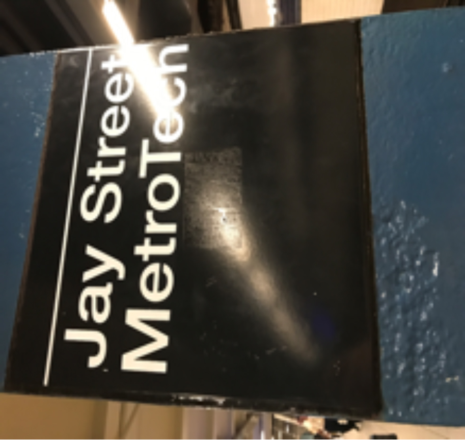
The photo of the sign at Jay Street Metrotech was taken on my way home. The sign has a type that resemble to a Gothic typeface. The MTA uses only helvetica for all its signs. This is logical because Helvetica is one of the most popular type of fonts that is used in modern world. This typeface was most likely created by a designer who specializes in design. The type looks like it was digitally produced. This style of type is done by the government because the MTA is a public service.
Welcome!
This is the first post on your Learning Blog. Edit or delete it, then start blogging!
The ePortfolio is both a Learning Blog and an Academic Career Portfolio. Use the Learning Blog to document your learning experiences and class assignments each semester. As time goes by, add content to the Academics and Career sections to show your department, graduate institutions, or future employers how well prepared you are for your chosen career.
NOTE: Remember to add appropriate Categories and Tags to your posts. This will help your professors and other visitors find the content they are looking for. The Categories “Coursework” and “Field Trips” and the Tags “OpenLab” and “City Tech” have already been applied to this post. Feel free to make changes!

