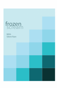
My Swiss poster for the Swiss poster project, Frozen Scream. I enjoyed creating this poster, mainly because of the fact that it included gradients and my favorite shades of blue, since I am not exactly a fan of blue. I also liked the name for our band as well… It fills me with an odd sense of nostalgia that I can’t quite seem to understand, but it’s there whether I like it or not, and it doesn’t bother me too much. I think I did a rather good job with this, negating the small blue spaces at the bottom, but other than that, I like to look at it.


