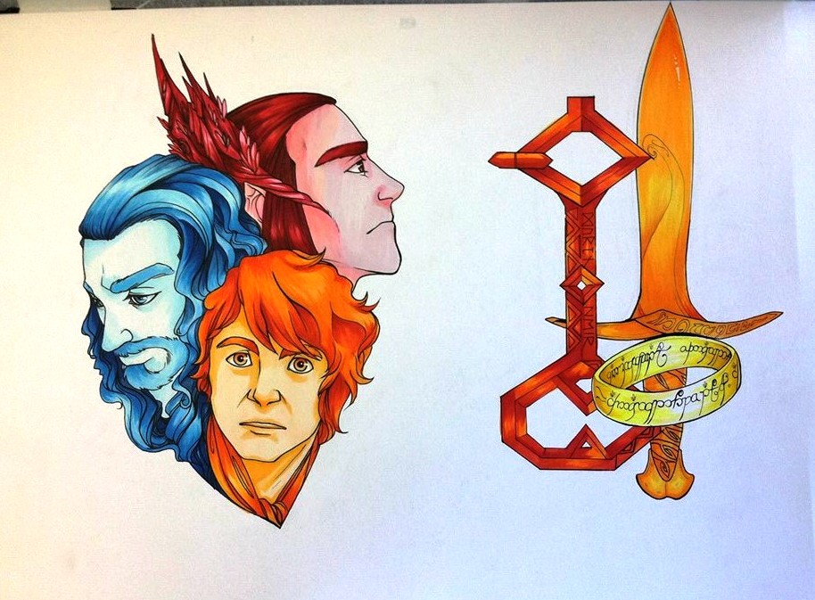
This project of mine was one of my favorites because of the fact that it, of course, has to do with one of my most favorite movies and books of all time. Despite the fact that it was my own desire to draw them, I still very much like the fact that I included them into the image. I also loved learning about split compliments and how they related with the opposite colors. I was never too clear on color interactions, but once I had learned about them, I found that it was rather enjoyable. I love warm shades, which is also why this image is one of my favorites. The warmth, and even the blue, warms my heart up.
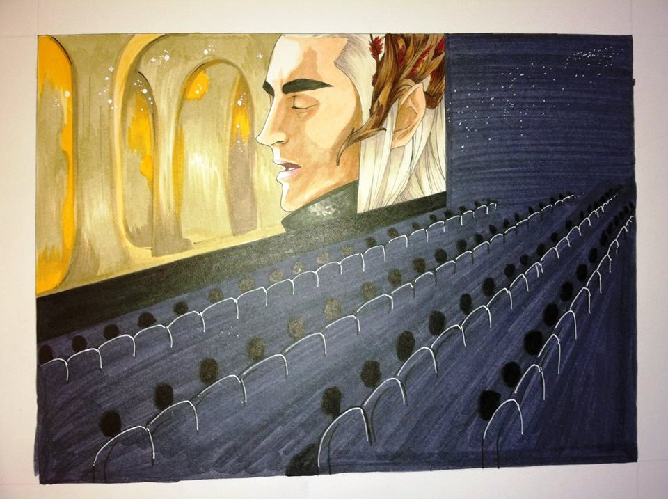
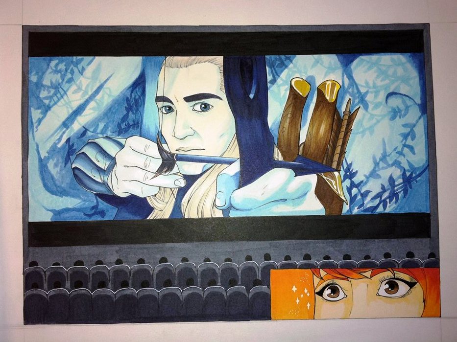
As you can tell by now, you probably know that I am a huge fan of the works of Tolkien. I also used The Hobbit for this piece, which was my final piece (the one on the left), and though I had some challenges with this one, I chose this image as one of my favorites either way, because of the fact that I was able to challenge myself and push my limits to see what I could really do. The colors did not blend too much in this one, and the color pallet didn’t match the one that I had chosen in the best of ways, but it still came out better than I thought it would. I am happy to say that this one did not come out too bad. In fact, I am happy to lay my eyes upon it. The image by its side, the one where there is an orange panel on the bottom, was a failed final project, judging on how I failed to capture the color pallet, and it could have also been executed in a more creative and eye-popping way. But I will always be fond of the drawing myself, as I am with the other.
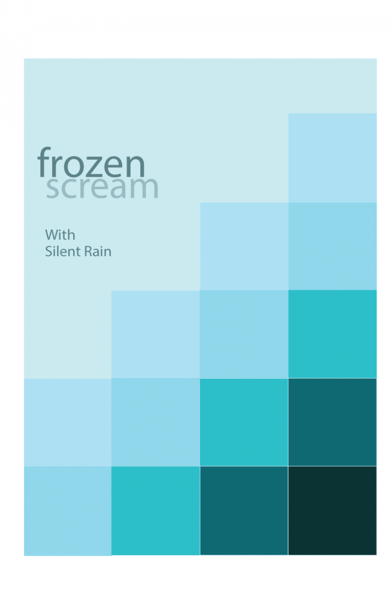
Now, I don’t know if this one can be included, but I am also very drawn to this Swiss poster project that we had done as well. It came out rather well, in my eyes, and though I failed to add the time and date, I still enjoyed creating this image and choosing which shades of blue I could use in order to make this poster look good. I enjoyed learning of muted colors and deciding which colors worked with each other, and though I am not a fan of the color blue, I did like this one very much, for there are no prismatic blue shades in this image, only modified blues. I like to look at it and think of the cool feeling I get, and think of snow and winter.

