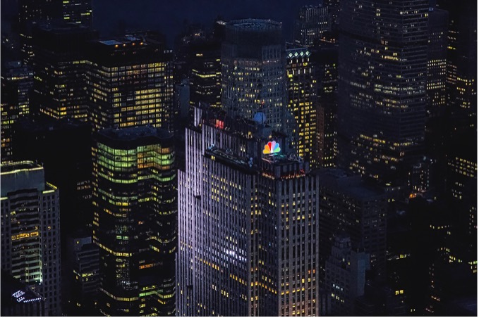
Whether you’re just waking up and starting your morning watching the TODAY show with Savannah Guthrie and Hoda Kotb, or kicking it back with your old man watching Sunday Night Football, or staying up late night to catch Pete Davidson perform as his Chad alter ego on Saturday Night Live, you have probably noticed the iconic peacock on the bottom right of the screen. National Broadcasting Company (NBC) has done a terrific job at logo identity throughout their tenure in the entertainment business.

Photo courtesy cdnlogo.com
David Sernoff founded NBC in 1926 with the vision that “events of national importance can be simultaneously announced and received” and “baseball scores can be transmitted in the air” (NBC Universal). With this vision in mind, the first logo for NBC was excellently executed with the placement of the electrified microphone radiating sound waves over our country. The lightning bolts resonated well with the audiences and stayed with the company until 1946.
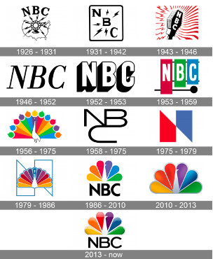
Photo by 1000logos.net
But as times change, so do the logos. Television was gaining popularity among the media mediums in America so, “the NBC logo lost the microphone and sound waves to become letters only—a visual holding pattern, as if the network was biding time while trying to figure out how to represent the new technology” (Reichers).
It wasn’t until 1956 when the Director of Design at NBC, John J Graham, designed the “Bird.” Behind the bird were peacock-like feathers that were, “supposed to emphasize the richness of colors the television network used” (NBC Logo).
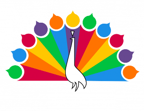
Photo by 1000logos.net
Introducing the bird to the country was a revelation for the company. American households were just getting introduced to color TV and the bird was a great mechanism used to drive people towards color programming.
NBC broadcasters did a terrific job at making the American audience crave color TV sets. Once the programming started, “The feathers unfurled as the announcer said, ‘The following program is brought to you in living color on NBC.’ This strategy was clearly aimed at black-and-white television set owners to clue them in on the color programming they were missing” (Ritter).
But as always, all good things must come to an end. In 1975, the bird was cut from the logo and we were left with an abstract “N” by design firm Lippincott & Margulies, a New York based design company made famous from their works on Campbell’s Soup Can, Citgo, and Coca-Cola. “‘It’s essentially an abstract with the bold look of strength and modernity,’ Walter Margulies, president of the firm, told the assembled press, ‘and once an abstract symbol is seated in the public mind it stays there’” (Dougherty). And sure enough, this new abstract logo stayed in the mind of the public, specifically Nebraska Educational Television.
In 1976, Nebraska ETV (NETV) filed a lawsuit against NBC on the premises of trademark infringement. Both logos looked nearly identical. The only difference between the two logos was the blue covered quadrilateral on NBC’s new logo. An agreement was settled out of court and “Jack McBride, general manager of NETV, estimated that the new and used NBC mobile and support color television equipment would cost $750,000 if purchased new. The settlement also included $55,000 for the educational network to expunge the “N” logo from NETV stations and for the development of a new NETV symbol” (Nebraska Agency and NBC Settle Dispute on Logotype).
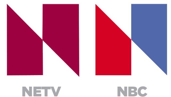
Photo courtesy twitter.com
After paying a heavy loss, NBC decided to return to its roots in 1979. Terry Glazer and Vasken Kalayjian at Lippincott & Margulies brought back the bird and complemented him with the new very expensive abstract “N.” This logo was accompanied by their new slogan “Proud as a Peacock” to help rally their rebranding.
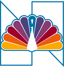
Photo by logodesign.org
Coming to back to the peacock we all know and love, we are greeted by the first iteration of him in 1986. NBC got Chermayeff & Geismar, a New York based design company notable for their work on National Geographic and Chase, to redesign the NBC logo. Steff Geissbuhler was given the task to tackle the logo and Geissbuhler effectively understood the assignment. The bird’s head is now flipped to the right to signify as if it is looking forward towards the future, giving a more optimistic prideful look. The amount of feathers diminished to only 6 now representing the primary and secondary colors off the RYB color model. The 6 feathers also now represent the 6 divisions within NBC: news (yellow), sports (orange), entertainment (red), stations (violet), network (blue), and productions (green).
Since then, there have only been minor tweaks and adjustments to the bird. In 2011, a 3D glass variant of the logo came out. In 2013, designers incorporated the NBC watermark below the logo while thinning out the feathers and adjusting the beak. Now, we are always greeted by the bird who withstood the test of time.