Category: Digital Media Foundations
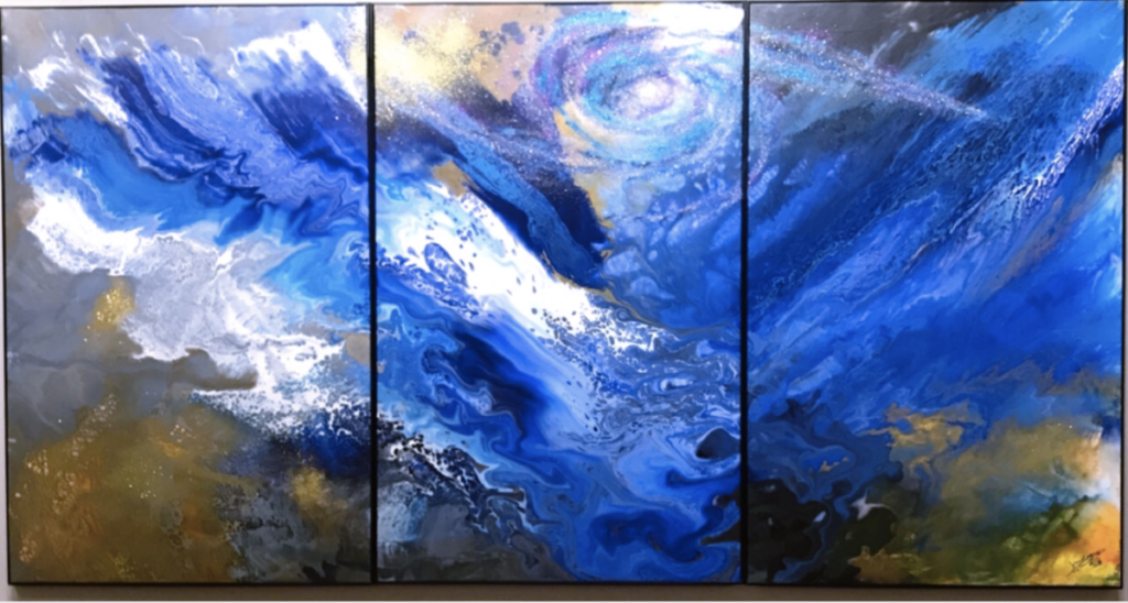
This is Cao Jun’s Symphony. This painting is from the Nassau County Museum Exhibit Blue seems like a moving moment because of the flow of the paints. There is nothing suggesting that this moment is anything but moving. The inside of this painting would be cold but peaceful. The different variety of blues gives off a very relaxing vibe. You can see there is a sort of vortex in the middle canvas suggesting that the blues are spinning and colliding in a similar motion as the vortex. Its use of earthy dirty kinds of colors gives a suggestion that the blue is water but the vortex suggests a space feel. This painting was interesting to me because makes the viewer really try to understand what is going on. The painting is completely up to the interpretation of the viewer.

This is Yves Klein’s Venus. This sculpture is a lookalike of the Venus de Milo by Alexandros of Antioch with a twist. It was believed to depict Aphrodite, the Greek goddess of love and beauty, and it bears the name of Venus, the Roman counterpart of Aphrodite. The original was made out of marble while Klein’s Venus is made out of plaster but coated with special paint. This paint was created by the artist himself. The Nassau museum states that the paint is “Rhodopas M60A thinned with ethanol and ethyl acetate to preserve luminescence” and “was concocted by the scientifically advanced artist with a Parisian color merchant and chemists at Rhone-Poulenc”. It is very interesting to see this iconic sculpture in this very sharp blue color. This blue is called IKB or International Klein Blue. This paint gives off a matte finish instead of a glossy one. It really puts emphasis on the figure of the sculpture.

This is the Mountain Temple of Sendai by Hasui Kawase. This painting stays true to the Japanese art style but uses color to describe its composition. The blue reflects how the temple is at night. The calmness of the blues makes the temple inviting and calm. It depicts a certain sophistication of the temple. You usually see this art style’s use of blue as something to represent waters and the skies during the day. There is also the use of other colors like green and browns to depict nature. In this painting, you see how everything is just a shade of one blue. I can really feel the stillness of the middle of the night with this use of blue. There is the use of negative space when you get to the moon as it is only the canvas. I would say this is my favorite out of all of the ones I’ve seen.

Visually Enhanced Quotes