Wednesday, June 3, 2015
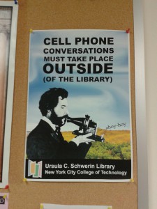
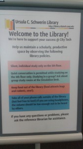
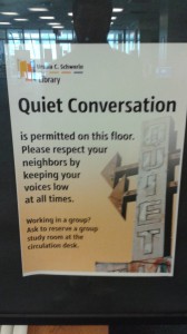
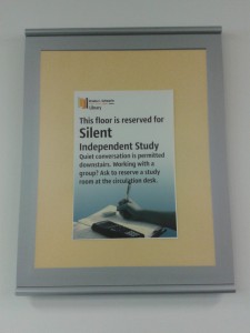
These were images I took on my phone of signage in our own City Tech Library:
What did I learn?
Knowing when to use CMYK and RGB is extremely important because they are each used for different mediums. I learned how to swap RGB colors to CMYK colors in Indesign. Had I not learned this easy method of switching between the two scales, I would probably have a difficult time creating a file for print and a file for web. I also learned that Trade Gothic is the font that is commonly used for City Tech.
What were my challenges?
My biggest challenges was during the poster replication exercise. The first was identifying the typeface that was used. I used a mixture of Univers and Trade Gothic. My other challenge was matching the body copy exactly to how it looked on the real published poster. It took a lot of messing around with the tracking to finally get it.
Other comments:
I really enjoyed my first day and look forward to learning more tricks to better myself as a designer.
– William Luperena


William,
Welcome to Faculty Commons June training. Thank you for sharing your reflection and posting the photos you took of some signage in the library.
Are you up to the challenge of proposing a ‘new look’ for library signage?
See you tomorrow.
Professor Jordan