My Initials
The instruction of the assignment is to create three square compositions in Adobe Illustrator, measuring 6×6”, dynamically combining the letters, and creating ligatures.
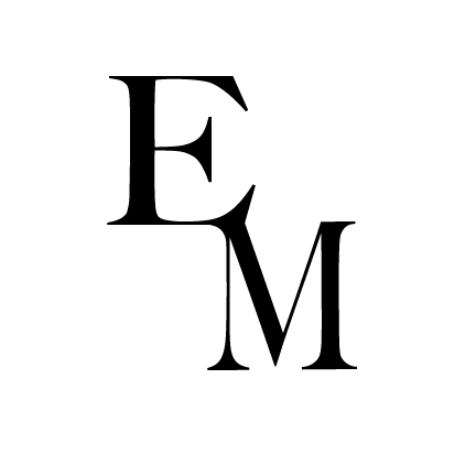
The first composition uses only serif fonts (fonts with small decorative strokes at the ends of letters). I combined the letters E and M in the same size and font Big Caslon Medium, with their edges creating an elegant look.
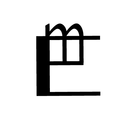
The second composition uses only sans-serif fonts (without strokes). I used the letters E (large) & m (small) in the font Kannada MN. I positioned the m on the second stroke of the E to create a fun shape resembling a window, which also looks like the Chinese word 巴 (pronounced as “ba”).

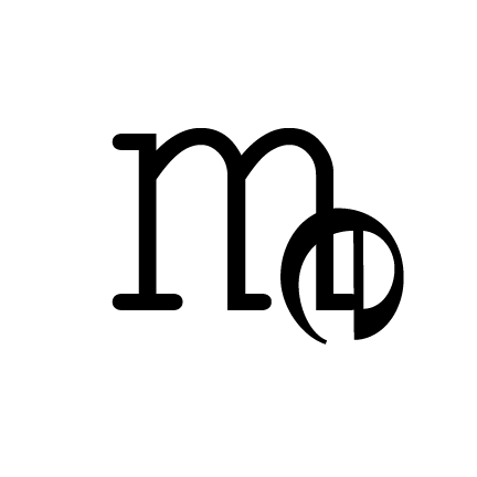
The third composition uses a serif font for m (Courier New) and a sans-serif font for e (Kannada MN). I angled the e and positioned it on the bottom right of m. The final look reminds me of musical notes. It is one of my favorites, and it is used as my current logo for my art portfolio website.
