
For this project we were suppose to chose a quote and create three designs revolving around the quote. The measurements of the project had to be “8.5 x 5.47”
and we were limited to using photography for only one of the designs. The quote I choose to use for my project is “Less is More” it is a quote usually associated with Ludwig Mies as he was the quote creator and one of the first to incorporate it into his artwork. The quote is a basic principal of minimalism, which isn’t only a style of art but a lifestyle.
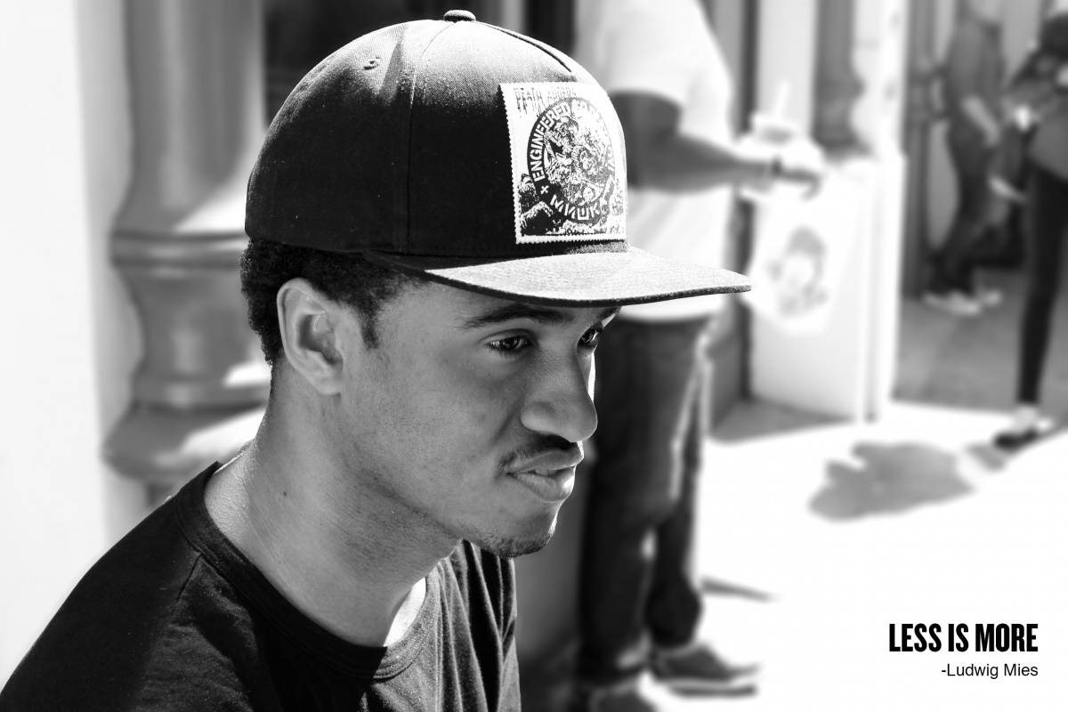
I like keeping things simple and not having to incorporate colors make design more dynamic and I think the photo portrait shows the dynamic lighting of the photo. Some might say the photo has too much going on in the background but that’s why I blurred it out. The main object of the photo isn’t really the person put the negative space around it. The original project idea had the font in a bigger size. After trying what my peers said about placing the text in a different area I came to the conclusion that it’s better off where it’s at.

