
For this project we were suppose to chose a quote and create three designs revolving around the quote. The measurements of the project had to be “8.5 x 5.47”
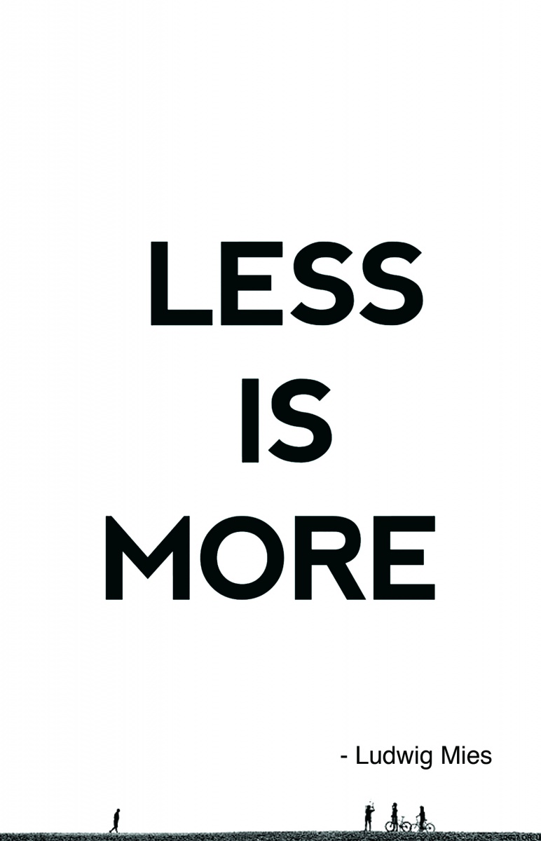
and we were limited to using photography for only one of the designs. The quote I choose to use for my project is “Less is More” it is a quote usually associated with Ludwig Mies as he was the quote creator and one of the first to incorporate it into his artwork. The quote is a basic principal of minimalism, which isn’t only a style of art but a lifestyle.
In this quote concept I designed the card with Minimalism in a bold sans serif font centered with a city 1 in the foreground. The quote is all the way at the bottom of the page in a small font. I think that sans serif is a good fit for minimalist design. For this project idea I just wanted to do straight typography but I felt as though there was too much negative space so to fill it I created a city silhouette to take up space. Overall I think this design is the one I like the less most out of all three concepts. The emptiness of the space I think is what makes the Boldness stick out more.

