
For this project we were suppose to chose a quote and create three designs revolving around the quote. The measurements of the project had to be “8.5 x 5.47”
and we were limited to using photography for only one of the designs. The quote I choose to use for my project is “Less is More” it is a quote usually associated with Ludwig Mies as he was the quote creator and one of the first to incorporate it into his artwork. The quote is a basic principal of minimalism, which isn’t only a style of art but a lifestyle.
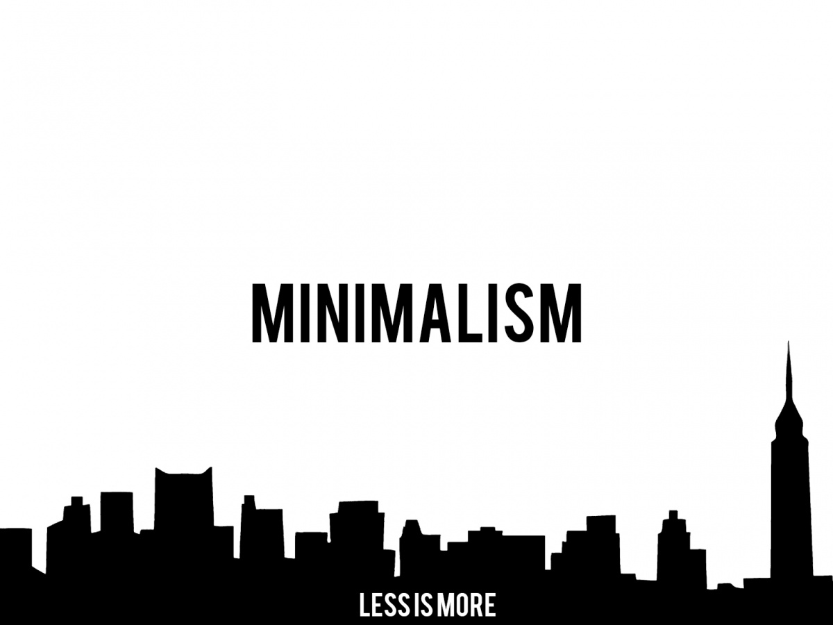
When first starting to sketch out ideas for my first design I made the decision that all my projects will be black and white. I planned on making things as simple as possibly while still having an interest design just because something is in black & white doesn’t mean that it has to be bland. For this design I was first going to just put less is more but when I first did I felt as though there was too much negative space in between left over. So to still keep things simple when added something I put a silhouette of a cityscape at the bottom and but the words minimalism in the foreground. I also made a universal decision for my projects that I would use sans-serif font it’s much simpler and less flashy. This is how I constructed my first project.

