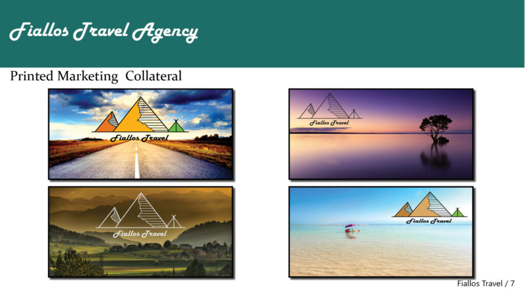
1A
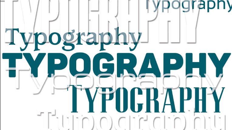
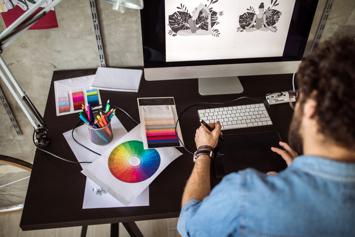
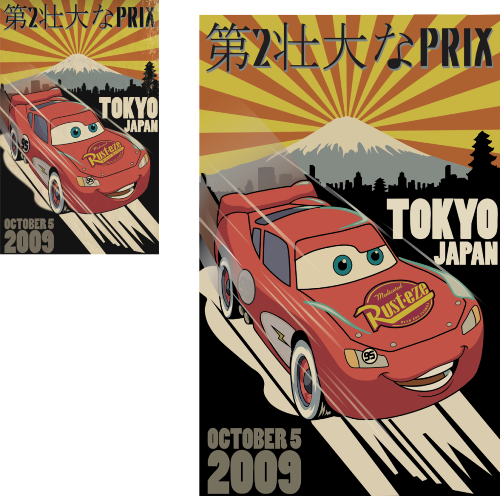
On June 12, I embarked on my first project, tasked with creating two captivating illustrations for the company’s official Instagram page. The initial artwork was dedicated to Blood Donor Month, while the second one commemorated Flag Day. My role encompassed integrating the company’s logos, slogans, typography, and visual style into the designs. Access to all the official company material for these and future projects was granted by my supervisor and design manager. Despite being primarily an illustration endeavor, the project demanded meticulous incorporation of logos and the company name. Additionally, for my subsequent project involving the creation of article layouts for the company’s official magazine, I took it upon myself to ensure proper attribution to the original owners of internet-sourced photographs, as the company doesn’t utilize its images. Overall, working on these projects has been an immensely rewarding experience as a designer, given the remarkable freedom for creativity they offer. My only obligations pertain to correctly utilizing the company’s logo and duly crediting non-proprietary photos.
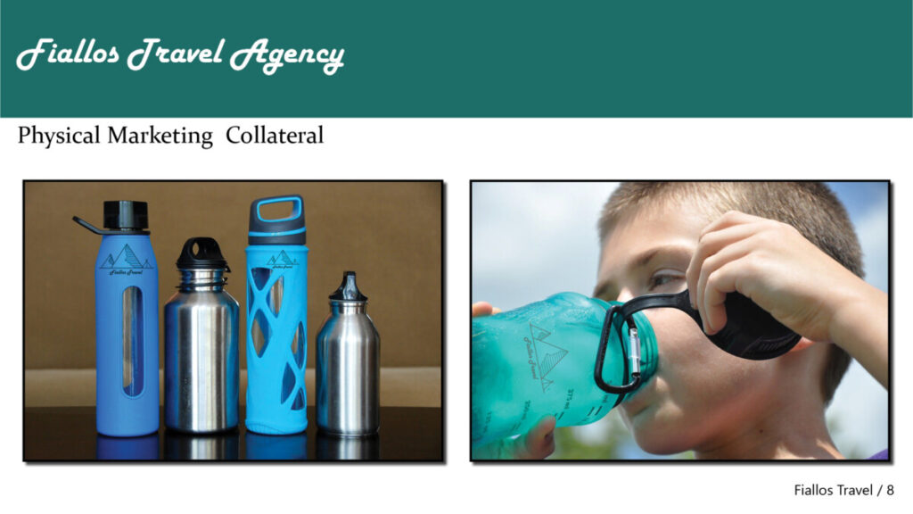
1B
I just want to note that I have not been provided with any confidential agreements or non-disclosure agreements by my supervisor or the design department head that require my signature. I have successfully completed two projects, and no confidentiality agreement has ever been mentioned to me concerning these projects. The company’s founder is aware that many of these projects are undertaken by students like me, and we have been permitted to include them in our portfolios and display them outside of the workplace.