Project Description
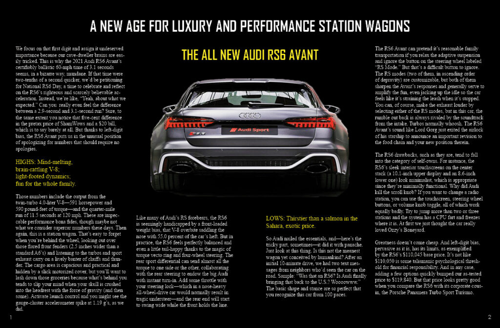
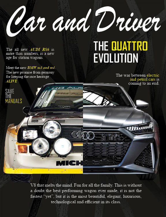
This typographic project has as its objective the creation of a cover and the first two pages of a magazine of our liking. In my case, I chose ‘Car and Driver magazine’, which is a specialist in everything related to the world of cars. For my magazine, I used an elegant but ‘modern’ approach so to speak, as it went with the personality of the model I used for the cover and pages.
Reflection
The biggest challenge of this project was the organization of the statements and title on the cover. My main obstacle was trying to position each text, some headlines were more important than others with a larger font size, and it should not cover or overlap the image of the cars. It was a long process, but I think that in the end, I managed to create a balance between the image and the text, where everything is legible and easy to recognize.
Additional Images


