My Bio

Hello my name is Emmanuel Hernandez and I am a current student at the New York City College of Technology, enrolled in Communication Design.

Born in the capital of the United States, lived a few years in Maryland, raised in Jackson Heights, Queens, New York. Both of my parents came to this country empty handed, wanted me and my sister to have a better future. Living in New York is like no other place, it is unique, The style and appearance of my neighborhood has made me become who I am today. It has given me a huge impact, and it became a part of my life.

At the age of five, my parents discovered that I have a disability. We are not sure how it happened, but I have a hearing problem. I am able to communicate with others and hear perfectly with my right ear, yet my left isn’t as functional like my right, it’s completely dead . During that same time period my parents quickly learned that I am talented, I have the talent to draw, I am an artist, and like Andrew Loomis once said, ” Drawing is vision on paper”. I feel that I am able to express myself with my skills of art, knowing the fact that my drawings are my power tool, that it can become meaningful.

Choosing this major was easy, I always figured why not put my art skills in technology. I always had this kind of interest since middle school, I like the way how every store in my neighborhood had its own unique typeface and logo. It came to the point where I said to myself, “One day my work will be known ! “. In my first year my interest increased, I was capable of learning new things, and work on programs that I have never used before such as Adobe. As I continued to take different courses while being in the graphic design field, I for sure now know that I want to become a graphic designer, yet I don’t know what kind. Hopefully the next few years I’ll earn my bachelor’s degree and become a successful graphic designer.


Logo Project – PlayStation

The PlayStation is an extremely popular series of video game consoles manufactured, marketed and owned by Sony Computer Entertainment Inc. The iconic PlayStation logo was first publicly introduced in Japan, it was created the third of December in 1994 by a Japanese designer named Manabu Sakamoto. Later released in North America in September 1995, and Australia in November 1995.  This Japanese designer, not only created the logo he had also worked on other logos for Sony products to such as VAIO.

VAIO

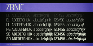
Sakamoto also designed the custom typeface used in the Playstation logo.The typeface itself was conceptualized by Manabu Sakamoto,  many can assume that designer was inspired, that the font used for the lettering is very similar to a font called Zrnic Light designed by Ray Larabie. Both have similar traits of typography but it is unsure if the designer used this idea or not.

FONT

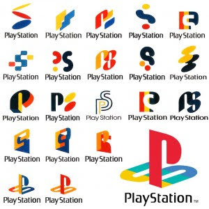
Before Playstation was introduced the logo had been in development, more than a few dozen logo concepts were submitted for the final approval, since then the PlayStation logo certainly became one of the most popular and instantly recognizable logos in the gaming arena. There were many weird designs, some seemed like a funky 50’s vibe, while others were plain and simple. The designer wanted to make a long to become outdated, timeless. The logo has always been seen with two letters P and S and with the four colors, the P is colored red, while the S has a three- color pattern of yellow, green and blue. The reason why it’s always been P and S, was because it meant for Playstation. The President of Sony, Norio Ohga, was reportedly furious at the termination of the partnership (Nintendo) and got Ken Kutaragi to develop the PlayStation Project in order to compete against Nintendo. That is how playstation came to be.

LOGO CONCEPT

The reason why the Playstation’s logo had to be changed several times before becoming the final logo, was so that their marketing and advertising pushes the boundaries and keeps the brand in the public eye. once they found the perfect logo, it hasn’t been any different ever since. This strong logo has carried the PlayStation brand to global success, and is now one of the most recognized logos in the world. Changing little in over 20 years from its initial concept, the strength of the PlayStation brand has outstripped even the Sony brand itself, with the product becoming bigger than the company who created it. So much so, that PlayStation as a brand now dwarfs all Sony’s other operations and is easily the most important part of the business.The Colors used in the design stand for “brilliance, passion, joy, charm and elegance”. Now the current PlayStation logo is often seen in a black and white color palette, giving it a very clean , smooth feeling look.

FINAL LOGO

It’s hard to tell whether or not the playstation logo has influenced other logo companies, but there may be a chance that the Playstation logo itself may have been inspired by none-other Sun Microsystems. It is no coincidence that both logos have identical features, such as the fact that the Sun’s logo, which features four interleaved copies of the word sun in the form of a rotationally symmetric ambigram which is similar to the Playstation logo. The symmetric ambigram is literally breaking the ‘s’ into two components, those components however look identical to the letter S in the playstation logo. Once again this is just a theory, probably the PlayStation logo was not inspired but it’s cool that both logos have similar traits.

LOOK ALIKE

Video Project

The assignment of this project was to make a 20 second video on a portrait, in this case the video was about depicting myself. The title of the video is called The Man Behind The Mask, the video itself tells a story of how a man (me) at some point is walking away showing the audience his back, not letting the audience demonstrates his face, yet at the same time there’s cut clips demonstrating how the man faces the audience by putting on a mask, still not revealing his identity. What I’ve learned about this project, while making this video is that by putting edits and trimming, and cutting clips can be fun yet very stressful. To be completely honest, I have never made a video for any class, yet my first one is 20 seconds long and I still struggle by doing so. I wanted the audience to capture the smooth transition between each movement, I have never learned how to edit, I did not possibly think that I could’ve been creative, but with a lot of patience I learned that having to put background sounds , showing different kinds of movements in the video can really make someone feel the intensity, can really make an interesting video. 

Museum Report

Who exactly is JR? JR is an unidentified French-born artist, yet he is well known by his amazing, original artworks. He started out on the streets of Paris and began his career as a teenage graffiti artist by making his mark on public space and society. JR now collaborates with communities by taking individual portraits, reproducing them at a monumental scale, sometimes illegally in nearby public spaces. Large black-and-white photographic images in public locations. He states that the street is “the largest art gallery in the world.” 

JR CHRONICALS

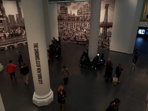
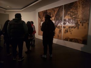
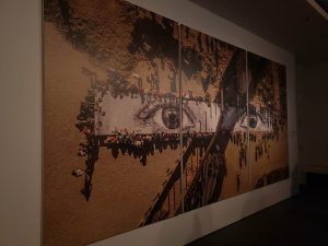
JR has the largest art gallery in the world. Thanks to his photographic collage technique, he exhibits his work free of charge on the walls of the world attracting the attention of those who do not usually go to museums. 200 Eastern Parkway Brooklyn, New York is where you’ll find JR: Chronicles. The first major exhibition in North America which is showcasing murals, photographs, videos, films, dioramas, and archival materials, all done by JR himself.

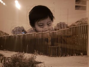
A Child curiously peeks over the Us-Mexico border in JR’s installation on immigration. Recently, we as a class, went to the Brooklyn museum to learn about the origins of JR, and his many well known artworks. To what I learned is that JR has expanded the meaning of public art through his ambitious projects that gives visibility and agency to a broad spectrum of people around the world. In the museum there was this project he made that really brought to my attention, “Kikito”. 

"KIKITO"

The project “Kikito” is a monumental photograph of kikito, a one-year-old boy from Tecate, Mexico, in a location near the child’s home along the U.S. -Mexico border. I had a lot of curiosity when I first saw it. Many just see the image and will simply say that there is just a huge baby on top of the border. However just by looking at the work of art, it truly expresses plenty of emotions. The monumental photograph was meant to react to President Trump’s recent reversal of the DACA program, a policy that protects eligible immigrants (who came to the United States illegally) from deportation.

what I found so compelling is the fact that the monumental artwork is a powerful and peaceful message about child immigration, specifically the unknown fate of the 800,000 dreamers that form part of the DACA program today. This is why I loved this project so much , because not only did he made an amazing monumental photograph he also made a statement to the world. In the end the JR’s team had a picnic at the border, a large table intersecting through the border, everyone was eating at both sides. The greatest part of it was what the artist said, he said ,” The people eat the same food and drink the same water and listen to the same music,” JR says. “For a minute we were forgetting about it, passing salt and water and drinks as if there were no wall.”


PICTURE WITH CLASSPICINC AT THE BORDER